A logo is the face of a brand, and in gaming, this rule applies as well. It is not just a picture but the way players remember a brand. It is a key to emotions, nostalgia, and even a sense of belonging. Gamers often recognize their favorite brands by a distinctive letter shape or color detail, even without the text. It is no surprise that a discussion about the best gaming brand logos is also a discussion about the history of the industry.
Logo as a Weapon – Why the Right Symbol Matters
What logos can genuinely be considered the best? There are a few simple yet essential qualities that determine whether a symbol will stay in players’ memories for years. These characteristics include:
- instant recognition;
- simplicity that never gets old;
- difference from rivals;
- match with the brand’s culture and values.
Players often decide where to spend time and money based on first impressions. The logo becomes the first test. A good one does many jobs at once:
- builds a sense of trust;
- shows that the brand cares about details;
- creates an image that is easy to recall among hundreds of icons.
This is true in both video games and gambling. The prizes there can be huge, so the visual look also has to feel strong and reliable. That is why online poker tournaments marketing emphasize the importance of logos that convey trust and professionalism. If a site looks cheap and the emblem is weak, players tend to hesitate. In this case, the logo stands as a sign of honesty and trust. A strong logo is not only about looks. It is a strategic tool in the fight for attention.
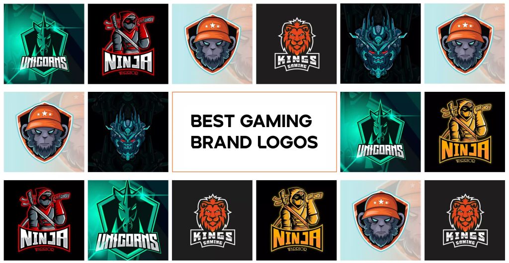
Icons of the Industry – Five Logos You Cannot Forget
Gaming has often pushed design forward. In the 80s, most brand logos were colorful and complex. Gaming brands like Atari or Sega already used clean, bold designs that still look stylish today. In the 90s, a new trend came. PlayStation and Nintendo 64 arrived with 3D shapes and bright colors. Today, the main style is minimalism. A few strokes can trigger the correct memory or feeling. Market leaders prove it:
- Nintendo. The company is more than a century old, but its logos have always looked sharp. The modern red frame with white letters is simple yet powerful. It connects to childhood, first consoles, and Super Mario.
- PlayStation. The logo shows a 3D “P” and “S” crossing each other. It appeared in 1994 and became a sign of the 3D era. Red, yellow, blue, and green represent play, variety, and technology.
- Xbox. Microsoft launched Xbox with a glowing green “X.” Later, it turned into a sphere with the letter cut out. The current logo is both simple and effective. It stands for power, tech, and even aggression.
- Steam. Steam is the gate to digital games. Its logo features a crank and rod, reminiscent of a train part. It reminds me of the industrial age, but in a digital form. The symbol is distinctive and immediately recognizable.
- Sega. The blue Sega font with its signature lines has been around for decades. It is so simple that you can draw it from memory. It proves that the strength of a logo lies in identity, not in complexity.
Why These Gaming Brand Logos Work
A successful logo can always be explained. It is not luck or magic. A few rules unite the best examples: color, shape, and context. Color comes first. Red in Nintendo stands for energy and drive. Green in Xbox feels tied to tech and motion. Blue in Sega signals trust and calm.
Shape matters just as much. The modern clean style means every logo can be drawn on paper in seconds. They are easy to spot and to separate from others. This works far better than complex patterns that only look good on a screen. Steam and PlayStation add 3D or mechanical touches. That gives them life, even if they are static.
Context is the last piece. Nintendo brings childhood memories, Xbox represents hardcore gaming, and Steam embodies the digital age. Without cultural ground, a logo risks staying a cold shape. Together, these signs act not only as pictures but as triggers for feelings.
What Today’s Designers Can Learn from Gaming Logos
Making a logo for a gaming project or a startup is tough, but top brands give clear lessons:
- Keep it simple. A player should recognize it immediately, even at first glance.
- Think about scale. A logo must work effectively on both a phone screen and a huge banner.
- Use associations. Futuristic style for esports, bright tones for casual games, and luxury for gambling.
- Keep balance. A logo must be unique enough, but still clear to a broad audience.
The best gaming logos share the same traits: simplicity, emotion, and meaning behind the form. They are more than decoration. They build trust and set the tone. Think how fast you notice Nintendo or PlayStation among hundreds of icons. That is the true power of a symbol. Styles, trends, and technology may change, but one fact remains: a strong logo in gaming will always be more than just a picture.