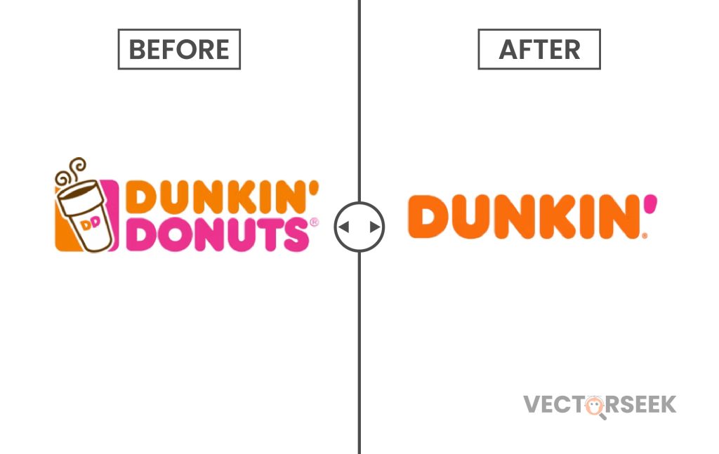
When a company rebrands, it’s rarely just about aesthetics—it’s a strategic move reflecting deeper shifts in business goals. In 2018, Dunkin’ Donuts dropped “Donuts” from its name, unveiling a sleeker, more modern “Dunkin’” logo. This was not just a visual change but a declaration of a broader menu vision. The rebrand underscored Dunkin’s ambition to move beyond its traditional identity and position itself as a leading coffee and beverage brand, catering to evolving customer preferences.
But how does this logo redesign tie into Dunkin’s menu expansion? Let’s explore.
The Strategy Behind the Logo Change
-
Emphasizing Beverages Over Donuts
Dunkin’s rebranding was a clear signal that it no longer wanted to be known primarily as a donut chain. Instead, the company sought to highlight its expanding beverage offerings, particularly coffee. According to reports, coffee and beverage sales accounted for 60% of Dunkin’s revenue, making it the brand’s core product rather than its baked goods.
-
Simplification for Modern Appeal
The new logo kept Dunkin’s iconic orange and pink colors, retaining brand recognition while simplifying its identity. The shorter name, Dunkin’, aligns with modern branding trends, making it more adaptable for digital and mobile-first marketing strategies.
-
Aligning with Younger, On-the-Go Consumers
Dunkin’ redesigned its stores and digital experience, investing $100 million in modernizing its locations with mobile ordering kiosks, digital menu boards, and efficient drive-thru lanes. This was a clear effort to cater to millennials and Gen Z consumers, who prioritize speed and convenience in their dining choices.
How Dunkin’s Menu Evolved Post-Rebrand
Dunkin’s logo change wasn’t just a visual update; it came with a strategic expansion of its menu. Here’s how:
-
Introduction of Plant-Based and Healthier Options
With changing consumer preferences, Dunkin’ introduced vegan-friendly, plant-based items, such as the Beyond Sausage Breakfast Sandwich. Additionally, the brand launched low-calorie Dunkin’ Refreshers to appeal to health-conscious consumers.
-
Expanding the Coffee and Beverage Line
Dunkin’ significantly broadened its coffee offerings to compete with Starbucks and other premium coffee chains. Some of the major expansions included:
- Cold brew and Nitro cold brew to cater to specialty coffee lovers.
- Seasonal lattes and espresso-based drinks.
- Non-dairy milk options like almond and oat milk.
-
Limited-Time and Trend-Driven Menu Items
Dunkin’ tapped into seasonal trends by introducing Pumpkin Spice Lattes, Peppermint Mochas, and other time-limited beverages. This not only drives seasonal sales but keeps the menu fresh and engaging.
-
Commitment to Global Expansion
The simplified Dunkin’ branding makes it easier to enter new international markets. The company has adapted to regional tastes in countries like China, the Middle East, and Europe, incorporating local flavors into their menus.
Visual Impact: How the Rebranding Influenced Customer Perception
Before and After: A Comparison.
| Feature | Before Rebrand (Dunkin’ Donuts) | After Rebrand (Dunkin’) |
|---|---|---|
| Logo | Bold, rounded font with “Donuts” | Sleeker, shorter “Dunkin’” |
| Menu Focus | Donuts and breakfast items | Coffee, specialty beverages |
| Store Design | Traditional interiors | Modernized, digitalized experience |
| Target Audience | Family-focused | Millennial and Gen Z-focused |
According to a 2019 survey, 80% of consumers recognized the rebrand as a positive move, associating Dunkin’ with higher-quality coffee and a modern dining experience.
What’s Next for Dunkin’?
Dunkin’s rebranding and menu expansion strategy continue to evolve. The company is leveraging mobile technology, AI-driven customer insights, and sustainable sourcing to stay ahead of competitors like Starbucks and McDonald’s.
Some key initiatives to watch include:
- AI-powered personalization in the Dunkin’ app.
- More sustainable packaging and ethically sourced coffee.
- Further global market penetration with localized menu items.
Final Thoughts
Dunkin’s decision to drop “Donuts” from its name wasn’t just about branding—it was a bold, strategic move that aligned with its broader vision. The rebranding reflects the company’s shift towards a beverage-driven, modern, and convenience-focused experience, keeping pace with changing consumer preferences.
As Dunkin’ continues to innovate, its transformation proves that a logo redesign can be more than just aesthetics—it can represent a brand’s entire future strategy.
🔥 Bonus Offer: Get 100,000 Brand Logos for Just $9!
Looking for high-quality logos? Download 100,000 Brands Logos in a Single Zip for Just $9
Here to Get Yours Now!


