A logo is not just a picture. For brands in the gambling industry, it is a visual code that must work quickly and accurately. In a sector where rules are strict and advertising is limited, it is often the logo that becomes the main means of memorisation. You’ll find these logos on apps, ads or football form. They’re built to be recognised instantly, even without text. The focus isn’t on style for its own sake. Every element serves a purpose.
The next part focuses on a handful of popular brands and how their logos work in practice.
Recognizable Gambling Logos: Market Examples
Many gambling brands rely on simple, high-contrast logos built for quick recognition. Shapes, colours, and typography are chosen to stay clear across devices. Below are examples of how major names apply these principles.
logo
The Gamblizard logo combines a clean icon, simple type and a mascot . The main symbol — a spade with a lizard silhouette — merges two ideas: gambling and the brand’s name. It’s minimal but readable, working well at small sizes like app icons or favicons.
The lizard points to the brand’s identity as a “scout” — a creature that observes and reacts quickly. This fits a service built around tracking offers and comparing options. That’s exactly what Gamblizard does: it reviews online casinos, checks bonus terms, and helps users filter deals based on clear criteria — not guesswork.
The logotype uses a modern font: letters are balanced and readable, with enough weight to stay visible on dark or bright backgrounds. The mascot — a lizard in glasses and a shirt — appears across the site but not inside the logo itself. The glasses and business attire suggest analysis, not chance. That supports the brand’s focus on comparisons and value-first thinking.
The use of dark blue and green reinforces contrast. Blue hints at structure and trust; green aligns with deals and saving. This colour pairing also keeps visual noise low, so key elements stay clear.
Unlike many competitors that rely on chips or cards, Gamblizard avoids cliché. The spade is a nod to the sector, but the lizard icon breaks the pattern. The brand tone is clear: smart, slightly playful, and focused on helping users.
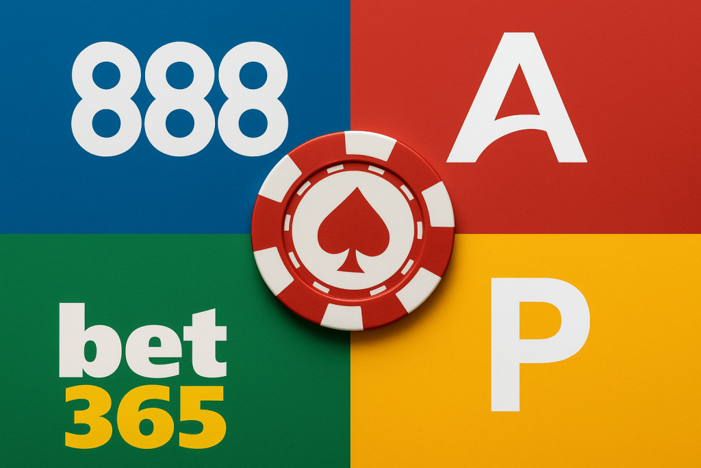
The Bet365
Bet365 uses only text in its logo — no icons, no extras. This puts full focus on the name. The typeface is bold and rounded, with tight spacing that keeps it clear even on small screens.
![]()
The colour contrast does most of the work. White and yellow on a green background creates a sharp visual split. It helps the “365” part pop without breaking the flow.
No extra shapes mean less noise. The logo stays legible across formats — from apps to TV ads. It’s built to be seen fast and remembered just as quickly.
The PokerStars
PokerStars uses a well-known shape — the spade — but gives it a clear point of difference. The red colour stands out, and the white star in the centre links directly to the name.
The symbol is compact and easy to read on its own. It often appears without text and still holds up. That makes it useful across screens, from mobile apps to live tables.
The use of red, white, and black keeps the design clear and easy to apply across formats. The full logo — icon plus text — works as a unit, but each part holds its own.
What Makes a Gambling Logo Recognizable
In the gambling sector, a logo needs to work fast. Users often scroll quickly or switch between apps, so visual clarity matters more than style. The most effective logos keep things simple. They avoid extra lines, complex shapes, or unnecessary effects.
High contrast is another key factor. Logos with clear light–dark separation stay visible across backgrounds — from mobile apps to dark-mode sites. Strong contrast also helps the name or icon stick after a short glance.
A logo must look sharp both on full-size sites and inside a small corner of a phone screen. That’s why bold type and clean icons tend to work best. Many gambling brands use common symbols — cards, chips, spades. This helps the logo stay relevant without blending in.
Colour choice plays a big role too. It’s not just about looking good — colours signal tone.
Used well, these features support quick recognition and lasting recall.
Quick Logo Tips
A strong gambling logo isn’t just about colour or shape — it’s about how well it works in real contexts. Here are focused design tips that help build clear visual identity:
- Check background flexibility. Make sure the logo holds up on both dark and light surfaces without needing edits.
- Test in motion. If used in animations or live streams, the logo should stay clear even with movement.
- Make sure the layout holds its shape when resized. If spacing shifts or elements move around, the logo loses impact.
- Keep text short and simple. Long phrases or stacked words get hard to read when the logo shrinks.
- Plan for icon-only use. Build a version that works without text — useful for favicons, app icons, or social media avatars.
These steps help the logo stay functional, not just visually polished.