
There are some objects and concepts we often perceive only by their literal meaning. A ship, for instance, is primarily seen as a means of transportation over water — a vessel to take passengers from point A to point B. However, in visual identity and branding, a ship is far more than just a boat. It is a powerful symbol — one rich in history, storytelling, and metaphor. From ancient times to modern psychology, ships have represented journeys, success, transformation, safety, and prosperity. This symbolism makes ships a favored motif in logo design, particularly for businesses connected to travel, history, exploration, or water-based industries.
Let’s explore some of the most famous logos that incorporate ships, examining the design elements, meaning, and visual impact each one delivers.
1. Adnams Ghost Ship
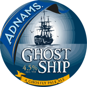
The Adnams Ghost Ship logo is hauntingly beautiful and creatively crafted. Featuring a stylized ghost ship sailing through stormy seas, the logo’s dark blue and grey color palette sets a chilling, adventurous tone. The ragged sails and rough sea suggest danger and mystery, directly referencing the beer’s name and unique identity. The white and yellow typography used below the graphic contrasts starkly against the dark background, offering visual balance and an energetic lift to the otherwise somber mood. It successfully captures a sense of folklore and the unknown — perfectly in line with the storytelling aspect of craft beer marketing.
Visual Elements: Depicts a stylized ghost ship navigating stormy seas.
Color & Typography: Utilizes a dark blue and grey palette, with contrasting white and yellow typography.
Symbolism: Evokes mystery and adventure, aligning with the beer’s name and branding.
2. Anchor Bay Entertainment
![]()
The Anchor Bay Entertainment logo embraces a pirate-themed design with a bold, minimalistic black-and-white palette. The centerpiece is a pirate ship, whose sail is cleverly shaped to resemble a roll of camera film — a nod to the company’s roots in home video and film. The skull and crossed sabers add a rebellious, cinematic flair. Typography is structured in a three-level layout, using a modern geometric sans-serif font that adds a professional tone, grounding the visual drama of the ship.
Visual Elements: Showcases a pirate ship with sails resembling a roll of camera film.
Color & Typography: Minimalistic black-and-white design with geometric sans-serif font.
Symbolism: Merges nautical themes with cinematic elements, reflecting the company’s focus on film.
Download: Anchor Bay Entertainment Logo
3. Bank Negara Indonesia
![]()
Bank Negara Indonesia’s logo uses maritime symbolism to represent national pride and forward movement. The ship in the center is minimal yet powerful, rendered in a soothing blue and red palette that conveys both trust and vitality. The stylized graphic aligns with Indonesia’s archipelagic geography, while the elegant serif typography adds gravitas and tradition. The integration of sea imagery with financial symbolism portrays the bank as both culturally rooted and globally oriented.
Visual Elements: Features a minimalistic ship in blue and red.
Color & Typography: Soothing blue and red palette with elegant serif typography.
Symbolism: Represents national pride and forward movement, reflecting Indonesia’s archipelagic geography.
Download: Bank Negara Indonesia Logo
4. Boston United
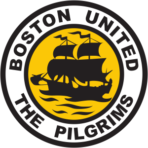
This football club’s logo takes on a heritage-inspired look with a round badge bordered in white and black. The central image is a silhouette of an old clipper ship in black against a vibrant yellow background, which radiates warmth and visibility. The logo communicates strength, tradition, and resilience — qualities associated with historical ships and competitive sports. The use of geometric sans-serif text maintains modern legibility while complementing the classic visual elements.
Visual Elements: Silhouette of an old clipper ship in black against a yellow background.
Color & Typography: Bold geometric sans-serif text in black.
Symbolism: Communicates strength, tradition, and resilience.
5. Corsair
![]()
Corsair’s logo is a masterclass in minimalism. Only the sharp black sails of a ship are depicted, placed to the left of the Corsair name in a sleek, all-uppercase sans-serif typeface. The absence of the full ship encourages imagination and leaves a striking visual impression. The bold sails suggest precision, speed, and modernity, reflecting the brand’s focus on high-performance computer hardware.
Visual Elements: Displays sharp black sails of a ship.
Color & Typography: Sleek, all-uppercase sans-serif typeface.
Symbolism: Suggests precision, speed, and modernity, aligning with high-performance computer hardware.
Download: Corsair Logo
6. Cronulla-Sutherland Sharks
![]()
The logo of this Australian rugby club features a ship illustrated in a traditional heraldic style. Rendered in black and white, the ship rides over stylized blue waves, contained within a golden-framed crest. The classic emblem conveys legacy, valor, and a connection to the ocean — all attributes resonating with the club’s coastal identity. The crest format and stylized water add depth and tradition to the design.
- Visual Elements: Traditional heraldic style ship over stylized blue waves within a golden-framed crest.
- Color & Typography: Black and white ship with blue and gold accents.
Symbolism: Conveys legacy, valor, and a connection to the ocean.
Download: Cronulla-Sutherland Sharks Logo
7. Devon County Council
![]()
Minimalism defines the Devon County Council logo. A monochrome black silhouette of a sailing ship is set atop two smooth curved lines, representing ocean waves. The design is modern, symbolic, and distinctly elegant, presenting the Council as progressive yet respectful of heritage. The absence of color focuses attention on form, making the message of authority and vision clear.
Visual Elements: Displays a black silhouette of a sailing ship atop curved lines representing waves.
Color & Typography: Monochrome design emphasizing form and authority.
Symbolism: Portrays progressiveness while respecting heritage.
Download: Devon County Council Logo
8. Directorate General of Shipping (India)
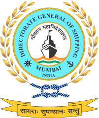
This emblem is richly detailed, echoing both tradition and official authority. A circular badge enclosed in a wreath showcases the bow of a ship over stylized waves in India’s national colors — saffron and green. Around the bright blue border, bold black serif text announces the organization’s identity. The crest’s structure and maritime symbolism highlight both governance and national pride in the shipping sector.
Visual Elements: Showcases the bow of a ship over stylized waves in India’s national colors.
Color & Typography: Bright blue border with bold black serif text.
Symbolism: Highlights governance and national pride in the shipping sector.
9. Fijian Drua
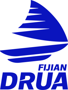
Fijian Drua’s logo is futuristic and abstract. A stylized ship composed of angular blue segments symbolizes motion and cultural uniqueness. The design is dynamic, appearing almost as if it’s in motion. The supporting typography carries cutout elements that echo the ship’s design — particularly the sail’s triangular sections. This synergy between text and image creates a cohesive, memorable identity.
Visual Elements: Stylized ship composed of angular blue segments.
Color & Typography: Dynamic design with supporting typography featuring cutout elements.
Symbolism: Symbolizes motion and cultural uniqueness.
10. Manchester City
![]()
This prestigious football club’s logo incorporates a ship as part of its homage to Manchester’s maritime heritage. Positioned above the rose of Lancashire within a circular badge, the golden gradient ship connects past to present. The ship acknowledges the city’s historical importance in global trade and industry. Clean blue and white colors represent clarity, while modern typography enhances the club’s evolving identity.
Visual Elements: Incorporates a ship above the rose of Lancashire within a circular badge.
Color & Typography: Clean blue and white colors with modern typography.
Symbolism: Acknowledges the city’s historical importance in global trade.
Download: Manchester City Logo
11. Manchester United
![]()
The ship in the Manchester United logo appears atop the club’s iconic shield, anchoring the design in heritage. Its placement and clean lines reflect the city’s mercantile history. Combined with the club’s devil emblem and bold red and yellow color scheme, the ship adds a layer of tradition and prestige. The visual balance between modern sports branding and historical references is expertly achieved.
Visual Elements: Incorporates a ship above the rose of Lancashire within a circular badge.
Color & Typography: Clean blue and white colors with modern typography.
Symbolism: Acknowledges the city’s historical importance in global trade.
Download: Manchester United Logo
12. Melbourne City FC
![]()
Melbourne City FC’s logo is split into quadrants with heraldic precision. The ship, located in the bottom right segment, is drawn in gold and stylized to reflect classic European emblems. Its placement within a clean cross structure offers symmetry and symbolism — representing maritime links and a solid foundation. The bright palette gives the design optimism and clarity.
Visual Elements: Quadrant design with a ship in the bottom right segment.
Color & Typography: Bright palette with heraldic precision.
Symbolism: Represents maritime links and a solid foundation.
Download: Melbourne City FC Logo
13. Midjourney

Midjourney’s logo is the epitome of minimalism. The stylized ship is composed of bold black contours, gently riding above simple wave lines. The logo evokes feelings of calm and exploration, resonating with the platform’s creative and meditative mission. The simplicity of the design invites open interpretation, making it a perfect match for an AI-based artistic brand.
Visual Elements: Features a minimalist ship composed of bold black contours above simple wave lines.
Color & Typography: Monochromatic design emphasizing simplicity.
Symbolism: Evokes calm and exploration, resonating with the platform’s creative mission.
14. Odesa Film Studio

Odesa Film Studio’s logo is a stunning visual centerpiece. At its heart is a stylized golden ship with elegant contours, encircled by a compass-like ring. The refined gradients and cool blue tones evoke both nautical themes and cinematic elegance. Though textless, the emblem conveys prestige, creativity, and cultural depth.
Visual Elements: Presents a stylized golden ship encircled by a compass-like ring.
Color & Typography: Elegant gradients and cool blue tones; textless design.
Symbolism: Represents creativity, direction, and cinematic excellence.
15. Old Spice
![]()
Old Spice’s logo is instantly recognizable — a classic sailing ship in rich burgundy. The ship’s illustration is intricate yet bold, set against a clean white background. Accompanying it is elegant cursive text in matching red. The overall feel is vintage masculinity, adventure, and timeless charm. The ship ties into the brand’s legacy of traditional grooming products.
Visual Elements: Features a classic sailing ship illustration.
Color & Typography: Rich burgundy ship against a white background, accompanied by elegant cursive text.
Symbolism: Conveys tradition, masculinity, and timelessness.
Download: Old Spice Logo
16. OpenSea
![]()
OpenSea, a prominent NFT marketplace, uses a clean and modern logo that features a simple white sailboat on a blue circular background. The minimal design conveys trust, openness, and reliability — key themes for digital platforms. The adjacent text is a bold sans-serif, ensuring legibility and professional appeal. Together, the elements communicate modernity and ease of use.
Visual Elements: Depicts a simple white sailboat on a blue circular background.
Color & Typography: Clean design with bold sans-serif text.
Symbolism: Conveys trust, openness, and reliability, essential for a digital marketplace.
Download: OpenSea Logo
17. Plymouth Argyle
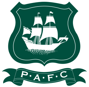
This football club’s badge is rooted in naval tradition. A dark green crest features a multi-sailed ship above stylized waves, with “PAFC” inscribed on a curved ribbon below. The white and green palette is noble and understated. The ship connects the club’s identity to its port city, conveying strength, resilience, and local pride.
Visual Elements: Dark green crest featuring a multi-sailed ship above stylized waves.
Color & Typography: White and green palette with “PAFC” inscribed below.
Symbolism: Connects the club’s identity to its port city, conveying strength and local pride.
18. Sunderland AFC
![]()
Sunderland AFC’s logo stands out with its intense color scheme and layered symbolism. The central crest features vertical red and white stripes, overlaid by a black warship at the top and an “AFC” insignia below. This combination of industrial strength and maritime identity reflects the city’s coal shipping heritage and the club’s grit.
Visual Elements: Central crest with vertical red and white stripes, overlaid by a black warship.
Color & Typography: Intense color scheme with layered symbolism.
Symbolism: Reflects the city’s coal shipping heritage and the club’s grit.
Download: Sunderland AFC Logo
19. The Pirate Bay
![]()
The Pirate Bay’s logo is a visual rebellion. A highly detailed pirate ship rendered in bronze and black gradients sails across a blank canvas, with a Gothic-type inscription underneath. It captures the essence of digital piracy, freedom, and the underground spirit. Despite its controversy, the logo’s elegance and clarity are undeniable.
Visual Elements: Highly detailed pirate ship rendered in bronze and black gradients.
Color & Typography: Gothic-type inscription underneath.
Symbolism: Captures the essence of digital piracy, freedom, and the underground spirit.
Download: The Pirate Bay Logo
20. Valhalla Motion Pictures
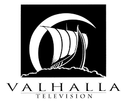
Valhalla Motion Pictures uses Norse mythology as its branding inspiration. A stylized Viking ship sails under a crescent moon, all rendered in white over a black square. The accompanying serif typography is elongated and sharp, enhancing the mythic, dramatic tone of the logo. The design is powerful, cinematic, and purposeful.
Visual Elements: A Viking ship silhouette sailing under a crescent moon.
Color & Typography: White design on a black square with elongated, sharp serif typography.
Symbolism: The Viking ship represents strength and adventure, while the crescent moon evokes mystery and the unknown.
21. Venture Lagoons
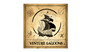
This logo features a black historic ship inside a gold-tinted square, resembling aged parchment. Pirate icons surround the ship, suggesting adventure and exploration. A black circle frames the ship, with an all-caps serif wordmark sitting below. The emblem communicates escapism, history, and nautical charm, perfect for a tourism or leisure brand.
Visual Elements: Black historic ship inside a gold-tinted square resembling aged parchment.
Color & Typography: Pirate icons surrounding the ship with an all-caps serif wordmark below.
Symbolism: Communicates escapism, history, and nautical charm.
22. Viking River Cruises
![]()
Viking River Cruises’ logo features a sleek stylized Viking longship rendered in red. The design emphasizes horizontal movement and grace, with sweeping lines forming the sail. The typeface used is serif, lending a feeling of elegance and heritage. Together, they reflect both historical richness and high-end travel experiences.
Visual Elements: Sleek stylized Viking longship rendered in red.
Color & Typography: Sweeping lines forming the sail with serif typeface.
Symbolism: Reflects historical richness and high-end travel experiences.
Conclusion
Ships in logo design carry deep meanings — of movement, heritage, ambition, and exploration. From sports teams to tech companies and cruise lines to banks, the ship motif is as versatile as it is symbolic. Each of the brands mentioned above integrates the ship in a way that not only resonates with their industry but also elevates their brand identity. Whether minimalistic or ornate, the ship remains a timeless emblem of adventure, resilience, and vision.