BMW is one of those car brands almost everyone knows—and respects. Its story began with aircraft engines, but over the years, it’s become a symbol of power, luxury, and smart engineering. That kind of growth doesn’t happen by accident.
One thing that’s been part of BMW’s journey from the start is its logo. It’s not just a design—it’s a symbol of what the brand stands for. And like the cars themselves, the logo has changed with the times.
Over the years, the BMW logo has kept up with shifts in style, technology, and culture. But even as it’s evolved, it’s stayed true to its roots.
In this article, we’ll take a closer look at the key versions of the BMW logo—from the classic roundel to the more niche versions used by its different divisions. Each one tells a piece of the story of how BMW has grown, changed, and kept pushing forward.
🏁 1. The Core of BMW’s Identity
BMW Logo
The first BMW logo appeared in 1917. It featured a black outer ring and a blue-and-white checkered center—colors taken from the Bavarian state flag. Over time, many people thought it represented a spinning airplane propeller, a belief likely tied to BMW’s early history in aircraft engines.
Even though the design has seen minor changes over the decades, the roundel remains a central part of BMW’s brand identity.
Download: BMW Logo
BMW Group Logo

The BMW Group logo is a cleaner, more formal version of the classic emblem. It’s mostly used in official settings like investor reports, press releases, or corporate documents. It still features the roundel but often in grayscale, making it more subtle and business-like. This version represents the entire BMW Group, including brands like MINI, Rolls-Royce, and BMW Motorrad.
Download: BMW Group Logo
BMW Flat Logo

In 2020, BMW updated its logo with a flatter, more minimal design. They removed the black outer ring and added transparency, giving the logo a lighter, more digital-friendly feel. This change wasn’t just about looks—it symbolized BMW’s shift toward digital innovation and future mobility.
Download: BMW Flat Logo
BMW New 2020 Logo
The transparent ring design sparked debate when it was first introduced, but it marked a clear change in direction. BMW explained that the new look was meant to feel more open and inviting, especially in digital spaces. You’ll mostly see this version in online platforms and corporate communications—not on the vehicles themselves.
Download: BMW New 2020 Logo
BMW Glossy Logo
Before the flat logo came along, BMW’s emblem had a glossy, three-dimensional look. It included metallic finishes, shadows, and highlights to create a polished, premium feel—perfect for use on cars and printed materials. This style helped give the logo a strong physical presence.
Download: BMW Glossy Logo
BMW Color Logo
The blue and white colors in the BMW logo aren’t just for style—they come directly from the Bavarian flag, honoring the company’s origins. The clean contrast and balanced layout have made the logo versatile and instantly recognizable across all platforms, from billboards to smartphone screens.
Download: BMW Color Logo
BMW Black Logo
For certain exclusive models, BMW introduced a blacked-out version of its logo. This version drops the blue and white in favor of a sleek monochrome look. It’s often used on high-performance M models or BMW Individual editions to emphasize exclusivity and a bold design edge.
Download: BMW Black Logo
⚙️ 2. BMW’s Historical & Corporate Vision
BMW Group The Next 100 Years

To celebrate 100 years in 2016, BMW introduced a special logo called “BMW Group: The Next 100 Years.” This design blends the brand’s timeless elegance with a clear focus on the future of mobility. It highlights BMW’s vision to keep innovating and leading in the years ahead.
Download: BMW Group The Next 100 Years Logo
BMW Certified Pre-Owned Logo
![]()
The Certified Pre-Owned (CPO) logo is there to give buyers peace of mind. It shows that pre-owned BMWs meet high standards for quality and reliability. The badge-like design of this logo helps communicate trust and authenticity.
Download: BMW Certified Pre-Owned Logo
BMW Technical Site Logo

The BMW Technical Site logo is simpler and more straightforward. You’ll usually find it on developer platforms and engineering documents, reflecting its practical and behind-the-scenes role within the company.
Download: BMW Technical Site Logo
BMW Bank Logo
![]()
BMW Bank handles the brand’s financial services. Its logo combines classic financial symbols with BMW’s trusted identity. It often features clean fonts and a grayscale look, keeping it professional yet connected to the main brand.
Download: BMW Bank Logo
BMW BKK Logo
![]()
BMW’s BKK is its health insurance arm in Germany. The BKK logo sticks to a corporate style suitable for internal welfare and health communications. It follows a clear, regulated design language, reflecting its official role within the company.
Download: BMW Bkk Logo
🏎️ 3. M Power & Performance Evolution
BMW M Series Logo – The High-Performance Sub-Brand’s Signature
The iconic M logo features three slanted stripes in blue, purple, and red, symbolizing BMW’s Motorsport roots. Introduced in the 1970s, it stands for speed, power, and precision engineering. Over time, this badge has become a symbol of ultimate performance and racing heritage. Fans and drivers instantly recognize it as a mark of BMW’s top-tier sports models. It reflects the brand’s passion for pushing limits on both road and track.
BMW M5 Logo
The BMW M5 logo represents one of the most iconic high-performance luxury sedans in the world. It combines the signature M stripes with a sleek and bold “M5” badge, symbolizing power and sophistication. Known for blending everyday usability with track-ready performance, the M5’s logo carries prestige and engineering excellence. This emblem signals aggressive speed wrapped in refined style. It instantly tells enthusiasts they’re looking at a true M powerhouse.
Download: BMW M5 Logo
BMW M3 Logo

The BMW M3 logo is a symbol of precision and driving excitement, associated with one of the most beloved sports sedans ever made. Featuring the classic M stripes alongside the “M3” badge, it represents agility, speed, and sharp handling. The M3’s logo reflects its legacy as a driver’s car that excels on both road and racetrack. It’s instantly recognizable and respected in automotive circles worldwide. The badge embodies BMW’s dedication to Motorsport DNA.
Download: BMW M3 Logo
BMW M1 Logo

The BMW M1 logo is historic, representing BMW’s first mid-engine supercar and a pioneer in the M performance lineup. It carries the iconic M stripes with a distinct, simple “M1” marking that signifies exclusivity and racing heritage. The M1 was BMW’s bold leap into supercar territory, and its logo reflects that groundbreaking spirit. Though rare, the emblem stands for innovation, speed, and a legendary chapter in BMW’s history. It remains a symbol of ultimate performance and design.
Download: BMW M1 Logo
BMW M Performance Logo
![]()
The M Performance logo appears on BMW models that aren’t full M cars but come with performance upgrades, like the M340i. It keeps the classic M stripes but adds the word “Performance” to show enhanced power and sportier features. This logo bridges the gap for drivers who want extra excitement without stepping fully into the M lineup. It signals a boost in handling, brakes, and style. The badge gives these cars a more aggressive and dynamic presence.
Download: BMW M Performance Logo
BMW Powered by M Performance Logo
This logo is found on parts or packages that bring M-level upgrades to regular BMW vehicles. You might see it on engines, fenders, or dashboards, marking M-enhanced suspension, brakes, or drivetrain components. It’s a subtle nod to the performance boost under the hood or in the chassis. This branding highlights BMW’s commitment to spreading Motorsport tech across its range. It appeals to drivers who want a taste of M’s performance without a full M model.
BMW M New 2020 Logo

In 2020, BMW updated the M logo to a flatter, simpler design that fits modern digital styles. The classic stripes remain, but the look is cleaner and more minimalistic. This redesign makes the logo versatile for digital platforms, from websites to apps. Despite the modern update, the logo keeps its connection to BMW’s racing roots. It reflects how the brand balances tradition with today’s design trends.
Download: BMW M New 2020 Logo
BMW Motorsport Logo
The BMW Motorsport logo takes the familiar M stripes and adds dynamic shapes or bold typography to express motion and speed. It’s the official emblem for BMW’s racing division, appearing on GT and endurance race cars. The design conveys energy and competitiveness, capturing the thrill of motorsport. It helps connect BMW’s track success with its road-going performance models. The logo is a badge of pride for fans and racers alike.
Download: BMW Motorsport Logo
BMW FAN Motorsport Logo

Created especially for fans and BMW Motorsport supporters, this logo has a friendlier, more casual style. It often features special event symbols or club badges. It’s designed to build community among enthusiasts who love BMW racing culture. The logo encourages participation in fan clubs and motorsport events. It shows the brand’s commitment to connecting with its loyal audience beyond just cars.
Download: BMW Fan Motorsport Logo
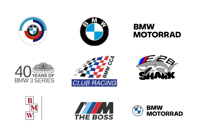
BMW CCA Club Racing Logo
The BMW Car Club of America’s racing logo mixes official BMW branding with grassroots racing style. It’s popular with North American BMW racers and club members who compete in amateur motorsports. This logo represents passion for racing at the community level, celebrating spirited competition. It balances professionalism with accessibility, making it a symbol of belonging for BMW racers. The design shows how BMW supports motorsport enthusiasts everywhere.
Download: BMW CCA Club Racing Logo
BMW Touring Sport Logo
This logo is used on BMW’s high-performance touring cars, combining sportiness with comfort. It carries the M heritage but emphasizes practicality for long-distance drives. Touring Sport models offer power with luxury, and the logo reflects that balance. It’s often seen on cars built to perform on highways as well as race tracks. This branding highlights BMW’s skill in blending performance with everyday usability.
Download: BMW Touring Sport Logo
BMW I’M THE BOSS Logo

This limited-edition logo was part of a bold marketing campaign featuring the slogan “I’M THE BOSS” next to the M branding. It targeted young, confident drivers looking for a statement car with attitude. The design was edgy and rebellious, standing out from typical BMW branding. It captured a sense of fun and ambition, appealing to drivers who want to own the road. This logo showed BMW’s willingness to experiment with marketing to reach a new audience.
Download: BMW I’M THE BOSS Logo
BMW Constructors Logo
Used in top-level motorsports like Formula 1 and Le Mans, the Constructors logo represents BMW’s engineering strength and racing expertise. It appears on cars, driver suits, and team gear, symbolizing teamwork and precision. This logo is about the brand’s role as a builder of world-class racing machines. It reflects BMW’s deep involvement in elite motorsport competitions. The badge stands for technical skill and the pursuit of victory.
Download: BMW Constructors Logo
🏍️ 4. BMW Motorrad: Two-Wheeled Excellence
BMW Motorrad Logo

The BMW Motorrad logo keeps the classic roundel but adds a strong “Motorrad” wordmark. This shows it’s a distinct motorcycle brand while still linked to BMW’s heritage. It conveys a sense of boldness and reliability on two wheels. The logo appeals to riders who value quality and performance. It’s a symbol of freedom and precision engineering.
Download: BMW Motorrad Logo
BMW Motorrad Wordmark Logo

Sometimes, BMW Motorrad uses just the wordmark without the roundel. This clean, simple version fits well in digital spaces where minimalism matters. It’s flexible and modern, making it easy to recognize on websites and apps. The text-only style highlights clarity and confidence. It’s all about straightforward, no-nonsense branding for riders.
Download: BMW Motorrad Wordmark Logo
BMW Motorrad WSDK Team Logo
![]()
The WSDK Team logo often features stylized helmets or racing graphics. It reflects the cutting-edge research and development behind BMW’s sportbikes. This logo embodies speed, technology, and competition. It speaks to racing enthusiasts and those who love high-performance machines. It captures the thrill of motorsport innovation.
Download: BMW Motorrad WSDK Team Logo
BMW R1200 Logo
The R1200 logo is seen on popular models like the R1200GS and R1200RT. It highlights the bike’s engine type and proud lineage. This badge represents power and reliability, trusted by riders worldwide. It carries a reputation for adventure and long-distance capability. The logo signals a bike built for both roads and off-road journeys.
Download: BMW R1200 Logo
🚘 5. BMW Car Model Logos
BMW 3 Series 40 Years Logo
This special logo celebrates 40 years of the BMW 3 Series, the brand’s best-selling and most beloved lineup. It honors decades of innovation, performance, and versatility that defined the compact luxury segment. The design balances heritage with a modern touch, reflecting how the 3 Series evolved while staying true to its roots. It’s a badge of pride for fans and owners alike. The logo symbolizes four decades of driving excellence.
Download: BMW 3 Series 40 Years Logo
BMW E28 Shark Logo

The E28 earned the nickname “Sharknose” thanks to its bold, aggressive front design. This cult classic status led to stylized shark logos appearing on enthusiast merchandise and accessories. The logo captures the fierce, sporty character that made the E28 beloved by drivers. It represents a memorable era of BMW’s design evolution. The “Sharknose” branding stands for passion and performance.
Download: BMW E28 Shark Logo
✅ Conclusion
BMW’s visual identity isn’t just one logo—it’s a whole family of symbols, each capturing a different side of the brand. Whether it’s the roar of a motorcycle, the thrill of motorsport, the strength of its finance arm, or the passion of its fans, every BMW logo reflects precision, innovation, and a strong connection with its audience.
From the iconic, track-ready M badge to sleek, modern digital designs, each logo tells its own story of performance, pride, and purpose.
So next time you see a BMW badge—on a bike, a car, or a screen—remember it’s more than just a logo. It’s a symbol of a rich legacy and a brand that’s always pushing forward.

