In the world of branding, logo design transcends aesthetics. It’s about communicating a company’s identity, values, and emotional resonance through simple visual elements. Among all shapes used in logo design, the square stands out for its structural power, offering a sense of stability, balance, and reliability. Unlike organic, flowing forms, the square is rigid, with equal sides and angles that symbolize solidity and order. In branding, this geometric shape is often used to evoke trust, professionalism, and strength.
But what makes the square so enduring in logo design is its ability to work in harmony with color. Each color adds emotional depth to the square’s rigid structure. Blue square logos evoke trust and security, red conveys energy and action, while multicolored designs introduce playfulness and diversity. This article explores 25 iconic logos that leverage the square shape, divided into five color-based categories. For each logo, we’ll examine how the square contributes to the brand’s message, its symbolism, and the overall emotional impact.
Blue Square Logos: Trust and Stability Framed in Precision
Blue is the color of trust, professionalism, and clarity. When paired with a square, blue conveys a message of structure, security, and dependability, making it a popular choice for industries like finance, healthcare, and technology.
1. American Express
American Express uses a deep blue square paired with bold serif typography, projecting financial reliability and authority. The square shape conveys order, balance, and trust — essential traits in the financial sector. Blue, as a color, evokes feelings of calm and security, making customers feel protected. While the logo is minimal and timeless, some critics feel it blends into a sea of similar corporate designs. A slight modernization could inject freshness while preserving its strong brand legacy
Download: American Express Logo
2. AXA
AXA’s logo features a crisp blue square, slashed diagonally by a sharp red line, combined with modern sans-serif white text. The blue suggests trust and professionalism, while the red slash adds forward motion and dynamism. This balance creates a clear, memorable visual identity across insurance markets. Its simplicity and clarity make it versatile across media, from digital screens to physical signage. Still, some argue that subtle refinements could help it stand out even more in crowded global markets.
3. Bupa

Bupa’s logo presents a soft blue square with a white heartbeat line and sleek sans-serif font, reflecting its healthcare focus. The calm blue color suggests care, stability, and wellness, perfectly aligning with patient trust. The heartbeat detail adds a personal, human touch without overcomplicating the design. It’s easily recognizable in both digital and print applications, ensuring strong brand consistency. Over time, some slight refreshes may help it remain visually competitive in the evolving health space.
Download: Bupa Logo
4. New York Life
New York Life’s iconic blue square showcases a traditional serif wordmark, emphasizing longevity, trust, and heritage. As a life insurance company, this solid, no-nonsense logo conveys a promise of long-term security. The blue provides a calming, stable presence that reassures clients. Its compact, balanced design has remained consistent for decades, reinforcing brand recognition. Yet, in an era of modern design shifts, a subtle update might enhance relevance without losing historical weight.
Download: New York Life Logo
5. JW Org

JW.org’s minimalist logo features a bright blue square with crisp white sans-serif typography, radiating clarity and simplicity. The clean design reflects the brand’s values of peace, openness, and service. The high contrast ensures excellent visibility across devices, especially in digital outreach efforts. While minimalist, the logo’s strength lies in its honesty and calm presence, avoiding unnecessary embellishments. It’s a model of straightforward, purpose-driven branding that resonates globally.
Download: JW Org Logo
6. Maxthon

Maxthon’s logo stands out with its clever use of two squares, creating a dynamic yet balanced visual identity. The primary, large square is painted in a bright blue, setting a solid and vibrant foundation for the rest of the design. Behind this, the square’s bottom part features a stylized cloud illustration, which is rendered in a softer, lighter blue, introducing a sense of calmness and fluidity to the otherwise strong, structured design.
At the forefront, a bold white lowercase “M” is prominently displayed in a custom geometric typeface. The middle vertical bar of the “M” is uniquely replaced by a solid white square, making the letterform distinct and memorable. This square within the “M” reinforces the brand’s affinity for structured, clean designs while symbolizing the interconnectedness of technology and innovation.
Download: Maxthon Logo
Red Square Logos: Energy, Passion, and Action Framed in Strength
Red is a color of boldness, passion, and energy. When paired with a square, it combines excitement with stability, signaling power, action, and reliability.
1. LEGO
The LEGO logo is playful yet sturdy, featuring a red square with bold yellow typography. The square symbolizes the structure and foundation of LEGO bricks, while the bright red and yellow colors communicate energy and creativity. LEGO’s logo is one of the most recognizable in the toy industry, with its bold, clean design reinforcing the brand’s commitment to fun and imagination.
Though LEGO’s logo has evolved slightly over time, it has maintained its core attributes of dependability and creativity. The square reinforces the idea that, even within a structured form, creativity can flourish. This combination of structure and playfulness resonates with both children and parents.
Download: LEGO Logo
2. Bild
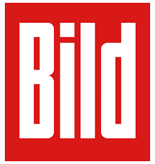
Bild’s logo features a red square with black bold typography, projecting strength and authority. The square conveys stability, while the red color adds urgency and energy. Bild’s logo successfully communicates its position as a leading voice in German media, balancing power with precision.
While effective, the logo could be more distinctive in the crowded media sector, where many brands use similar bold typography. A more unique design approach could set Bild apart while keeping the essence of its strong, authoritative presence.
3. Avon

Avon’s red square logo features elegant typography, combining boldness with a touch of femininity. The square reflects stability, and the red conveys empowerment and confidence—perfect for a beauty brand. The clean, straightforward design communicates Avon’s dedication to quality while reinforcing the brand’s focus on women’s empowerment.
While Avon’s logo is effective, it could benefit from a more modern update to make it more visually engaging in today’s competitive beauty market. The use of red and a square foundation remains a solid choice, but a more dynamic visual could elevate the brand’s image.
Download: Avon Logo
4. Uniqlo
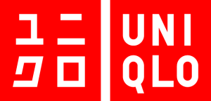
Uniqlo’s red square logo is simple and bold, featuring minimalist typography. The clean design and the vibrant red color suggest energy and vitality, perfectly aligned with the brand’s affordable, stylish approach to fashion. The square adds structure and simplicity, emphasizing Uniqlo’s no-frills, modern identity.
Uniqlo’s logo is effective in its straightforwardness, but the red square is quite common in the retail sector. To make it stand out more, the logo could explore more creative, dynamic design elements while still maintaining its minimalist approach.
Download: Uniqlo Logo
5. Sony SAB

Sony SAB’s logo uses a red square with bold typography, conveying strength and excitement. The square provides a stable foundation, while the red symbolizes passion and energy, which resonates with the entertainment industry. The logo is straightforward but impactful, offering a sense of reliability and excitement.
Though the logo is effective, the use of a red square is common in the entertainment sector. Adding a unique design twist could help Sony SAB stand out in a crowded market, giving the logo more distinctiveness and appeal.
Download: Sony SAB Logo
6. ZoomInfo

ZoomInfo’s logo features a solid red square emblem with rounded corners, creating a soft yet modern look. Inside the square, a stylized white capital “Z” is designed using several straight lines, which gives the emblem a clean, structured feel. The top-right corner is accentuated by an arrowhead pointing up-right, symbolizing progress, growth, and forward momentum—values that align perfectly with the data-driven, growth-oriented focus of ZoomInfo.
Accompanying the emblem is simple, lowercase black lettering rendered in a modern sans-serif typeface. The overall design communicates both strength and approachability, balancing professional precision with a dynamic, forward-looking vision.
The red square, with its rounded edges, adds warmth and energy, while the sharpness of the “Z” and the arrowhead suggest precision and direction. The use of a square combined with the arrow effectively ties structure and dynamism together, showcasing ZoomInfo’s role in helping businesses grow through well-organized, actionable data.
Download: ZoomInfo Logo
7. LG
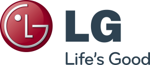
The LG logo is a striking example of how minimalism and geometry can come together to create an iconic and memorable design. The logo features a minimalistic face composed of two uppercase letters “L” and “G” alongside a solid white dot, all drawn in thin white lines. This composition sits within a bold, solid red square, which plays a crucial role in stabilizing and strengthening the delicate design.
The square itself is not just a background element; it acts as a solid foundation that balances the more intricate white lines of the “face.” Its bright red color provides a strong visual contrast, drawing attention to the simple yet powerful composition. Red, a color often associated with energy, passion, and excitement, amplifies the logo’s ability to capture attention and convey a sense of innovation and forward-thinking.
Download: LG Logo
8. Saturn
![]()
The Saturn logo is a bold and powerful visual identity, executed in a striking red, white, and black color palette. The design draws on distinctive geometry, symbolizing stability, strength, and precision—key qualities for a company in the automotive industry. At the core of the logo is a graphical emblem, featuring two wide orbits that cross each other within a solid red square. The orbits, which suggest movement and connection, are framed by the square, reinforcing the idea of structure and durability.
The red square is vibrant and eye-catching, representing energy and power, while also providing a solid foundation for the emblem. This geometric composition enhances the overall strength of the logo, with the orbits symbolizing the company’s dynamic and forward-thinking approach.
Download: Saturn Logo
9. SFR
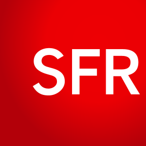
The SFR logo is a masterclass in minimalism elevated by the strategic use of bold color. Designed in a highly laconic style, the logo relies on the sheer power of its bright, scarlet-red and white palette to make an instant impact. The central element is a large, solid red square that serves as the commanding backdrop, radiating energy, urgency, and dynamism—qualities often associated with the telecommunications sector.
Positioned in the upper left corner of the square is the small, white “SFR” abbreviation. It’s set in a medium-weight, geometric sans-serif typeface, marked by its straight cuts and clean lines, which lend the design a sense of precision and modernity. This restrained typographic approach allows the boldness of the red square to take center stage, while the crisp white lettering ensures excellent legibility and contrast.
Download: SFR Logo
10. Wells Fargo
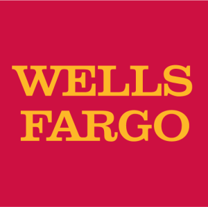
Wells Fargo’s logo features a red square with a gold depiction of the bank’s historic stagecoach. The square shape offers stability and structure, while the warm red and gold colors convey reliability and heritage.
The logo is iconic and has evolved over time to reflect the company’s modern presence while maintaining a strong connection to its historical roots. The design balances tradition with forward-thinking, making it memorable.
Download: Wells Fargo Logo
Multicolor Square Logos: Playfulness Within a Structured Form
Multicolor square logos introduce a dynamic and playful twist to the square’s inherent structure. These logos often communicate creativity, diversity, and inclusivity, blending multiple elements within a stable form.
1. LIFEWTR
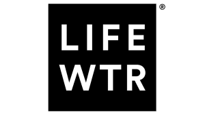
LIFEWTR’s logo is a stunning example of minimalism and simplicity. The emblem is rendered in a stark black-and-white color palette, which not only creates a sense of sophistication but also helps the logo stand out with its bold, straightforward design. At its core, the logo features a solid black square as the main visual element. This square serves as a strong foundation, encapsulating the clean, modern lines of the uppercase white lettering that reads “LIFEWTR” across two lines.
The square shape itself speaks to structure and reliability, while the sharp contrast between the black square and white text enhances readability and impact. The use of a square for the background solidifies the brand’s message of stability, simplicity, and consistency—core values that LIFEWTR wishes to convey as it positions itself as a premium bottled water brand.
2. Level

Level’s logo features a multicolored square with a sleek, modern design. The colors within the square communicate diversity and innovation, while the square itself provides structure and reliability. This logo is perfect for a brand that wants to balance creativity with dependability in the tech or finance sectors.
The multicolor approach adds an element of playfulness, which helps Level stand out. However, the design could become more memorable with a more unique arrangement of colors or a refined visual element to make it instantly recognizable.
Download: Level Logo
3. Great Wolf Lodge
![]()
Great Wolf Lodge’s logo uses a multicolored square that blends vibrant hues with clean typography. The square represents structure, while the colors evoke fun and adventure, aligning with the family-friendly resort’s mission to offer an exciting experience.
While the multicolor design conveys energy and inclusivity, it could be more refined to ensure a stronger visual identity in the highly competitive hospitality industry.
Download: Great Wolf Lodge Logo
4. Ansett Australia
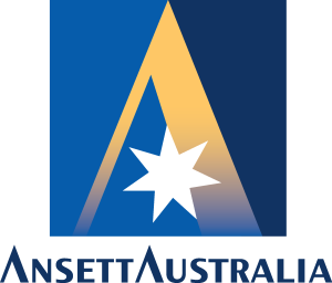
Ansett Australia’s logo uses a neutral gray square to create a professional, grounded look. The color palette and clean design reflect the airline’s focus on stability and trust. The square shape, a symbol of structure, communicates reliability, making the logo perfect for a travel brand.
The logo is effective, though it might feel a bit too traditional compared to other global airlines that use more dynamic or innovative logo designs.
Download: Ansett Australia Logo
5. Home Depot
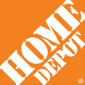
Home Depot’s logo uses a warm orange square, reflecting its connection to the home improvement industry. The square provides a solid, dependable base, while the color orange conveys energy and excitement. The combination of structure and energy communicates the brand’s focus on providing practical solutions with a sense of enthusiasm.
The logo is strong and instantly recognizable, though it could stand out even more with a more unique design twist.
Download: Home Depot Logo
6. Motel 6
Motel 6’s logo uses a warm, earthy palette, combining red and blue within a square. The colors evoke comfort and familiarity, while the square structure adds dependability. The logo is simple, clean, and effective, communicating the brand’s focus on affordable, no-frills accommodations.
The logo’s straightforward design works but could benefit from more creativity to enhance its visual appeal in the competitive travel industry.
Download: Motel 6 Logo
7. Woolworths

Woolworths’ logo uses a green square to evoke freshness, trust, and reliability in the supermarket sector. The square provides a stable structure, while the green communicates health, sustainability, and freshness, aligning with the brand’s focus on quality products.
The logo is effective but could stand out more in a competitive market with additional design elements or a more distinctive visual twist.