
If you’ve ever handed a logo file to a printer and gotten back a pixelated mess, you’ve already learned the hard way that file format matters more than most people expect. The format determines what you can do with the file, where it looks sharp, and whether a designer can open and edit it without starting over. Understanding the difference between PNG, SVG, and AI isn’t technical trivia – it’s practical knowledge that prevents expensive mistakes.
The confusion is understandable – all three formats produce images that look essentially the same on screen at standard sizes. It’s only at the edges of use, scaling up for a billboard or embedding in a responsive website, that the differences become obvious. Brands that take their visual identity seriously, including digital platforms like sankra where consistent logo rendering across devices and screen sizes is a genuine operational concern, treat format decisions as part of design strategy rather than an afterthought. Getting it right costs nothing. Getting it wrong costs time, reprints, and sometimes a designer’s full hourly rate.
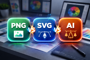
The core difference: raster versus vector
Before comparing the three formats directly, one distinction cuts through most of the confusion. PNG is a raster format – it stores images as a fixed grid of pixels. SVG and AI are vector formats – they store images as mathematical descriptions of shapes, curves, and colors that can be redrawn at any size without quality loss. This single difference explains most of what follows. A PNG logo looks perfect at the exact size it was created. Scale it up significantly and the edges soften, the text gets fuzzy, and the whole thing starts looking like it was designed in 2003. An SVG or AI logo can go from a 16-pixel favicon to a ten-foot banner without losing a single crisp edge.
When PNG is actually the right choice
PNG gets a bad reputation in professional design circles, but it earns its place in specific situations. The format handles transparency well, is universally supported by browsers and applications, and works fine for logos that will only ever appear at predictable, controlled sizes – a profile picture, an email signature icon, a small header image. The practical ceiling for PNG logos is roughly the size at which they were exported. If someone exports a PNG at 500 pixels wide and later needs it at 2000 pixels for a trade show banner, the result will be visibly degraded. This is why PNG should never be a primary logo file – it’s a delivery format for specific use cases, not a master file.
SVG: the web standard that most brands underuse
SVG has been around for decades but became genuinely mainstream only as responsive web design made resolution-independence a real requirement. An SVG logo is a text file containing XML code that describes the logo’s geometry. Browsers read this code and draw the logo fresh at whatever size the layout demands. The result is identical sharpness at 20 pixels or 2000 pixels.
| Format | Scalability | Web use | Print use | Editability | File size |
| PNG | Fixed resolution | Good at set sizes | Poor at large scale | None | Medium–large |
| SVG | Infinite | Excellent | Good for most print | Moderate | Very small |
| AI | Infinite | Not directly | Professional standard | Full | Large |
Beyond scalability, SVG has two additional advantages for web use. First, the files are tiny – a complex logo might be 10–30KB as an SVG versus several hundred KB as a high-resolution PNG. Second, SVG elements can be styled and animated with CSS, which opens possibilities that raster formats simply can’t match.
The one limitation of SVG
SVG was designed for vector graphics, which means it handles logos built from geometric shapes and text beautifully. Where it struggles is with photographic elements or highly complex gradients that were created in raster software. Most professional logos don’t fall into this category, but it’s worth knowing before committing to SVG as the primary format.
AI: the master file format
Adobe Illustrator’s native AI format is where logo design lives and dies. It’s not a delivery format – you won’t embed an AI file on a website or send it to someone who doesn’t have Illustrator. What it is, is a complete working file that preserves every layer, every editable text block, every adjustable path and anchor point. The AI file is what a designer needs to make changes. Swap a color, update the tagline, adjust spacing for a new application – all of this requires the original AI file. The designer must reconstruct the emblem from a flattened format if they lack it, which consumes time and creates inconsistencies. Every logo package should have all three formats: AI for editing, SVG for the web, and PNG for everyday use. They all have their own jobs. Treating any single format as the permanent master is how logos get degraded, redesigned unnecessarily, or handed off in versions that don’t quite match the original.