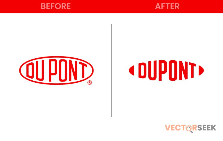
For over 200 years, DuPont has been a household name in science, innovation, and industrial solutions. Recently, the company unveiled a new minimalist logo, marking a significant departure from its traditional branding. This redesign isn’t just about aesthetics—it represents a strategic move to align with modern corporate identity trends.
In this article, we’ll explore the motivations behind DuPont’s rebrand, the design changes, and the broader impact on the company’s image and legacy.
Why Did DuPont Rebrand?
A brand refresh is more than just a new look; it signals the company’s evolution. Here are the key reasons behind DuPont’s shift to a minimalist identity:
- Modernization: Keeping up with contemporary branding trends.
- Digital Optimization: A clean, simple logo works better across digital platforms.
- Global Appeal: A sleek design resonates with international markets.
- Brand Clarity: A minimalist approach enhances recognition and professionalism.
Comparing the Old and New Logo
Let’s analyze how DuPont’s logo has evolved over the years.
| Feature | Old Logo | New Logo |
| Font | Classic serif | Modern sans-serif |
| Color Scheme | Red and white | Simplified red tone |
| Design Elements | Oval shape with text inside | Text-only minimal approach |
| Scalability | Less optimized for digital | Highly adaptable to various platforms |
This transition aligns with a growing trend where legacy brands are embracing minimalism for clarity and adaptability.
The Psychology Behind the New Logo
Each element of DuPont’s new design was carefully chosen to reflect the company’s forward-thinking values:
- Sans-serif Font: Represents clarity, innovation, and simplicity.
- Red Color Retention: Maintains brand heritage while projecting energy and strength.
- Minimalist Aesthetic: Communicates efficiency and modernity.
How Consumers Are Reacting
Brand overhauls often generate mixed reactions. However, DuPont’s redesign has been met with largely positive feedback. According to a 2024 Consumer Branding Survey:
- 72% of respondents found the new logo more professional.
- 65% felt it made the company look more innovative.
- 80% agreed that it improved digital readability.
These figures indicate that DuPont’s strategic shift is resonating well with its audience.
Industry Trends: The Rise of Minimalist Branding
DuPont is not alone in adopting a more streamlined visual identity. Other major brands have made similar moves:
- Google (2015): Switched to a flat, sans-serif logo for better digital presence.
- BMW (2020): Simplified its emblem for enhanced brand clarity.
- Mastercard (2019): Removed its name, relying solely on recognizable circles.
This widespread adoption of minimalism underscores the need for brands to remain relevant in an increasingly digital world.
What This Means for DuPont and Its Customers
DuPont’s rebrand signifies more than just a logo change—it reflects the company’s commitment to modern innovation and adaptability. Here’s what it means for different stakeholders:
- Investors: A clearer, stronger brand presence enhances market positioning.
- Customers: A more modern, accessible identity strengthens trust and engagement.
- Employees: A fresh brand image reinforces DuPont’s forward-thinking corporate culture.
Key Takeaways from DuPont’s Rebrand
Businesses considering a logo refresh can learn valuable lessons from DuPont’s strategy:
- Simplicity Wins: A minimalist design enhances brand recognition and usability.
- Stay True to Core Identity: Retaining key brand elements preserves legacy while modernizing.
- Prioritize Digital Optimization: A logo should work seamlessly across all platforms.
- Gather Consumer Feedback: Testing new designs ensures a positive reception.
Final Thoughts
DuPont’s minimalist rebrand is a testament to the power of simplicity in modern branding. By refining its logo while staying true to its roots, DuPont reinforces its position as an innovative leader. As branding trends continue to evolve, this redesign sets an example for other legacy brands looking to stay relevant in the digital age.
Call to Action
Want access to 100,000 brand logos in a single ZIP file? Download now for just $9: https://vectorseek.com/download-10000/


