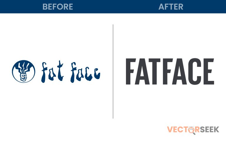
FatFace, a well-known British lifestyle brand, has come a long way since its inception in 1988. What started as a small surf-inspired venture has transformed into a major high-street fashion retailer. Over the years, FatFace’s branding, particularly its logo, has evolved to reflect this shift. But why did the company rebrand? And how has this transformation helped reposition FatFace in the competitive retail industry? Let’s dive into the journey of FatFace’s logo transformation and what it signifies for the brand.
The Origins: A Surf and Ski-Inspired Identity
FatFace was founded by two friends, Tim Slade and Jules Leaver, in 1988. The duo, passionate about adventure sports, began selling printed sweatshirts from a campervan to fund their skiing lifestyle in the French Alps. The name “FatFace” was inspired by the famous ski run “La Face” in Val d’Isère, France.
The First Logo: Rugged and Adventurous
The earliest FatFace logo reflected the brand’s roots in surf and ski culture. It had a playful and rugged design, with a hand-drawn aesthetic that resonated with adrenaline-seekers and outdoor enthusiasts. This visual identity helped FatFace carve out a niche among young, active consumers who resonated with the free-spirited lifestyle.
The Shift Towards High-Street Fashion
As FatFace gained popularity, it gradually expanded beyond sportswear and casual apparel into a full-fledged lifestyle brand. The early 2000s marked a strategic shift where FatFace started focusing more on everyday fashion, appealing to a broader audience beyond adventure seekers.
The Second Logo: A More Refined Approach
With this shift, FatFace introduced a new logo that was cleaner, more structured, and modernized. The design embraced a serif typeface, giving it a more polished and sophisticated look. This change indicated FatFace’s transition from a niche adventure brand to a mainstream fashion retailer with a high-street presence.
The 2018 Rebrand: A Contemporary Makeover
In 2018, FatFace underwent a significant brand refresh to further align itself with modern high-street fashion trends. The most noticeable change was the logo redesign, which transformed from a serif font to a bold, sans-serif wordmark with slanted terminals on the letters “f” and “e.”
Why the Change?
- Market Expansion: FatFace wanted to appeal to a wider demographic, including families and working professionals.
- Modern Aesthetic: The new logo embraced minimalist trends, making it more versatile across digital and physical branding.
- Brand Consistency: A cleaner typeface ensured better visibility across different retail channels, from stores to e-commerce platforms.
The Impact of the Logo Transformation
The logo transformation was not just a cosmetic change; it had a profound impact on the brand’s market perception and business performance.
Key Benefits of the Rebrand
- Enhanced Brand Recognition: The simpler, bolder typeface made the logo easily recognizable on signage, packaging, and digital assets.
- Increased Consumer Engagement: The modern look resonated with younger demographics, broadening FatFace’s customer base.
- Better Retail Experience: The updated logo seamlessly fit into the redesigned store layouts, contributing to a more cohesive shopping experience.
Industry Trends: Why Brands Are Updating Their Logos
FatFace’s logo evolution is part of a larger trend where legacy brands are modernizing their visual identities to stay relevant. Some notable examples include:
- Burberry (2018): Switched from a detailed serif logo to a clean, sans-serif wordmark.
- Calvin Klein (2017): Introduced a minimal, all-uppercase design.
- Peugeot (2021): Updated its emblem with a sleek, contemporary look.
Conclusion
FatFace’s journey from a niche surf and ski brand to a major high-street fashion retailer is a testament to strategic brand evolution. The logo transformation played a crucial role in this transition, helping the company connect with a broader audience while maintaining its heritage. As consumer preferences continue to evolve, brands like FatFace must stay agile, ensuring their visual identity aligns with market expectations.
Are you a designer, brand strategist, or just someone who loves logos? Get access to 100,000 Brand Logos in a Single Zip for Just $9 on VectorSeek. Download now and explore a massive collection of high-quality logos!


