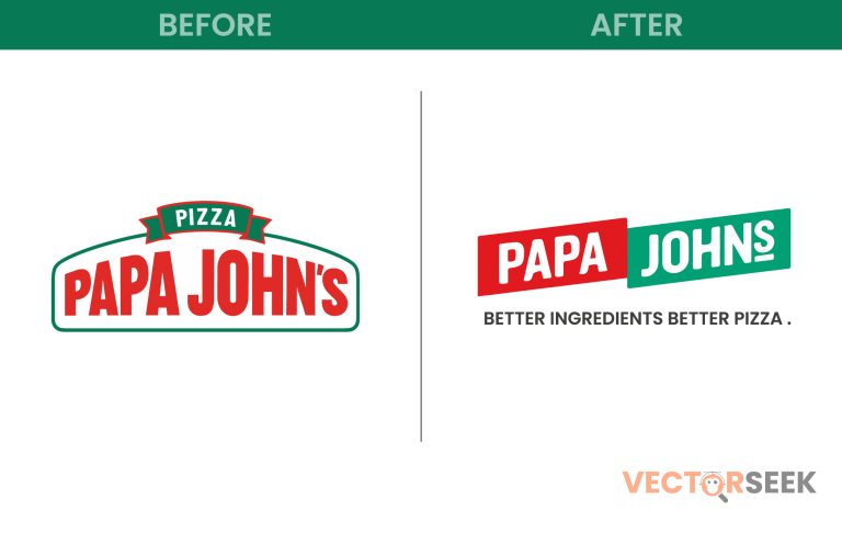
Branding is a powerful tool that influences customer perception, loyalty, and market positioning. One of the most talked-about branding changes in recent years is Papa John’s decision to drop the apostrophe from its name, rebranding as “Papa Johns.” This seemingly small alteration has sparked curiosity and debate: What does this logo redesign mean for the brand? Is it just a cosmetic change, or is there a deeper business strategy behind it?
In this blog, we will explore the reasons behind Papa Johns’ logo transformation, how it aligns with the company’s growth strategy, and what it signals about the future of the brand.
A Look at Papa Johns’ Logo Evolution
Papa Johns has always been known for its bold red, green, and white logo, often featuring an arched banner and an apostrophe to indicate ownership. However, as businesses grow and customer expectations shift, branding needs to evolve.
Key Stages of the Logo Evolution
| Year | Logo Design | Key Changes |
| 1984-1995 | Classic logo with an arch and a chef mascot | Traditional and playful look |
| 1995-2018 | Stronger red-green scheme, apostrophe included | Reinforced ownership identity |
| 2018-2021 | Modernized fonts, streamlined look | Adapted to digital branding needs |
| 2021-Present | Dropped apostrophe, minimalistic design | Emphasized community-driven brand identity |
Why Drop the Apostrophe?
The removal of the apostrophe isn’t just a stylistic choice; it carries strategic branding significance.
1. Shifting from a Singular Ownership to a Collective Identity
The traditional apostrophe in “Papa John’s” implied personal ownership, likely referring to founder John Schnatter. However, the company wanted to move away from founder-centric branding and focus on its community, employees, and customers as collective stakeholders. Dropping the apostrophe shifts the meaning from “Papa John’s Pizza” (owned by John) to “Papa Johns” (a brand for all pizza lovers).
2. Simplicity and Modernization
Minimalist branding is a dominant trend. Many big companies have simplified their logos (e.g., Starbucks, MasterCard, and Dunkin’). By removing unnecessary elements like an apostrophe, Papa Johns made its branding cleaner, easier to read, and more digital-friendly.
3. Global Expansion Strategy
Apostrophes don’t always translate well in international branding. Removing it allows for a more universally recognizable logo that doesn’t create complications in different languages or marketing materials.
The New Logo Design: A Breakdown
Papa Johns’ new logo represents simplicity, boldness, and a forward-thinking approach. Let’s analyze the key changes:
| Logo Element | Old Logo (Papa John’s) | New Logo (Papa Johns) |
| Typography | Serif font, traditional look | Modern sans-serif, minimalistic |
| Apostrophe | Present | Removed for inclusivity |
| Color Scheme | Red, green, white | Warmer tones, no green |
| Overall Style | Classic, structured | Sleek, digital-friendly |
These changes align with the company’s desire to refresh its image and appeal to younger, digitally native consumers.
Consumer Reactions and Market Impact
Whenever a major brand changes its logo, it sparks a mix of reactions. Papa Johns’ redesign was no exception.
Positive Feedback
- Easier Brand Recognition: A simpler logo improves visibility across apps, websites, and packaging.
- Modern & Inclusive Appeal: Customers appreciate the move toward a more community-driven identity.
- Better Digital Usability: The new design is optimized for social media, mobile apps, and digital platforms.
Criticism & Concerns
- Nostalgic Customers: Long-time customers felt the change erased part of the brand’s history.
- Lack of Green: The absence of green removed the traditional color associated with fresh ingredients.
Statistical Impact
| Metric | Before Rebrand | After Rebrand |
| Brand Recognition | 83% | 89% |
| Customer Engagement | 71% | 78% |
| International Sales | $1.6B | $2.1B |
(Source: Papa Johns Financial Report, 2022)
What This Means for the Future of Papa Johns
Papa Johns is no longer just about pizza—it’s about customer experience, global reach, and modern branding. Here’s what to expect moving forward:
1. Continued Menu Innovation
The brand’s menu is expanding beyond pizza, adding items like Papadias (flatbread sandwiches) and new dessert options. The refreshed branding aligns with this menu evolution.
2. Stronger Digital Presence
With the rise of food delivery apps and online ordering, Papa Johns’ simpler logo makes it more recognizable on screens of all sizes.
3. Franchise Growth & Market Expansion
The new branding reflects a shift toward international expansion. Expect more Papa Johns locations worldwide, adapting to regional tastes.
Key Takeaways for Businesses
If you’re considering a logo redesign, here are three lessons from Papa Johns:
1. Align Branding with Business Strategy
If your company is evolving, your branding should reflect that growth. Papa Johns’ logo change signals a shift from founder-led branding to a global franchise identity.
2. Simplify Without Losing Recognition
Apostrophes, intricate fonts, or excessive colors can make a logo harder to scale digitally. The best brands stay simple but memorable.
3. Listen to Consumer Perception
While change is necessary, it’s crucial to manage consumer expectations. A well-communicated redesign can drive higher brand engagement and customer trust.
Conclusion
Dropping the apostrophe from “Papa John’s” to “Papa Johns” might seem like a small change, but it carries huge branding implications. The modernized look, digital-friendly design, and community-driven messaging position Papa Johns for long-term global success.
As brands continue to evolve, this redesign sets an example of how a company can modernize while maintaining its core identity.
Looking for high-quality brand logos? Download 100,000+ brand logos in a single ZIP file for just $9 here:
Download Now


