Batman Logo Vector
Batman Logo: Overview
Batman is an American comic book superhero owned by DC Comics. The character was designed by Bill Finger and Bob Kane. It was launched on March 30th, 1939 in the 27th issued comic book named Detective Comics. Bruce Wayne is a rich American who saves the world as Batman and his mission is to bring down every criminal who was involved in killing his parents Thomas and Martha when he was just a small boy.
Growing up, Bruce taught himself to fight and survive and he closely watched the Gotham City overnight to spot the crime areas. He was inspired of bats and that’s what got him into becoming the Batman. He trains and gets all kinds of knowledge from his butler Alfred Pennyworth – Alfred was more than a butler to Bruce; he was his confidant and cared for Bruce like a father. DC also introduced sidekicks for Batman like Batgirl and Robin.
Colors of Batman Logo
Batman changed its logo 15 times over the years and used the following colors.
| Year | Colors |
| 1939 | White, Black |
| 1941 | White, Black |
| 1944 | Black, White |
| 1946 | Black, White |
| 1950 | Black, White |
| 1956 | Black, White |
| 1958 | Black white |
| 1960 | White, Black |
| 1964 | Black, White |
| 1966 | Black, White, Yellow |
| 2000 | Black, White, Yellow |
| 2011 | Black, White |
| 2016 | Black, White |
| 2018 | Black, White, Dull Yellow |
| 2018 | Black, White |
Batman Logo Details
The origins of Batman logo started with the creators of the superhero. The latest batman logo is designed by DC’s in-house graphic design team. The batman logos have been almost the same over the years.
History of Batman Logo: Evolution of the Logo
Batman changed its in the following ways and years.
1939
This is the first logo of Batman. Unlike latest Batman logos, this one does have a head. It just has wings. The logo is in deep dark black color. This Batman logo has 5 points.
1941
This is the second logo of Batman. This logo is more explanatory compared to the 1939 Batman logo. This logo has head and ears. This version has 7 end points. The wings seem more spread out.
1944
This is the third Batman logo. This logo is more vertically stretched. It has 5 end points but the curves are more inverted. The wings seem to be bigger than the above 2 batman logos.
1946
This Batman logo has kind of squared wings with 7 points just like the 1941 Batman logo. The ears are bigger and pointier. This Batman logo is stretched horizontally.
1950
This version of Batman logo again has more inverted yield curve wings with 5 end points. The center end point is bigger than the rest. The ears are less pointy and are slightly bigger.
1956
This is the most different Batman logo. The top points of the wings have soft curves and have 5 end points. The center point is bigger and the ears have become pointier again.
1958
This Batman logo is similar to the 1944 Batman logo. There are small differences; the ears are smaller and less pointy, there is small distance between the head and the top points of the wings. The end points are not very pointy.
1960
This logo is similar to the 1946 Batman logo. The distance between the head and the top points of the wings is a lot and the bottom end points are a lot pointier than before. The curves are very much inverted.
1964
This logo is similar to the 1958 Batman logo. The first and the last bottom end points are equal to the center point. The center point has a curved point.
1966
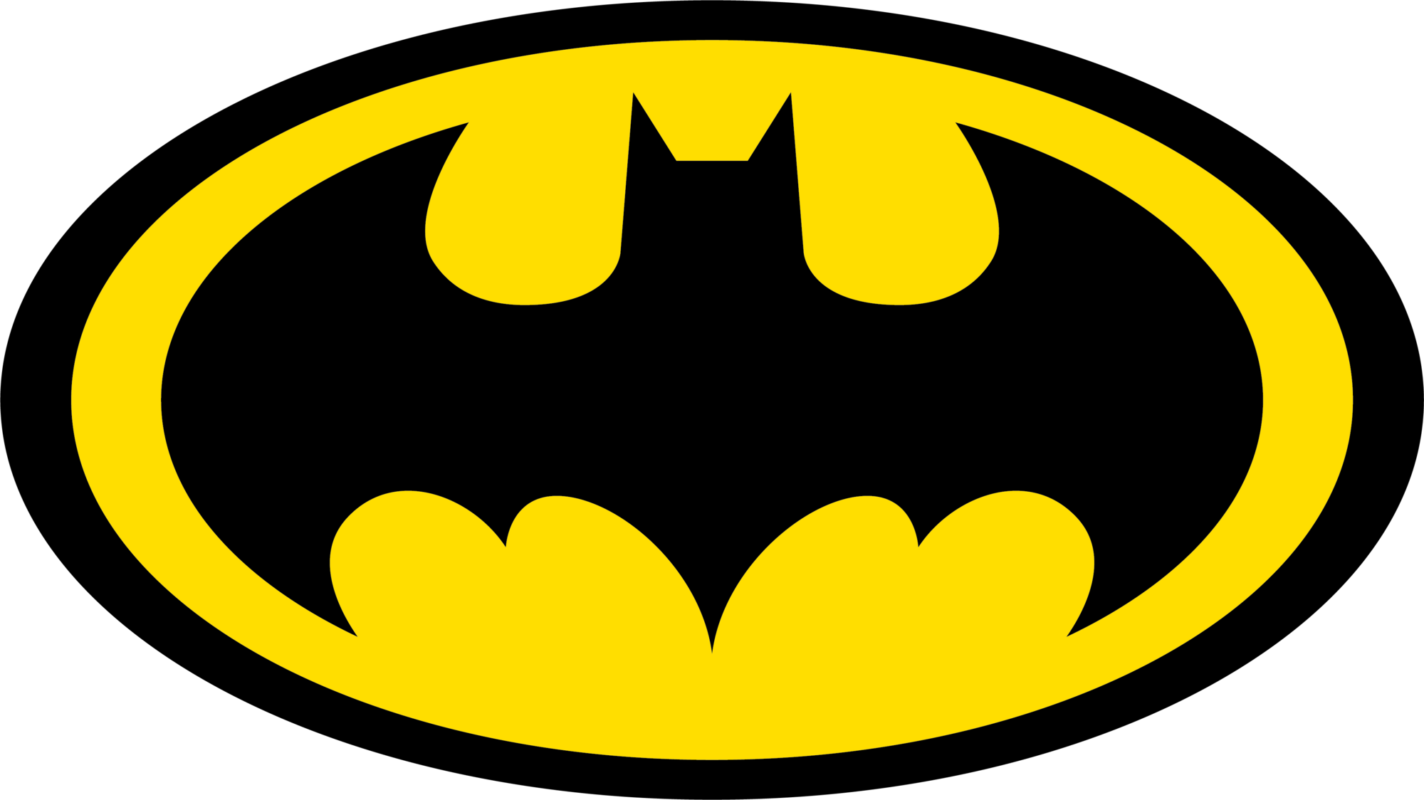
This Batman logo has some catchy colors. The logo consists of a black oval with bright yellow color fill and the traditional batman logo in the center. The batman logo has small years with a big head and the points are not sharp.
2000
This Batman logo has a very different Batman icon shape. The oval is horizontally stretched and the color scheme stays the same. This Batman logo has inverted curved wings and the distance between the head and wings have a curved dip. The first and the last bottom end points are equal to the center point.
2011
In this year, Batman logo changed a lot. The wings are elevated and the distance between the head and the wings are in boat shape. The head and the ears are smaller. The center point is bigger than the rest of the bottom points.
2018
This logo is similar to the 2011 Batman logo. This logo is very stretched to a good extent. This logo has a dull yellow outline. The head is almost gone and the years are closer to each other. In this year, another Batman logo was introduced.
This is the current Batman logo. It is slightly similar to 2000 Batman logo. The logo wings are designed in inverted yield curves. The distance between the head and the wings has stretched boat curve. The top ends of the wings are pointy and the bottom end points have less pointier. These end points have a good number of gaps.
Conclusion
All the batman logos except the 1958, 1960, and 2018 have colors in them. Since bats are black and usually come out at night, the creators added black color in the logo and it seems to fit right. None of the Batman logos have any text – this is because the logo itself explains everything about the comic and the movie series.

