BMW Logo Vector
Quick Info
- Posted:
- Website: www.bmw.com/
- Quality: High Resolution
- Categories:
- Report Copyright Issue
About BMW
BMW or Bayerische Motoren Werke AG is a German multinational manufacturing company of motorcycles and luxury vehicles. Its headquarters are in Munich, Bavaria, Germany. Before it sold cars, it manufactured engines for aircraft. It was founded in 1916. It owns Mini, BMW Motorrad, and Rolls-Royce. According to stats, in 2021, BMW made more than approx. 111.240 billion euros.
The company was founded by Gustav Otto in 1910 in Bavaria. It was first named Otto Flugmaschinenfabrik and on 7th March 1916, it was named Bayerische Flugzeugwerke AG. It was renamed in 1922. BMW also manufactured railway brakes, household items, and farm equipment as well. As of 2021, BMW has 118,909 employees working around the world.
Meaning and History of BMW Logo
BMW cars are considered a luxury. There are so many car enthusiasts who keep BMW cars and modify them to win some of the world’s biggest races. BMW cars are fast and powerful. The BMW logo changed 8 times in the following years of working.
- 1913
- 1916
- 1923
- 1936
- 1963
- 1970
- 1997
- 2020
Evolution of BMW Logo
If love cars then you must be knowing that most drifters use BMW cars because these cars have good stability. They are smooth and they give control to the user. There are yearly competitions around the world where people modify their BMW cars into luxury ones. The logo of BMW evolved in the following ways.
1913
In this year, the logo is a black circle with lines separated by two stars and separated by two texts. The first text is placed on top of the circle ‘RAPP’ and the second text is placed on the bottom of the circle ‘MOTOR’, in the middle of the circle there is a black horse silhouette which perfectly matches the chess knight figure facing left and the background is white.
[caption id="attachment_66604" align="aligncenter" width="300"] 1913 BMW LOGO Vector[/caption]
1916
In this year, the logo completely changed. The logo is round having a golden outline followed by a thick black inline and another golden inline. The center of the circle has traditional blue and white partitioning. BMW is written in thick black inline on the top.
[caption id="attachment_66605" align="aligncenter" width="300"]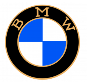 1916 BMW LOGO Vector[/caption]
1923
In this year, the logo was the same but boldness was added overall in the logo.
[caption id="attachment_66606" align="aligncenter" width="300"] 1923 BMW LOGO Vector[/caption]
1936
This year, the logo has now a thin outline, followed by a thick black inline and another thin inline, and the blue and white part stays the same.
[caption id="attachment_66607" align="aligncenter" width="300"] 1936 BMW LOGO Vector[/caption]
1963
In this year, now there are two outlines and the rest is the same.
[caption id="attachment_66608" align="aligncenter" width="300"] 1963 BMW LOGO Vector[/caption]
1970
In this year, the logo added different colors. The circle is nested 5 times. The first layer of the circle is half white and half light blue. The second layer is half white and half dark blue, the third layer is half white and half pink, the fourth layer is completely black and the last layer is traditional blue and white.
[caption id="attachment_66609" align="aligncenter" width="300"]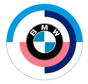 1970 BMW LOGO Vector[/caption]
1997
In this year, the logo has a single outline, followed by a thick black inline and a thin inline and the blue and white are still there. The white light gradient is highlighting a small part from the top left side and also highlights B.
[caption id="attachment_66610" align="aligncenter" width="300"] 1997 BMW LOGO Vector[/caption]
2020
This is the final year of modification where the logo is completely minimalized. It has a slightly thick outline with a thick white inline and another inline with the same white and blue center.
[caption id="attachment_66611" align="aligncenter" width="300"] 2020 BMW LOGO Vector[/caption]
Building of BMW Logo
BMW’s last logo is quite boring. It seems like the company saved money on logo making as anyone could make it. The car brand is huge and the logo should be staggering even if it is minimalized. BMW logo is categorized in the following ways.
Font
In the first year, the text was written in simple and bold Calibri Body font but the tail of Rs is slightly extended. In the second year, rounded serif typeface font was used. Upcoming year, bold serif typeface font was used. For the rest of the years, bold Calibri Body was used.
Color
In the first year, black, blue, and white color was used. The second year, golden, black, blue, and white colors were used. In the year, greyish silver, black, blue, and white colors were used. Upcoming, white, blue, and black colors are used. In the next year, white, blue, black, and pink colors were used. In the second last year, dark grey, white, blue, and black colors were used. Upcoming, grey, white, and blue colors were used.
Provided Services
At VectorSeek, you can download different editable files of the BMW logo. BMW logo vector is used by salespeople, business folks, and even students. You can use the BMW logo vector for editing, on documents, on business cards, and even on websites with all legal rights. Below are the most downloaded BMW logos available at VectorSeek:
- BMW logo PNG
- BMW logo SVG
- BMW logo AI
- BMW logo Vector
You can also download all of these formats of the BMW logo in a zip file.
Conclusion
As we said before the last logo of BMW is very dull and seems uncompetitive but the logos before the last ones are magnificent. We wish to see a better logo for BMW in the coming years.

