Coca Cola logo vector
Quick Info
- Posted:
- Website: www.coca-cola.com/
- Quality: High Resolution
- Categories:
- Report Copyright Issue
About Coca Cola
Coca Cola also known as Coke is a carbonated soft drink made by the Coca-Cola company. The company originated in Atlanta, Georgia, United States. It was founded on 8th May 1886 by Confederate Colonel John Stith Pemberton. The drink's main ingredients are kola nuts and coca leaves which make caffeine.
Coca-Cola is ranked 87th position in 2018 on the list of Fortune 500. John was a soldier in the American Civil War and was injured which led him to become addicted to morphine. Since he had a degree in medical science so, he wanted to find an alternate for it. Then he came up with the idea and made the drink as a medicine and sold it in his drugstore.
Meaning and History of Coke Logo
Coke is preferred over many popular drinks. It is said that Coca-Cola sells more than 1 trillion drinks around the world. No matter how small or how underdeveloped the country is, coke is the no.1 drink. Coca-Cola changed its logo 11 times in the following years.
- 1886
- 1887
- 1889
- 1890
- 1891
- 1893
- 1899
- 1903
- 1934
- 1941
- 1987
Evolution of Coke Logo
On average, it is calculated that a person drinks Coke once a day. There are so many people who feel like having a coke with their everyday meal as it helps in digesting the food fast. Many people mix their Coke with alcohol to dilute the taste. Coke changed its logo in the following years.
1886
This year, the logo was just COCA-COLA. written in this way.
[caption id="attachment_70135" align="aligncenter" width="300"]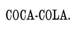 1886 logo[/caption]
1887
This year, the Coca-Cola was styled. The C of the coca was extended from the bottom to the A and the C of the Cola was extended from the top in the L. There is a dash between coca and cola.
[caption id="attachment_70136" align="aligncenter" width="300"]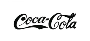 1887 logo[/caption]
1889
In this year, The C of coca was the same but the C of the cola is now extended from the bottom to A. There is are two diamonds in the Cs.
[caption id="attachment_70137" align="aligncenter" width="300"]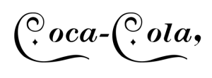 1889 logo[/caption]
1890
This year, coca-cola was styled with swirls; almost giving a look of musical letters. Both the Cs are now extended from bottom to the O(s).
[caption id="attachment_70138" align="aligncenter" width="300"]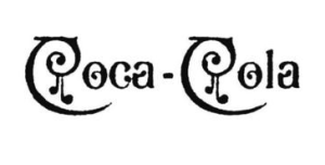 1890 logo[/caption]
1891
This year, the logo was again similar to the logo of 1887.
[caption id="attachment_70139" align="aligncenter" width="300"]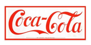 1891 coca cola logo[/caption]
1893
This year, the logo is the same but it is now slightly extra bold.
[caption id="attachment_70140" align="aligncenter" width="300"] 1893 coca cola logo[/caption]
1899
In this year, the logo is still the same but it is now slightly bigger in size.
[caption id="attachment_70141" align="aligncenter" width="300"] 1899 coca cola logo[/caption]
1903
In this year, the font was slightly changed and color is now dark grey.
[caption id="attachment_70142" align="aligncenter" width="300"] 1903 coca cola logo[/caption]
1934
In this year, the logo is the same but the color is now dark red.
[caption id="attachment_70143" align="aligncenter" width="300"] 1934 coca cola logo[/caption]
1941
In this year, the dark red is now simple red and the rest of the logo is the same.
[caption id="attachment_70144" align="aligncenter" width="300"] 1941 coca cola logo vector[/caption]
1987
In this year, the logo is now mate red and the rest is still the same.
[caption id="attachment_70145" align="aligncenter" width="300"] 1987 coca cola logo vector[/caption]
Building of Coke Logo
Coca-Cola has made fans around the world. People say that they have become an addict of the drink and there is no way they could ever leave it. No matter where people go, they opt for coke even though there are plenty of such drinks. The Coke logo is made up of the following things.
Font
In the first year, Antique5 Light font was used. In the year 1890, the font was completely customized and in the rest of the years, Spencerian Script font was used.
Color
In the first 7 years, only black color was used. In the 8th year, dark grey color was used. And the next 3 years, only red color was used.
Provided Services
VectorSeek furnishes their visitors with different editable formats of the Coke logo without regardless of any legal and copyright issues. Visitors can download Coke logo formats for free. We have the following formats for the Coke logo:
- Coke logo PNG
- Coke logo SVG
- Coke logo AI
- Coke logo Vector
You can also download the zip file of the Coke logo.
Variants of Coke Logo
VectorSeek provides the service of downloading different variants of the Coke logos for free and, in HD quality. Click on the desired variant and see it in download within seconds. No need to worry about login or sign-up. We have the following variants of the Coke logo:
Conclusion
Coke made very small changes to its logo. There is nothing special about this logo but it has made a psychological impact on people around the world and that is why it seems nice to everyone. If you see this from the eyes of a graphic designer, it is ordinary.


