Coors Light Logo Vector
Quick Info
- Posted:
- Website: www.coorslight.com/en-US
- Quality: High Resolution
- Categories:
- Report Copyright Issue
Coors Light Logo - History, Symbol, Meaning, PNG, Vector & Evolution
Back in the 1940s, Coors Brewing Company launched a beer with the name “Coors Light”. The word “Light” in the beer name came from the fact that this beer was lighter in calories. The Second World War forced the company to discontinue this product but later in 1973, it was reintroduced.
It is a 4.2% ABV light beer that is brewed in multiple states of the USA. Coors Brewing Company reintroduced the beer back in 1978. Molson Coors Canada Inc. brews the Canadian version of Coors Light. However, in the UK and Australia, this beer is famous as “Coors”.
Fun Fact
A cold-certified label is used on the beer package, the color of the label turns white to blue when the beer temperature reaches 4 °C.
Coors Light Logo History
Over time, the company’s logo evolved significantly. Initially, the logo had a vintage look but it turned out to be an angular minimalism. If we take a look at the current logo of the beer, we can easily witness that the current logo is largely inspired by the first logotype that was introduced in 1978. The company’s logo represents the company’s vision of loyalty and customs.
The signature inscription has been redesigned several times but the color remained unchanged. Furthermore, this unique logo and inscription make the bottles stand out on the shelves.
1978 – 1980
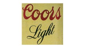
Two levels of inscriptions were incorporated in the very first logo in 1978. Word “Coors” as an upper inscription and the word “Light” has a lower inscription. The color of the word “Coors” was red and the color of the word “Light” was black. Both words were placed against the background of beige color. We can witness the same style of upper inscription intact in the present logo design of the beer. However, it was the first and last time that the lower inscription “Light” was written in such an artistic and sophisticated manner.
1980 – 1994
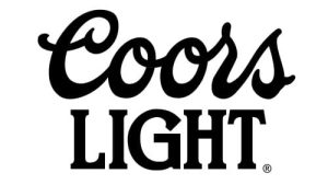
The company considered redesigning the logo back in 1980. The color was changed to monochrome and the font of the lower inscription “Light” was also changed. In Old Coors Light Logo, the word “Light” was written in non-capital letters and solid serif font style. However, this new logo features a lower inscription in all capital letters. The new inscription includes the letter “G” in a bigger size as compared to the rest of the letters. This was done to balance the unique inscription of the word “Coors”. This logo remained intact till 1994.
1994 – 1999
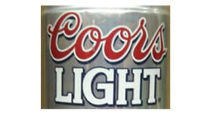
The new logo was introduced in 1994 and a thick white outline was introduced for the word “Coors” Furthermore, the company changed the color palette, and two colors red for the upper part and white for the lower part were used with a black outline. Both inscriptions are used against the Silver-Grey color background. Silver-Grey color repeats the original color of aluminum beer cans.
1999 – 2005
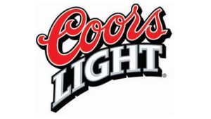
Again in 1999, the company redefined the logo and made it more artistic and stylish. However, the company did not change the color palette but the orientation of words was changed. The horizontal position of the wordmark became diagonal and the lower part was a bit arched. Lines of letters became clearer and thicker. A black color shadow outline was introduced for the upper wordmark.
2005 – 2012
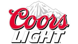
The Coors light logo was again changed in 2005. A new graphical element was incorporated above the upper wordmark “Coors”. The new graphical element is an image of snow peaks in a white-grey color. In addition to these modifications, the lower inscription’s font and style were changed. Previously, the lower inscription was bit arched and in a diagonal position. But this logo features the word “Light” in a bolder, italicized style. The font of this inscription is Sans-Serif and a double outline in gray and black color is introduced. A sharp tail is introduced to the letter “G” to represent masculinity, power, and strength.
2012 – 2015
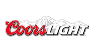
The logo was set in one horizontal wordmark. Interestingly, there is no space between these two letters. Furthermore, snow mountains have also changed. The New Coors Light logo features a wider image of snow peaks above the wordmark. In order to have a better contrast with the snow peaks, the outline color of the word “Coors” was changed to black from white. These snow mountains became an integral part of the brand’s visual identity.
2015
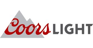
Coors Light Logo 2015 version features an entirely different approach. The long snow mountains are replaced by the triangular icons in grey color. These triangular graphical assets are placed just behind the wordmark “Coors”. Furthermore, the letter “C” of the word “Cross” is cut diagonally while the letter “S” is left outside of the mountains. The wordmark “Light” is written in a custom sans-serif font. The sharp and elongated tail of the letter “G” of the wordmark “light” was introduced to represent diversity, strength, and masculinity.
2015 – 2017
Again in 2015, the company decided to recreate the logo to introduce a more simple, easy-to-remember, and clean logo design. So, the company approached the graphic design agency “Turner Duckworth” to recreate the visual identity of the company.
The new design of the logo looks simplistic and less bulky. This design got rid of bulky and messy outlines of the wordmark that make the logo look clean. Furthermore, trimming and shadows were not popular any longer. So, the company got rid of those design elements.
2017 – Today
This is the conclusion of my study and research, it should not be taken as an Official Statement from the company.
Doubtlessly, the company’s primary symbol is mountains. Many experts believe that these graphical assets represent the 2D Model of the Colorado Rockies. However, these Colorado Rockies are simplified as much as possible graphically.
Criticism
Despite the fact that the company has traveled a long distance to reach this iconic, unique, and solid logo but still brand has to face criticism. This is because the company’s logo closely resembles the pattern on Evian Mineral Water Bottles. However, the company rejected these allegations and is in no mood to consider modifications. The company claims that its graphical illustrations represent coolness, freshness, and cleanliness.
Fonts and Colors
Wordmark utilizes two different writing fonts. The word “Coors” features a swirling font that feels like a handwritten text. Similarly, the word “Light” uses an individual sans-serif font. However, the partially cut edges are introduced in the letters “L”, “G” and “T”.
The color scheme is restrained: the designers combined red (# D31245), gray (# 717073), and silver (# D1D3D4) to make the logo noble.
Coors Light color codes
The following three colors are used in the brand’s logo
- Gray - # 717073
- Silver - # D1D3D4
- Red - # D31245
Color codes of Logo Palette
Red
| Color Name | Red |
| Hex | #c3092b |
| RGB | 195 9 43 |
| CMYK | 0 95 78 24 |
| Pantone | PMS 185 C |
Neon Silver
| Color Name | Neon Silver |
| Hex | #ccc9c8 |
| RGB | 204 201 200 |
| CMYK | 0 1 2 20 |
| Pantone | PMS 420 C |
Nickel
| Color Name | Nickel |
| Hex | #767474 |
| RGB | 118 116 116 |
| CMYK | 0 2 2 54 |
| Pantone | PMS Cool Gray 9 C |
Comparison to Competitor’s Logo
When we compare the current Coors Light Logo with logos of competitors i-e Miller Lite and Bud Light, we can easily witness that Coors Light Logo stands out of the crowd. As Coors logo is more solid, simple, easy to remember, and easily recognizable.
Future Logo Consideration
As we know the company regularly updated the logo in history. So, we can perceive that the company has the potential to adopt the contemporary design requirements. There is a strong probability of modifying the logo in the future as well to keep the logo in line with the latest trends in the industry.
Conclusion
Everything that consumers witnessed in the first-ever logo of the company is still preserved somehow. Though the font, style, and graphical elements have changed greatly but current logo still carries the legacy of the company’s visual identity journey.

