De Chivas Logo Vector
Quick Info
- Posted:
- Website: www.chivasdecorazon.com.mx/en
- Quality: High Resolution
- Categories:
- Report Copyright Issue
Chivas Logo: Company Overview
Chivas is the nickname of a Mexican professional football club. Its original name is Club Deportivo Guadalajara. It is also called the Guadalajara Club. This club is based in Guadalajara metropolitan area, Jalisco, Mexico. The club competes with a top-tier Mexican football club called Liga MX. Guadalajara is among the top 10 founding members of Liga MX (Primera Division).
Its short name is GDL and it was founded on May 1906. The club is owned by Grupo Akron and its President is Amaury Vergara. Since 2010, the club has played its home matches in Estadio Akron in Zapopan. Previously, the club played its matches in Estadio Jalisco.
Colors of Chivas Logo
Chivas changed its logo 16 times and used the following colors
| Year | Colors |
| 1908 | Red, white |
| 1911 | Red, white |
| 1917 | Red, white, blue |
| 1923 | Red, white, blue, yellow |
| 1984 | Red, white, blue, yellow, green |
| 1987 | Red, white, blue, yellow, green |
| 1997 | Red, white, blue, yellow, green |
| 2003 | Red, white, blue, yellow, green |
| 2006 | Red, white, blue, yellow, green |
| 2007 | Red, white, blue, yellow, green |
| 2009 | Red, white, blue, yellow |
| 2010 | Red, white, blue, yellow, green |
| 2017 | Red, white, blue, yellow, green |
| 2018 | Red, white, blue, yellow, green |
| 2019 | Red, white, blue, yellow, green |
| 2020 | Red, white, blue, yellow, green |
Chivas Logo Details
It seems like whenever Chivas played a match, they came up with a different logo. Even though the logo has been almost the same still the club took the changes very seriously. There are very minor changes in every logo.
History of Chivas: Evolution of the Logo
Chivas changed its logo in the following ways.
1908
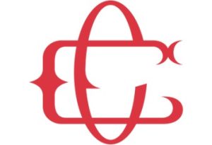
This logo has a light red color with a white background. The logo has 2 C letters which overlap each other.
1911
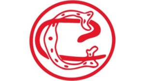
The logo has a red circle with a white color fill. The logo again has 2 C letters. One C is fully red and the other one is red with a white color fill and also has red dots.
1917
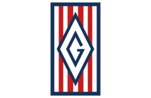
You can see a vertical rectangle of blue color with white color fill. It has red lines and there is a blue diamond shape in the center with white color fill and there is a letter G in blue color in the center of the diamond.
1923
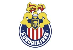
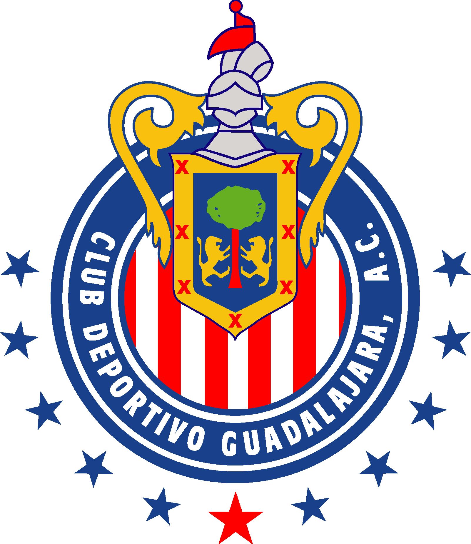
In this year, the logo has completely changed. You can see a 4-nested circle. The second circle has Guadalajara written in it in white color on a blue background. The last circle has a white color filled with red strips. On top of the circle, there is a 2D design of a person with muscular arms in yellow color, and a masked face wearing a feathered hat in yellow and red color. Between the two arms, there is a yellow shield with a blue color fill and there seems to be a tree and two lions climbing the tree on either side.
1984
Most of the logo is the same as the above one. Now there are 7 blue stars outside below the circle on the bottom. The arms are replaced with trophy handles. The feathered hat is smaller than before. The yellow mask is now completely white. The yellow tree in the shield is now green in color. The text in the second circle is Club Deportivo Guadalajara A.C. and all letters are capitalized and in white color.
1987
This logo is completely the same as the above one. The only difference is that now there are 10 stars instead of 7.
1997
This logo is the same as the above one. The only difference is that there are 7 stars in the shield that is placed between the trophy handles. Plus, the trunk of the tree in the shield also has a brownish-red color.
2003
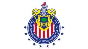
This logo is clearer than the previous ones. The only difference is the text in the second circle, now it says “Club Deportivo Guadalajara S.A. DE C.V.”.
2006
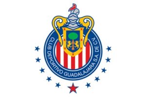
This logo has 11 stars instead of 10. The star in the center is red in color with a blue outline. The rest of the logo is the same.
2007
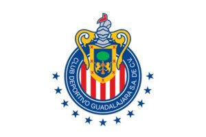
The red star is gone now and is just like the blue one. The rest of the logo is unchanged.
2009
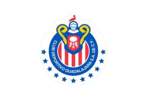
The logo gives a look of a matted drawing. The colors of the tree, the trunk, and the lions in the shield are now just white. The blue color fill in the shield is now red. The whole logo has a ghost outline of a light bluish-white color.
2010
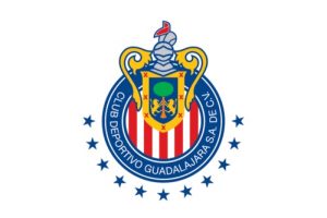
All changes to the logo have been undone and looks the same as the logo of 2007.
2017
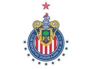
The only difference in this logo is that there are 2 nested red and white stars on top of the logo.
2018

The red star from the top has disappeared from the logo and the colors of the logo are brighter than before.
2019
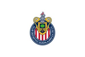
In this logo, the 11 stars from the logo are gone. The rest of the logo is the same.
2020
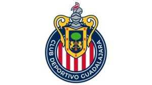
The logo is the same as 2019, the only difference is that the colors are brighter and the logo is much clearer than ever.
Conclusion
The logo of Chivas has come a long way. All the logos used Simple Calibri Body font. The first two logos have 2 C letters and it means Chivas Club. The third and fourth logo had the word Guadalajara in it. The rest of the logos of Chivas had the full name of the club. The color combination is striking and just like any other football team has. As of now, there are no new changes announced in the logo by the club. But we are sure that the club will stick to the design and the colors and there will be only minor changes. You can download Chivas logo AI from VectorSeek.

