FedEx Logo Vector
Quick Info
- Posted:
- Website: www.fedex.com/en-us/home.html
- Quality: High Resolution
- Categories:
- Report Copyright Issue
About FedEx
FedEx is also known as FedEx Corporation, previously known as Federal Express Corporation and FDX Corporation. It is an American-based company that is a multinational conglomerate holding corporation. The company provides different business services, e-commerce services and transportation. It was founded in May 1971 and its headquarters is in Tennessee.
It was founded by Frederick W. Arkansas. As of 2020, FedEx offices are located in more than 942 locations around the world. Executive chairman is Frederick himself and its President and CEO is Raj Subramaniam. According to the reports of 2022, the company made a profit of $93 billion and employs 547000 employees.
Meaning and History of FedEx Logo
FedEx is known as the best transportation and delivery service in the world. Frederick was a graduate of Yale University and he gave the idea of the company in his mid-term paper and the company was designed to provide urgent delivery services. He started the company small in Memphis. FedEx changed its logo 3 times in the following years.
- 1971
- 1991
- 1994
Evolution of FedEx Logo
The company became a huge hit by 1983 and made a billion-dollar revenue in the same year. Company expanded its business in Asia and Europe by 1984. The company acquired Flying Tiger Line in 1988 and became the biggest delivery and transportation company in the world. The company changed its name to FedEx from Federal Express in 1994. FedEx changed its logos in the following ways.
1971
This year, the logo has a square that is divided into two colors. The division is diagonal. The first part is dark blue and federal is written in white color and all the letters are capitalized. The second part is white and express is written in red color and all the letters are also capitalized. The white part of the square has a blue border/outline.
[caption id="attachment_74646" align="aligncenter" width="258"]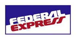 Fedex logo Vector 1971[/caption]
1991
This year, the logo was the name of the company. The square was gone and FEDEX was written in two color combinations. FED is written in dark purple color and EX is written in dark orange color.
[caption id="attachment_74648" align="aligncenter" width="253"] Fedex logo Vector 1991[/caption]
1994
This year, the logo is the name of the company. Now Fed is written in light purple color and Ex is written in light orange color. Maybe this is the idea of logo minimalization by FedEx. In this logo, FedEx is joined and there is no space between the two words. The initials of Fed and Ex are capitalized and the rest of the letters are in a small case.
[caption id="attachment_74647" align="aligncenter" width="300"] Fedex logo Vector 1994[/caption]
Building of FedEx Logo
FedEx is the only company that made its name in the world by transporting lots of shipments via air in one day and they are also known for keeping things in the original condition even if the shipment is being delivered or transported from ship. It also acquired Kinko’s Inc. and renamed it to FedEx Kinko’s. FedEx logo consists of the following two things.
Font
In the first year, the font was completely customized. In the second year, the font used was Rexlia Heavy OTF (800) and in the last year, the logo was written in customized extra bold Calibri Body font.
Color
In the first year, the logo had blue, white and red colors. In the second year, the logo had dark purple and dark orange color and in the last year, the logo had light purple and light orange color.
Provided Services
VectorSeek furnishes their visitors with different editable formats of FedEx logo regardless of any legal and copyright issues. Visitors can download FedEx logo formats for free. We have the following formats for FedEx logo:
- FedEx logo PNG
- FedEx logo SVG
- FedEx logo AI
- FedEx logo Vector
You can also download the zip file of FedEx logo.
Variants of FedEx Logo
VectorSeek provides the service of download different variants of the FedEx logo for free and, in HD quality. Click on desired variant and see it in download within seconds. No need to worry about login or sign-up. We have the following variants of FedEx logo:
- FedEx old logo
- FedEx original logo
- FedEx logo black and white
- FedEx logo transparent
Conclusion
We think that all three logos of FedEx are nice in fact, they are very much competitive. We presume that in the first logo the diagonal position of the logo symbolizes speed and since the company soon became a multinational brand, they just shortened their name and the logo. Though on Wikipedia, the logo says FedEx and below it, Corporation is written which starts from E of Ex.

