Ford Logo Vector
About Ford
Ford or Ford Motor Company is an American multinational automobile manufacturing company. Its headquarters is in Dearborn, Michigan, United States. It was founded on 16th June 1903 by Henry Ford. The company manufactures commercial vehicles, automobiles, SUVs, and luxury cars. The Lincoln car brand is owned by Ford. They generated approx. 136 billion dollars in 2021.
Henry Ford first made a car on 3rd November 1901. It was named Cadillac Motor Company on 22nd August 1902. Ford’s first investors were Horace and John Dodge. The first president of Ford was a local banker named John S. Gray. Ford 4x4 cars are said to be the most powerful ones.
Meaning and History of Ford Logo
Ford vehicles are tested and tried on different roads and they are nominated as the most durable ones. Since it has been more than 100 years of existence of Ford, so the transformation journey of its logo is amazing. Every year, the Ford logo is enhanced to become better and more good-looking. The Ford logo was transformed 11 times in the following years.
- 1903
- 1907
- 1909
- 1911
- 1912
- 1917
- 1927
- 1957
- 1961
- 1976
- 2003
Evolution of Ford Logo
Ford company still owned by the Ford Family and has 40% shares of the whole company and also has voting power as well. Ford was ranked 17th number in the 500 fortune companies in 2018. As of 2020, they have more than 186,000 employees working around the world. Below are the changes done to the Ford logo.
1903
In this year, the logo was just like the way logos used to be back in the early 1900s. We especially liked this logo for Ford. This logo has curves and leaves in white color with a black background. In the center of it, you can see capitalized FORD MOTOR, below motor, you can see Co. and below it, Detroit is written and below it, MICH. Is written.
[caption id="attachment_66737" align="aligncenter" width="300"]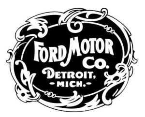 1903 Ford Logo Vector[/caption]
1907
In this year, the logo looks like a rugby ball. In it, you can see nested widened ovals. Above the nested oval, the text says ‘FOR QUALITY HALL MARK AND ECONOMY’. In the nested oval, FORD is written and below the oval, the text says ‘EVERY CAR GUARANTEED TWELVE MONTHS’.
[caption id="attachment_66738" align="aligncenter" width="300"]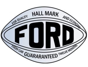 1907 Ford Logo Vector[/caption]
1909
In this year, the logo looks like someone has signed an autograph of Ford in a very stylish way. Ford is written in double inverted commas. The tail of the D is extended towards the F.
[caption id="attachment_66754" align="aligncenter" width="300"] 1909 Ford Logo Vector[/caption]
1911
In this year, the logo gave a royal look. The logo is now a nested oval. In the first layer, on top, the text says ‘THE FAMOUS’ and on the bottom, the text says ‘MOTOR CARS’. In the second layer, Ford is written, and F is styled.
[caption id="attachment_66739" align="aligncenter" width="300"] 1911 Ford Logo Vector[/caption]
1912
In this year, the is styled like a bird. The logo has a blue outline followed by a white inline and then the whole bird is blue. There are white lines in the bird that represent the wings of the bird. In the bird, you can see Ford written in the same font style and below it, the text says ‘THE UNIVERSAL CAR’.
[caption id="attachment_66740" align="aligncenter" width="300"] 1912 Ford Logo Vector[/caption]
1917
In this year, the logo became very simple. There is again an oval with a black outline and the inside of oval is grey and only Ford is written.
[caption id="attachment_66743" align="aligncenter" width="300"] 1917 Ford Logo Vector[/caption]
1927
In this year, the logo is an oval with a blue outline, then a white inline; leaving the rest of the oval in blue color and Ford is written.
[caption id="attachment_66747" align="aligncenter" width="300"] 1927Ford Logo Vector[/caption]
1957
In this year, the oval is extended and has dips. It has a thin blue line and thick white inline, followed by blue background and Ford is written in white.
[caption id="attachment_66749" align="aligncenter" width="300"] 1957 Ford Logo Vector[/caption]
1961
In this year, the oval is more extended and now has two outlines and one inline, with the same background color and Ford is written in the same way.
[caption id="attachment_66750" align="aligncenter" width="300"] 1961 Ford Logo Vector[/caption]
1976
In this year, the logo is now a complete and perfect oval. There are still two outlines and one inline and with the same background and same text but the whole logo is now 3D.
[caption id="attachment_66753" align="aligncenter" width="300"] 1976 Ford Logo Vector[/caption]
2003
This is the last year of modification and it was the year when Ford finally decided to opt for minimalization. The oval is in perfect shape with one outline and one inline and with the same background and same text.
[caption id="attachment_66751" align="aligncenter" width="300"] 2003 Ford Logo Vector[/caption]
Building of Ford Logo
The Ford logo is broken down into two parts; color and font.
Font
In the first year, bold sans-serif typeface font was used. In the second year, Ford was customized and added boldness whereas, the rest of the text was written in simple Calibri Body font. In the third year, there was no font because it was an autograph from Henry Ford. In the next year, bold Baskerville Old Face font was used. In the next year, BELL MT font was used. In the rest of the years, no font was used.
Color
In the first year, only black and white colors were used. In the second year, grey and black colors were used. In the next two years, black and white colors were used. In the next year, blue and white colors were used. In the next year, light grey and black colors were used. In the rest of the years, whitish grey and blue colors were used.
Provided Services
At VectoSeek, visitors can benefit from downloading different formats of the Ford logo for free and without any sign-up or sign-in. Visitors can use any format or variant of the Ford logo without worrying about copyright issues. Below, you can see the most downloaded formats of the Ford logo:
- Ford logo PNG
- Ford logo SVG
- Ford logo AI
- Ford logo Vector
You can download a ZIP file of the Ford logo with a single click.
Variants of the Ford Logo Vector
VectorSeeks keeps an eye on visitors' needs when it comes to different variants of logos. Different variants of Ford are downloaded by salespeople at Ford, senior executives, and students who make presentations on Ford. You can find the following different variants of the Ford logo below:
- Ford Raptor Logo Vector
- Ford Ranger Logo Vector
- Ford Racing Logo Vector
- Ford Fiesta Logo Vector
- Ford F 150 Logo Vector
- Ford King Ranch Logo Vector
- Ford FX4 Logo Vector
Conclusion
Ford's logo became very boring for some years. It seemed as if someone didn’t want to work on the logo and it looks like the designer did not put in a lot of effort. The very first and the last two logos of Ford are very competitive.

