Hasbro Logo Vector
Quick Info
- Posted:
- Website: shop.hasbro.com/
- Quality: High Resolution
- Categories:
- Report Copyright Issue
About Hasbro
Hasbro is also known as Hasbro Inc. It is an American-based multinational conglomerate holding company. It was founded in 1923 by Henry, Hillel and Herman Hassenfeld. Its headquarters in Rhode Island, United States. Its chairman is Richard Stoddart and Chris Cocks is CEO. The company made a revenue of 5 billion dollars in 2021.
It employs 5600 employs. It was previously named as Hassenfeld Brothers in 1923, the company’s name changed to Hasbro Industries in 1968 and it was renamed to Hasbro Bradley in 1984 and, in 1985, it was finally renamed to Hasbro Inc.
Meaning and History of Hasbro Logo
Hasbro owns products and trademarks of Wizard of the Coast, Parker Brothers, Milton Bradley and Kenner and many others. According to stats of 2020, 81.5% of the company’s shares are owned by popular institutions. Hasbro changed its logo 8 times in the following years.
- 1944
- 1955
- 1959
- 1968
- 1978
- 1993
- 1998
- 2009
Evolution of Hasbro Logo
Hasbro also owns the products and trademark of G.I. Joe, Transformers, Rom The Space Knight, Power Rangers, MASK, Micronauts, Furby, Monopoly, Little Pony, Twister and Nerf and acquired Entertainment One in 2019 which also included PJ Masks and Peppa Pig. The company changed its logo in the following ways.
1944
This year, there is a vertical oval with a black outline and white filling. The bottom of it is overlapped by a black ribbon and in it, Hasbro is written in white color and all the letters are capitalized. In the last part of the oval, INC is written. On the top part of oval, HB is written in black color.
[caption id="attachment_72956" align="aligncenter" width="300"]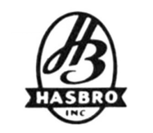 Hasbro Logo Vector 1944[/caption]
1955
This year, the logo just had the name of the company written in black color. The letter H is capitalized and the rest of the letters are in small case.
[caption id="attachment_72957" align="aligncenter" width="300"]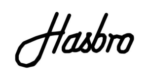 Hasbro Logo Vector 1955[/caption]
1959
This year, the logo was completely overhauled. Now there is a boy facing to the front and is leaned to the right. The logo is made up of a black outline and white filling. The shirt is white in color and Hasbro is written on the bottom of the shirt in black color with capitalized letters.
[caption id="attachment_72958" align="aligncenter" width="281"]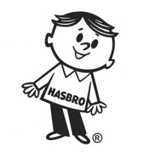 Hasbro Logo Vector 1959[/caption]
1968
This year, the logo is again the name of the company. The letter H has customized; it has small triangles in it and the rest of the letters are in a small case.
[caption id="attachment_72959" align="aligncenter" width="300"] Hasbro Logo Vector 1968[/caption]
1978
This year, the logo has a square with soft edges in blue color and followed by a white inline. The inner side of this square has a customized square with a house in the center of it. The house has white outline and is filled with dark blue color. It also has the icon of a couple kissing each other. The couple’s icon is of white color. Below outside this customized square, Hasbro is written in blue color and all the letters are capitalized.
[caption id="attachment_72952" align="aligncenter" width="300"] 1978 Logo[/caption]
1993
In this year, the logo has a borderless square in light blue color and Hasbro is written in white color and all of these letters are capitalized.
[caption id="attachment_72953" align="aligncenter" width="300"] 1993 Logo[/caption]
1998
In this year, the logo has the same square but it is now a bit tilted to the left and Hasbro is written in white color. The letter is capitalized and the rest of the letters are in small case. There is a laughing smile is drawn in white color.
[caption id="attachment_72954" align="aligncenter" width="300"] 1998 Logo[/caption]
2008
In this year, the square has additional small lines in blue color near the 4 corners and the letters H and O are slightly out of the square. The laughing smile is still there.
[caption id="attachment_72955" align="aligncenter" width="300"] 2008 Logo[/caption]
Building of Hasbro Logo
Hasbro got the help of marketing and promoting themselves from the Family Game Night show of Discovery Family Network. Before this business, the company used to sell textile remnants. After this success, the company started to produce and manufacture school supplies and pencil cases. Hasbro’s logo is made up of the following two things.
Font
In the first year, HB was written in a customized font and HASBRO is written in bold Calibri Body. In the second year, the text is written in customized Spencerian Palmer Penmanship font. And in the third and sixth years, the text was written in bold Calibri Body. Fourth year, H was designed and the rest of the letters are written in Bunken Tech Sans Pro Extra Bold font. In the fifth year, the font is similar to Heisman. In the last two years, the text was written in Promixa Nova TT font.
Color
In the first four years, the colors used in Hasbro logo are black and white. In the rest of the years, white and blue colors are used in the logo.
Provided Services
Visitors can use any format or variant of Hasbro logo without worrying about copyright issues. Below, you can see the most downloaded formats of Hasbro logo:
- Hasbro logo PNG
- Hasbro logo SVG
- Hasbro logo AI
- Hasbro logo Vector
You can download a ZIP file of the Hasbro logo with a single click.
Variants of Hasbro Logo
VectorSeeks keeps an eye on visitors needs when it comes to different variants of logos. You can find the following different variants of the Hasbro logo below:
- Hasbro old logo
- Hasbro original logo
- Hasbro logo black and white
- Hasbro logo transparent
Conclusion
The Hasbro logo with the triangles design was very creative and it gave a very professional look. The first logo gives a very traditional vibe and the third will be canceled in 2022 and the years to come. The last two logos are very well-designed and give a jolly feel.

