Hot Wheels Logo Vector
Quick Info
- Posted:
- Website: hotwheels.mattel.com/shop
- Quality: High Resolution
- Categories:
- Report Copyright Issue
Hot Wheels Logo: Company Overview
Hot Wheels is an American company that designs and manufactures scale-model cars and racing tracks. It is owned by Mattel and it was first introduced on May 18, 1968. It was invented by Elliot Handler. It was a good competitor of Matchbox until Mattel bought it in 1997 Matchbox owner Tyco Toys. Different car manufacturers licensed Hot Wheels to make a scale model of their car via original design detailing and blueprints.
Hot Wheels were intended for young adults and children but soon it became hype among adult scale model car collectors as well. This is why Hot Wheels launched limited edition scale model cars. Elliot Handler saw his son playing with a Matchbox model car and he thought to come up with his brand to give a head-to-head competition.
Colors of Hot Wheels Logo
Hot Wheels changed its logo 9 times and used the following colors
| Year | Colors |
| 1968 | White, black, orange, red |
| 1969 | White, red |
| 1970 | White, red |
| 1973 | Light orange, white |
| 1990 | Red, white, orange |
| 2000 | Red, white, orange |
| 2004 | Red, white, orange |
| 2010 | Yellow, orange |
| 2014 | Yellow, orange |
Hot Wheels Logo Details
Hot Wheels logos have been the same and have slight differences. The color combination has also been almost the same. The logo is all about flame and fire as the company says Hot Wheels. The logos are highly striking and eye-catching.
History of Hot Wheels: Evolution of the Logo
Hot Wheels changed its logo 9 in the following ways.
1968
This is the first logo of Hot Wheels. It has a traditional flame and the name of the company is written in white color and below it, there is a text that says “Hottest metal cars in the world”. Below it, there is another flame in orange color.
1969
This year, the logo is just a red flame and the name of the company is written in white color. Outside below the flame, there is text that says “Fastest metal cars in the world”, all of the letters are capitalized. On the right bottom corner of the flame, there is a customized circle in red and there are 2 words on either side; Mattel Inc. and Toymakers. Both of these words have capitalized letters in white color.
1970
In this year, the flame is the same and has the same company name. The customized circle just has the word Mattel in it and the rest of the text is gone.
1973
This year, the logo is the same but the red color has been replaced with a light orange color.
1990
This year, the logo is the same but the orange color can be seen in the name of the company. The name of the company is half white and half orange. The flame is again in red and there is a white outline covering the whole logo.
2000
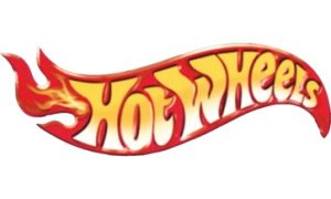
In this logo, the customized circle is gone and the rest of the logo is the same. This time, the logo has a 3D look. There is an additional flame beside the letter H.
2004
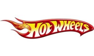
In this year, the flame is slightly different. The additional flame has extended the main flame. The red color of the flame is darker than before.
2010
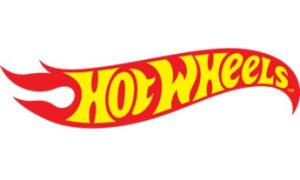
This year, the logo again has a simple look and the red is lighter than before. The name of the company is in yellow and the additional flame has disappeared. The flame has again changed its design.
2014
In this year, the logo is the same but the color is lighter than before.
Conclusion
We love all the logos of Hot Wheels. The customized circle in the logo seemed extra and it is a good thing that it was only seen in the first five logos. The font used in the Hot Wheels logo is a custom sans-serif typeface. It is a modest and clean font that represents hot and fiery. The letters H and W are always capitalized and the rest of the letters are in small case.

