LAYS Logo Vector
Quick Info
- Posted:
- Website: www.lays.com/
- Quality: High Resolution
- Categories:
- Report Copyright Issue
About Lay’s
Lay’s is a brand of fried potato chips. It is owned by PepsiCo and is produced by Frito Lay. It is an American brand that was founded in 1940. Till 1961, PepsiCo owned the Lays and now it is owned by Frito Lay Inc. The brand is called Lay’s in the United States and in some Asian countries, while some countries name it differently.
In the UK, it is called Walkers, in Australia, it is called Smith’s, in Egypt and West Balkans, it is called Chipsy, in Israel, it is called Tapuchips, in Columbia, it is called Margarita, in Mexico, it is called Sabritas, in Canada, it is called Hostess, and in Vietnam, it is called Poca.
Download: LAYS Black and White Logo
Meaning and History of Lay’s Logo
The origins of Lay’s started in 1932 by a man named Herman Lay opened a small snack food shop in Nashville, Tennessee. The business did well which led Herman to purchase a potato chip manufacturer company in Atlanta, Georgia in 1938. The company was called Barrett Food Company and renamed it H.W. Lay Lingo & Company. The company changed its logo 7 times in the following years.
- 1932
- 1965
- 1986
- 1997
- 2003
- 2007
- 2019
Evolution of Lay’s Logo
Herman delivered Lay’s chips in the trunk of his car and started to sell in the Southern United States. Herman changed the name of the company again in 1944 to The Lay’s Lay Lingo Company. Lay’s was the first brand to be aired on tv ads and Bert Lahr modeled for the company. The company changed its logo in the following ways.
Download: LAYS Logo Without Name
1932
This year, the logo has a red small banner like shape and in it, Lay’s is written in white. The tail of the Y is outside of the shape and is in red color. In the letter L, there is a black line and the bottom of the shape has an underline in red color.
[caption id="attachment_72904" align="aligncenter" width="300"]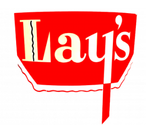 Lays logo vector 1932[/caption]
1965
This year, there is a red square and Lay’s is written in white color. The head of the L, the apostrophe, the tail of the Y is out of the square and is also in red color.
[caption id="attachment_72905" align="aligncenter" width="300"]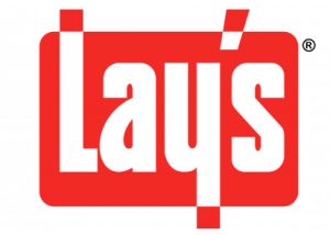 Lays logo vector 1965[/caption]
1986
This year, the square is gone and Lay’s is written in white and there is a thick red border around the letters.
[caption id="attachment_72903" align="aligncenter" width="300"]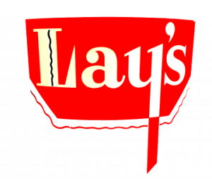 Lays Logo 1986[/caption]
1997
This year, the logo has a yellow circle and there is a red banner overlapping the circle. Lay’s is written in white color and has a blue outline. The yellow circle has a white gradient. The apostrophe, the end of the L and Y is slightly out of the red banner.
[caption id="attachment_72906" align="aligncenter" width="300"] Lays logo vector 1997[/caption]
2003
This year, the logo is the same but the yellow circle is given a 2d look and the red banner has dark red color in the borders. The blue outline on the letters is gone.
[caption id="attachment_72900" align="aligncenter" width="300"] 2003 Logo Vector[/caption]
2007
This year, the yellow circle is completely yellow and the white gradient is gone. The red banner is a golden border at the bottom and below the letter S, BRAND is written.
[caption id="attachment_72901" align="aligncenter" width="300"] 2007 Logo[/caption]
2019
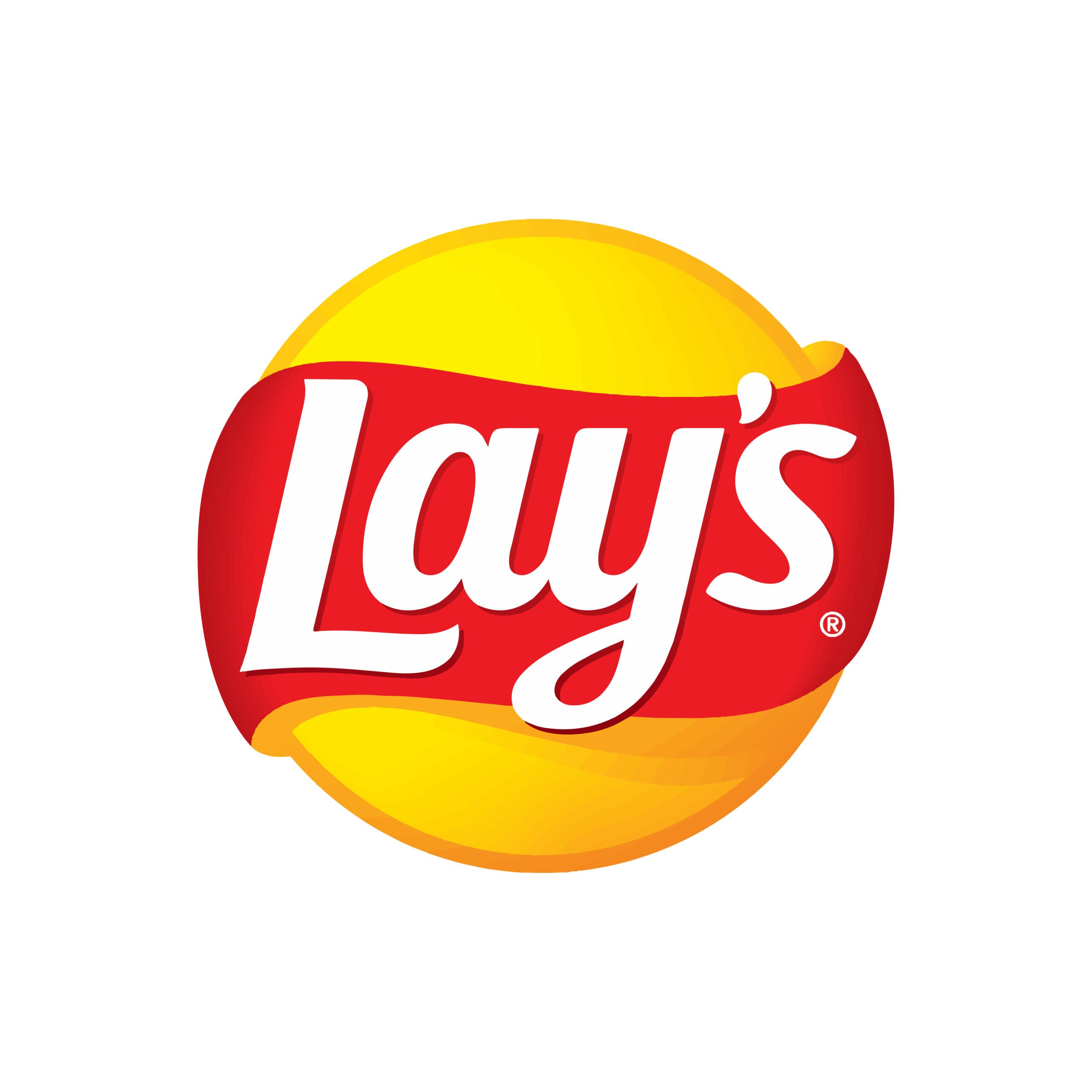
This year, the word brand and the golden border has gone. The letter L is completely inside the red banner. The end of the y and apostrophe are slightly out of the red banner. The logo is given a 3d look. The colors are dull than before.
[caption id="attachment_72902" align="aligncenter" width="300"] 2019 Logo[/caption]
Building of Lay’s Logo
In 1961, the company merged with Frito Company which was founded by Charles E. Doolin in that same year, the company was called Frito-Lay Inc. and made a revenue of 127 million dollars and became the highest revenue-generating company in the United States. By 1965, the company has 8000 employees working in 46 manufacturing plants. Lay’s logo is based on the following two things.
Font
In the first and third years, the logo was completely customized. In the second year, Lay’s was written in customized bold Calibri Body font. And the rest of the years, Lay’s was written in Helvetica Halbfett font.
Color
First-year, red, white and black colors were used. In the second and third years, red and white colors were used and in the fourth year, red, white, yellow and blue colors were used. In the fifth year, dark red, regular red, yellow and white colors were used. And in the second last year, red, white, yellow and golden colors were used. In the last year, red, white and yellow colors are used.
Provided Services
Visitors can download Lay’s logo formats for free. We have the following formats for Lay’s logo:
- Lay’s logo PNG
- Lay’s logo SVG
- Lay’s logo AI
- Lay’s logo Vector
You can also download the zip file of Lay’s logo.
Variants of Lay’s Logo
Click on desired variant and see it in download within seconds. No need to worry about login or sign-up. We have the following variants of Lay’s logo:
- Lay’s old logo
- Lay’s original logo
- Lay’s logo in blue
- Lay’s logo in pink
- Lay’s logo black and white
- Lay’s logo transparent
Conclusion
We don’t understand why there is a black line in the first logo and the rest of the logos are good. The company has made a fortune on behalf of this logo. The current logo has dull which is a good idea for minimalization.
Related Logos:

