Lazada Logo Vector
Quick Info
- Posted:
- Website: www.lazada.com/en/
- Quality: High Resolution
- Categories:
- Report Copyright Issue
Lazada is one of the most popular online shopping platforms in Southeast Asia. Founded in 2012, it quickly grew into a major player in the e-commerce industry. By 2016, Alibaba Group acquired Lazada, bringing advanced technology and a stronger marketplace to millions of buyers and sellers. Today, Lazada offers a wide range of products across different categories, making it a top choice for online shoppers.
Meaning and History of the Lazada Logo
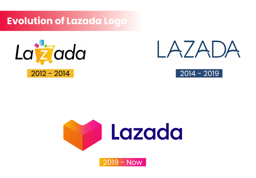
 evolution of lazada logo 01[/caption]
For many people in Southeast Asia, Lazada is the go-to platform for online shopping. Whether you're an individual seller or a large business, you can list your products on Lazada with ease. While setting up a seller account may require some paperwork, shoppers enjoy a hassle-free experience with fast delivery through partners like LEX-Express and Kerry.
2012 – 2014: The Playful Beginning
 Lazada 2012 logo[/caption]
The first Lazada logo was fun and colorful, reflecting the excitement of online shopping. It featured a yellow shopping cart with a white "Z" and three floating shapes in pink, blue, and green. These shapes symbolized the variety of products available. The text was written in a simple, slightly slanted sans-serif font.
2014 – 2019: A Sleek and Professional Look
 Lazada 2014 logo[/caption]
In 2014, Lazada updated its logo to a more modern design. The new version used bold, uppercase letters in a deep blue color. The font had unique touches—arched "A" letters and softened edges on the "L" and "Z." This gave the logo a sharp, professional appearance while keeping it clean and stylish.
2019 – Present: A Fresh and Vibrant Identity
 Lazada 2019 logo[/caption]
The latest redesign in 2019 introduced a heart-shaped emblem in a gradient of pink to orange. The wordmark remained in dark blue but with a more stable and professional look. This combination of playful graphics and strong typography represents Lazada’s balance between fun shopping experiences and reliable service.
Font and Colors of the Lazada Logo
The Lazada logo uses a bold, sans-serif font similar to Futura Maxi Pro Demi or Harmonía Sans Std Semi Bold. The letters are full and well-structured, giving the brand a strong and trustworthy image.
The color scheme includes:
-
Dark Blue: Represents professionalism and reliability.
-
Pink-to-Orange Gradient: Adds energy, warmth, and excitement, reflecting the joy of shopping.


