Mercado Libre Logo Vector
Overview
We rarely see e-commerce companies having a unique and distinctive logo. Usually such companies have simple-looking logos with regular color combinations. Today, you will learn about Mercado Libre logo details with complete history, meaning, evolution, creation and much more. You can also download Mercado Libre logo in PNG, AI, Vector and SVG variants.
About Mercado Libre
Mercado Libre means free market in Spanish language and it was previously known as Mercado Livre which means the same in Portuguese. This company is based on Argentina and is headquartered in Uruguay. The company is incorporated in the United States and is mostly opted by Latin American users.
It is a public company which was founded in 1999 by Marcos Galperin. Its current CEO, chairman and President is the founder himself. It also owns 4 different brands including Mercado Pago, Mercado Credito, Mercado Ads and Mercado Envios.
Meaning and History of Mercado Libre Logo
It is an online marketplace and an e-commerce payment system company and the company made a profit of 7.07 billion dollars in 2021. The company has more than 30000 people working around the world. The company has more than 174 million visitors using the site. Mercado Libre changed its logo 4 times in the following ways.
- 1999
- 2000
- 2012
- 2020
Evolution of Mercado Libre Logo
The founder launched the company when he was studying in Stanford University and he was funded by John Muse who is the co-founder of HM Capital Partners. Mercado Libre was also funded by some of the biggest names of the business sector including Banco Santander Central Hispano, GE Capital, Goldman Sachs, Flatiron Partners and JPMorgan Partners. Mercado Libre changed its logo in the following ways.
1999
In this year, the logo was the name of the company. Mercado was written in blue color with all small case letters and Libre is written in yellow color and the letter L is capitalized.
[caption id="attachment_82681" align="aligncenter" width="300"]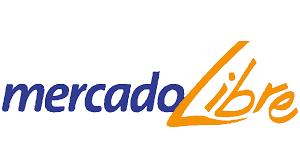 1999 Mercado Libre[/caption]
2000
In this year, the logo has a blue oval and there are two hands shaking in white color. There is yellow filling in the oval in empty spaces. Outside below the oval, Mercado is written in white color with blue outline and below it, Libre is written in yellow color with blue outline.
[caption id="attachment_82680" align="aligncenter" width="300"]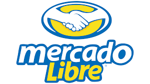 2000 Mercado Libre[/caption]
2013
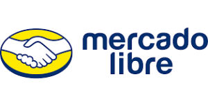
In this year, the logo is the same but the blue outline of oval is replaced with purple. The blue outline is also gone from the words. Mercado is written on top of Libre in purple color.
2020
In this year, the shaking hands are replaced with two white arms flexing muscles. The rest of the logo is same.
[caption id="attachment_82678" align="aligncenter" width="300"] 2020 Mercado Libre[/caption]
Designing of Mercado Libre Logo
The company was awarded with an Endeavor Company in 1999. eBay acquired 19.5% of the company’s shares in 2001. The shares were sold back to Mercado Libre in 2016 but it continued to work with the company. The company opened its first physical store in Chile in 2017. Mercado Libre logo is based on the following two things.
Colors
In the first year, blue and yellow colors are used. In the second year, yellow, blue and white colors are used. Last two years, white, yellow and purple colors are used.
Font
In the first year, Mercado is written in italicized Calibri Body and Libre is written in a customized font. In the rest of the years, the fonts are similar to Europa Grotesk SH Med and Coolvetica Regular.
Provided Services
VectorSeek furnishes their visitors with different editable formats of Mercado Libre logo without regardless of any legal and copyright issues. Visitors can download Mercado Libre logo formats for free. We have the following formats for Mercado Libre logo:
- Mercado Libre logo PNG
- Mercado Libre logo SVG
- Mercado Libre logo AI
- Mercado Libre logo Vector
You can also download the zip file of Mercado Libre logo.
Conclusion
The shaking of hands and the arms flexing in the logo represent the joint venture between Mercado Libre and other partners. The color combination is bright and the company hasn’t opted for minimalization. Visitors can download Mercado Libre logo in PNG, AI, SVG and Vector variants and formats.

