Microsoft Logo Vector
Quick Info
- Posted:
- Website: www.microsoft.com/
- Quality: High Resolution
- Categories:
- Report Copyright Issue
About Microsoft
Microsoft or Microsoft Corporation is an American multinational tech company that develops personal computers, consumer electronics, and computer software and provides related services. Their headquarters is in Redmond, Washington. It was founded by Paul Allen and Bill Gates on 4th April 1975. It became worldwide popular in the 1990s. As of 2022, the company made more than 83 billion dollars.
Before Microsoft, it was called Traf-O-Data and it was used to analyze and track automobile traffic data. Microsoft made their operating system in 1980 and it was called Xenix but MS-DOS made them super famous.
Meaning and History of Microsoft Logo
Microsoft products and services are used on a daily basis and around the world. There is no person left on this Earth who has not used Microsoft software and services once. The fact is that Microsoft has made our lives easier and made us more productive. The logo of Microsoft has always been simple and minimal. It changed 6 times in the following years:
- 1972
- 1975
- 1980
- 1982
- 2011
- 2012
Evolution of Microsoft Logo
Every time the logo changes, it is easy to get and there are no complications. Even since it became a brand, the company tried to minimize the logo but the current logo has been just for a decade now and there is news of them changing it.
1972
In this year, Microsoft was Traf-O-Data and the logo has all the creativeness in the world. You can see a ToD and is designed in a way that it looks distinguished and the same at the same time. On its right, you can see Traf-o-Data.
[caption id="attachment_70560" align="aligncenter" width="300"]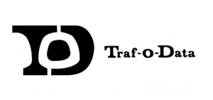 1972 Logo[/caption]
1975
In this year, Microsoft is in capitalized letters and the letters are made up of bold lines that look like Aki lines font.
[caption id="attachment_70561" align="aligncenter" width="300"] 1975 Microsoft Logo Vector[/caption]
1980
This year, the logo is given a stylish look. It gives a modern and sharper look. The M, R and F edges are extended.
[caption id="attachment_70562" align="aligncenter" width="300"] 1980 Microsoft Logo Vector[/caption]
1982
This year, the logo is given a professional look. The letters are all in capital but the O after the R has lines with a white circle in it.
[caption id="attachment_70563" align="aligncenter" width="300"] 1982 Microsoft Logo Vector[/caption]
2011
In this year, the word Microsoft is now bolder and only M is capital and the O after the R and the S are cutting each other. It seems as Micro and Soft is separated with the cut.
[caption id="attachment_70565" align="aligncenter" width="300"] 2011 Microsoft Logo[/caption]
2012
This is the final year of modification, here, you can see a square of four boxes and on its right, you can see Microsoft.
[caption id="attachment_70566" align="aligncenter" width="300"] 2012 Microsoft Logo[/caption]
Building of Microsoft Logo
The Microsoft logo is composed of the following two attributes.
Color
Until the last year of modification, the logo only used black color. In the last year, red, green, yellow, blue and grey colors are used.
Font
The first font was basically just lettered with no specific font because it was completely customized. Then in the second year, monochrome logotype font was used which looked similar to Aki Lines font. Next year, the New Zelek font was used. In the next year, simple sans-serif typeface font was used. Then next year, Helvetica black italicized font was used. In the last year, Segoe Semi-bold sans-serif typeface font was used.
Provided Services
VectorSeek empowers their visitors to download different editable formats of Microsoft logos for free and in the best available quality. You can download the following Microsoft logo formats:
- Microsoft logo PNG
- Microsoft logo SVG
- Microsoft logo AI
- Microsoft logo Vector
All of these above-mentioned editable formats of Microsoft logos can be downloaded in a ZIP file.
Conclusion
Microsoft’s logo is an example of significance, distinctive and specialty at the same time. From Traf-o-Data to the final look of the Microsoft logo, every change was easy but it gave a good impact. The logo is also another reason why it became a huge success around the world.

