Nescafe Logo Vector
Quick Info
- Posted:
- Website: www.nescafe.com/
- Quality: High Resolution
- Categories:
- Report Copyright Issue
About Nescafe
Nescafe is a coffee brand of Nestle. It was founded on 1st April 1938. Nestle started to make coffee in 1930 and contracted with Brazil since they harvest world-class coffee beans. Max Morgenthaler led this project. It became a staple in America during World War 2. Nescafe Gold was introduced in Europe in 1965.
The brand made such an impact that airline company AeroGal painted a Boeing 737-200 red to promoted Nescafe. In 2009, the brand offered to help an abandoned theater in Chile and named it Nescafe Theater of Arts making it the world’s first Nescafe Theater.
Meaning and History of Nescafe Logo
Coffee is an eye-opener when it comes to Monday mornings. You can see lines of people standing to place their coffee orders. There are so many companies that offer free coffee to their employees so that they never feel tired and go less on coffee. Nescafe changed its logo 6 times in the following years.
- 1938
- 1953
- 1968
- 1983
- 1998
- 2014
Evolution of Nescafe Logo
There are different types of coffees. Famous coffee brands like Starbucks and Tim Hortons also have a secret menu for coffee. There is a saying that if you go on to try every type of coffee in the world, one would have to be born again. Nescafe changed its logo in the following ways.
1938
In this year, the logo was the name of brand. The first end of N was extended to E and the last end of N was also extended to E – making it a rectangle. The E has an apostrophe. It has a dark red background and letters were written in white.
[caption id="attachment_70112" align="aligncenter" width="300"] 1938 Nescafe Logo Vector[/caption]
1953
In this year, the red background was removed and letters were in dark grey color.
[caption id="attachment_70113" align="aligncenter" width="300"]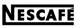 1953 Nescafe Logo Vector[/caption]
1968
In this year, the lower extended part of N was removed and the E had an extended apostrophe to its top. The line is now up to F only.
[caption id="attachment_70114" align="aligncenter" width="300"] 1968 Logo[/caption]
1983
In this year, the font was changed.
[caption id="attachment_70115" align="aligncenter" width="300"] 1983 Logo[/caption]
1998
In this year, the font was styled a bit more with the same font.
[caption id="attachment_70116" align="aligncenter" width="300"] 1998 Logo[/caption]
2014
In this year, the font is again changed and the apostrophe is now red.
[caption id="attachment_70117" align="aligncenter" width="300"] 2014 Logo[/caption]
Evolution of Nescafe Logo
Researchers actually conducted some tests to confirm if coffee activates the brain. They made 2 groups of 5 people. One group was given juices and water in the morning and the other was given coffee. The second group turned out to be more productive as compared to the first one. Nescafe logo has the following two parts.
Font
In the first three years, the logo was extra bold Calibri Body. Then in the fourth year, customized Titla Condensed Bold font was used. In the second last year, customized Campan Extra Bold font was used. In the last year, customized Roihu Bold Font was used.
Color
In the first year, red and white color was used. Then in the second year, grey color was used. In the next three years, black color was used. In the last year, red and black color was used.
Provided Services
At VectorSeek, you can find the best and highest quality Nescafe logo in different editable files which are completely free. To download different formats of the Nescafe logo, all you need to do is click and you are done. VectorSeek offers the following formats of the Nescafe logo:
- Nescafe logo PNG
- Nescafe logo SVG
- Nescafe logo AI
- Nescafe logo Vector
You can download the Nescafe logo in a ZIP file without any sign-up.
Conclusion
Nescafe logo is no doubt simple but with time, it has made a powerful impact and it was all because of marketing. People now opt for Nescafe coffee even though several coffee brands exist.


