Paw Patrol Logo Vector
Paw Patrol Logo: Company Overview
Paw Patrol is an animated television series. It was created by Keith Chapman and is for the Canadian TV audience. It was produced by Spin Master Entertainment and its animation was provided by Guru Studio. This series is a part of the TVOKids programming block and is broadcast on TVOntario. The genre of this series is based on adventure and action.
The series was developed by Scott Kraft and directed by Jamie Whitney. The series has 253 episodes and 10 seasons and is loved by kids. The series was first started in 2013 and still going on. The series was also aired in the United States on Nickelodeon in 2013.
Colors of Paw Patrol Logo
Paw Patrol changed its logo 2 times and used the following colors
| Year | Colors |
| 2012 | Blue, grey, white, black, yellow, red |
| 2013 | Blue, grey, white, black, yellow, red |
Paw Patrol Logo Details
Paw Patrol changed its logo 2 times and has no plan of changing it even in the coming years. The series is a big hit and the seasons have a different theme every year but it doesn’t tend to change its logo. This is also a good idea to save resources.
History of Paw Patrol: Evolution of the Logo
Paw Patrol changed its logo in the following ways.
2012
The logo is a customized shield with soft curves. It has an inline with Ryders written in white and greyish color. Below it, P.A.W. is written in blue and white color, and below it, there is a white bone, and Patrol is written in it in blue color. Before and after the text, there is a shade of orange yellowish color. All the letters are capitalized. The words Paw Patrol is designed in customized Bumble-Regular OTF (400) font.
2013
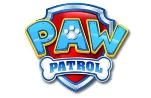
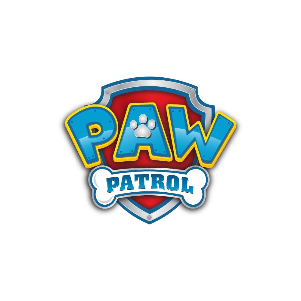
This logo is quite better than the first one. It is neat and clear. The shield has a better and more visible design. The inline is gone. The shield’s outline is in blue color and has a grey and silver color. The center space of the shield is red and Paw is written in blue color and has a yellow outline. The hollow space of the letter A has a paw designed in it. Below it, there is a bone in white color and blue outline and Patrol is written in blue color. All the letters are capitalized. The word PAW now doesn’t have separating dots. The word Patrol is designed in Aargau-Bold font and the word PAW is designed in a customized slab serif font.
Conclusion
The first logo of Paw Patrol is unclear and some of the text is blurred. The second logo of Paw Patrol is striking and makes a statement. The series has now become a decade old and there is still no news about any changes in the logo. The word Paw in both logos gave me a tough time when it came to identifying the font style. Both of them are highly customized.

