Pepsi Logo Vector
Quick Info
- Posted:
- Website: www.pepsi.com/
- Quality: High Resolution
- Categories:
- Report Copyright Issue
About Pepsi
Pepsi is a carbonated soft drink by PepsiCo. It was created in 1893 and introduced as Brad’s Drink, in 1898, it was renamed as Pepsi-Cola and, in 1961, it was renamed as Pepsi. It was first created in New Bern, North Carolina by Caleb Bradham. He made it in his drugstore and sold it. It was sold to relieve dyspepsia (indigestion) and cola was for flavor.
Pepsi first had vanilla and sugar in it. Caleb made the drink to boost energy and cure poor digestion. The bottling of Pepsi started in 1903 and rented a warehouse. In that same year, Caleb sold more than 7k gallons of Pepsi.
Meaning and History Pepsi Logo
Nowadays, Pepsi is introduced as extra strong and the company claims it boosts your energy. There are so many people who claim that Pepsi boosts digestion after eating food. There was a time when parents would restrict their kids for not consuming soft drinks and now children drink Pepsi at the early age from 13 years. Pepsi changed its logo 16 times in the following years.
- 1893 – 1898
- 1905 – 1906
- 1940 – 1950
- 1962 – 1973
- 1987 – 1991
- 1996 – 1997
- 2003 – 2006
- 2008 – 2014
Evolution of Pepsi Logo
Pepsi does a lot of charity around the world and that is why it is many people’s no.1 drink. It promoted most of its products by promoting sports. In countries where it is usually hot or humidity, people prefer to drink Pepsi. Pepsi changed their logo in the following ways.
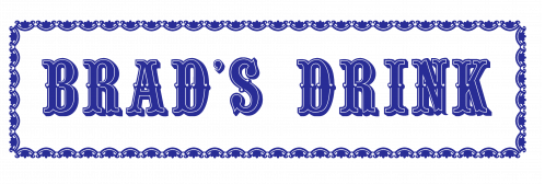
1893
In this year, the logo has a blue ornate rectangular frame with white background and BRAD’s DRINK is written in blue.
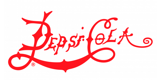
1898
In this year, the company’s name was Pepsi-Cola and the logo was completely customized where the letters are styled in an impressive way. The P and C are capitalized. The P and C are joined. There is a dot on I and there is another dot right next to I.
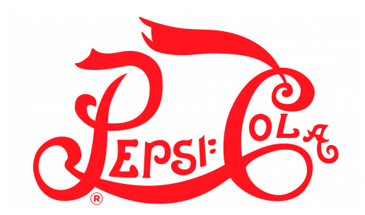
1905
In this year, is the same but the styling of letters was lessened. There are two dots on the right side of I.
1906
In this year, the font style was the same but was not bolded.
1940
In this year, the logo P and C are not joined anymore. The letters are now simple. The two dots after ‘I’ is gone but there is just a single dot now.
1950
In this year, the logo is a metal cap of the bottle. The upper part of the cap is red, the bottom is white having the text ‘Pepsi. Cola’ and the bottom is blue. The cap is facing right.
1962
In this year, the company was named as Pepsi. Now the cap is facing front with same color distribution but PEPSI is capitalized whereas, P is outside of the cap and S and I are outside of the cap as well.
1973
In this year, the logo has a black square with thin black border. Its inner part is white and there are blue and red frames making another circle which has red, white and blue colors. In the white part, PEPSI is written.
1987
In this year, the square is gone leaving the blue and red frames and the rest of the contents.
1991
In this year, the logo has completely changed. Now, you can see a red banner and, on its right, there is a Pepsi red and blue icon and on top of it, PEPSI is written.
1997
In this year, the background is gone and Pepsi is written in white and it has a blue shadow. PSI are overlapping the red part of the Pepsi icon.
2003
In this year, the logo is the same but it is now given a glossy look with a white gradient.
2006
In this year, Pepsi is written in blue with a white shadow. The Pepsi icon has water drops on it.
2008
This year, the Pepsi icon is in a blue circle and Pepsi is written in small case. The red part of the Pepsi icon is more than blue.
2014
This year, the blue circle is gone and the rest is the same.
Building of Pepsi Logo
Pepsi is a very known brand and many people prefer it over other popular drinks. Pepsi is considered one of the most important companies because it employs a lot of people in a lot of countries. The Pepsi logo is based on the following two things.
Font
In the first year, the font used was capitalized bold Quentin D. In the next 5 years, the font was completely customized. And in next 4 years, bold Calibri Body font was used but the letters were slightly stretched. Then in the next two years, Artspeed Regular OTF font was used. In the last years, Qero Mite font was used but the E was customized.
Color
In the first year, blue and white color was used. For the next 5 years, red and white color was used. In the next year, white, red and blue color was used. In the next year, black, white, red and blue color was used. For the rest of the years, blue, white and red color was used.
Provided Services
VectorSeek allows its visitors to download fully customizable and editable files of Pepsi logo for free and with a single click. We provide the following different types of editable files of Pepsi logo:
- Pepsi logo PNG
- Pepsi logo SVG
- Pepsi logo AI
- Pepsi logo Vector
You can download all of these files in a single zip file.
Variants of Pepsi Logo
VectorSeek tracks the latest and the trendiest variants of Pepsi logo. We understand the need of visitors and provide different variants of Pepsi logo in HD quality for free. Below are the most wanted variants of Pepsi logo:
Conclusion
The first logo of Pepsi when it was Brad’s Drink is also impressive. In those years, people were not so creative but somehow the designer managed to make it look very tempting. In the next 4 years, Pepsi logo was very much extra. After Pepsi Cola became Pepsi, the logo then became competitive.

