Philadelphia Phillies Baseball Team Logo Vector
Phillies Logo: Company Overview
The Phillies are also called the Philadelphia Phillies. It is an American baseball team and it competes in MLB (Major League Baseball). It plays in the National League of East Division. The team has been playing in Citizens Bank Park as a home stadium – this stadium is located in South Philadelphia Sports Complex. The team has won 2 World Series championships against the Tampa Bay Rays in 2008 and the Kansas City Royals in 1980.
The team also won 8 National League Pennants and had 15 playoff appearances. As of 2023, the team has played more than 21k games with a regular record of 10, 112-11, 259-115 (.473). The first World Series was played in 1903 and Phillies have played 120 seasons consecutively and 140 seasons since the 1883 establishment of the team.
Colors of the Phillies Logo
Phillies changed its logo 16 times and used the following colors
| Year | Colors |
| 1900 | White, blue |
| 1901 | Black, white |
| 1910 | Green, white |
| 1911 | Pink, white |
| 1915 | Black, white, red, blue |
| 1938 | Blue, yellow |
| 1939 | Blue, yellow, white, pink |
| 1944 | Pink, blue, white |
| 1946 | Pink, white, black |
| 1950 | Blue, white, pink |
| 1970 | White, pink |
| 1976 | White, pink, red, yellow, black, blue |
| 1981 | White, pink |
| 1982 | Purple, white |
| 1992 | Red, white, blue |
| 2019 | Pink, white, blue |
Phillies Logo Details
Phillies changed its logo a lot of times. The team is more than 100 hundred years old and they deserve unique logos. The Phillies logo transformation journey has been one of a kind. It used different colors and fonts.
History of Phillies: Evolution of the Logo
Phillies changed its logo in the following ways.
1900
The font is just a denotation via letter P in blue color. It is designed in Stengkol font.
1901
The logo is the same, the only difference is its color; black.
1910
The logo is the same but the font is completely different. The font is designed using an old English style letter. It is in green color.
1911

The logo is now designed with a different font – the font is similar to Retro 86 Light. The font has a pink color.
1915
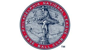
This logo consists of 8 nested circles. The third circle has text in white with pink background. The text says “Philadelphia National League Baseball Club”. All the letters are capitalized. In the last circle, there is a picture of a person standing on a mound with a ball. There are staircases behind this person and there are 8 people placed in differently. This sketch is in white and blue horizontal lines.
1938
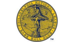
The logo is the same as the logo of 1915. The only difference the color; the logo is in blue and yellow colors.
193
The logo is still the same. The second circle of the logo is in pink color. The circle with the text has white background and the rest is the same.
1944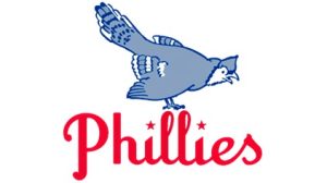
The logo has completely changed. The logo has a bird facing to downwards to the right. The bird is in blue and white color. Below it, Phillies is written in bright red-pink color. The letters I have 2 stars.
1946
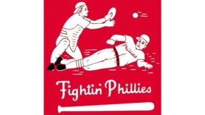
This logo has a pink square and there are two players playing baseball. One player is catching the ball coming from the right and the second player is reaching the spot. The boots and the belt are in black color. The players are in white color. Below the players, there is a text “Fightin’ Phillies”. Below this text, there is a white base bat.
1950
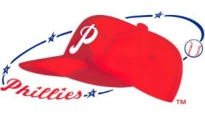
In this year, the logo has a dark red-pink cap. The cap has a white letter P. There is a blue swish from one end of the cap to another. There are 4 white and blue stars and a pink, white, and blue ball. There is Phillies written in the swish.
1970
In this year, the logo has a letter P. The hallow part in the letter p has a line in it and gives a look of a ball. Below it, Phillies is written in pink and white color. The font is written in customized Gready Bold.
1976
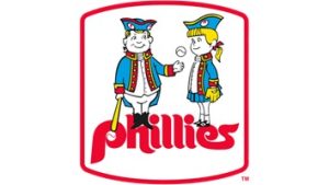
In this year, the logo has a pink square with soft edges and white hallow space. The hallow space has a boy and a girl wearing fancy caps and dresses. The boy is holding a yellow base bat and a ball. The boy and the girl are looking at each other. The boy and the girl are standing on the word “Phillies”.
1981
The logo is just the letter of baseball team in pink color. The letter P is similar to the logo of 1970.
1982
The logo is the same as of 1982, the only difference is the color; it is in purple color.
1992
In this year, the logo has a customized triangle in red color. In its’ hallow space. There is an old-styled telephone in white color on a blue background. Phillies is written in pink and white colors and is overlapped on the phone. The word Phillies is underlined in red and white color.
2019
In this logo, there is a blue telephone and Phillies is overlapped by pink and white color.
Conclusion
The logos consisting of the letters P only are very simple and have a singular color. The bird in the logo of 1944 is the Ruffed Grouse – it is a national bird of Philadelphia. We personally liked the logos of 1944 and 1950. We have no idea why the latest logo has an old-styled telephone. Comparing the latest logo to the old logo, the old ones are better than before. You can download Phillies logo in PNG via VectorSeek.

