Premier League Logo Vector
Quick Info
- Posted:
- Website: www.premierleague.com/
- Quality: High Resolution
- Categories:
- Report Copyright Issue
About Premier League
Premier League or The Football Association Premier League Limited is a system of men’s football league. It has 20 clubs and it is connected with EFL (English Football League). It starts from August and ends in May. 38 matches are played and usually, matches are played on Saturdays and Sundays. It was founded as The FA Premier League on 20th February 1992.
According to 2019 and 2020, the Premier League acquire TV rights deals that were worth of 3.1 billion pounds. The chief executive is Richard Masters and the shareholders are members of the league. According to stats of 2018, before the pandemic, the website alone had 643 million visitors and the TV audience was of 4.7 billion.
Meaning and History of Premier League
People love football to the level of madness. The top-rated channels of YouTube are about people who give in-depth analyses about football. Football players enjoy a luxurious life as they are paid in millions even if they don’t bag a trophy. The love for football is very special to some. Premier League’s logo changed three times in the following years.
- 1992
- 2007
- 2016
Evolution of Premier League
Football is a game for the fit. Both men and women can play. But in today's era, people follow and pay more attention to men’s football and Premier League is all about men’s football. In the three years, massive changes were made in the Premier Leagues logo.
1992
In the first year, you can see a lion facing to the left and has a crown sitting on its head. One paw of the lion is on a football – the lion and the football are on a green bolded line. Under it is written THE F.A. PREMIER LEAGUE in a rectangle. Under it is a green bolded line.
[caption id="attachment_70568" align="aligncenter" width="300"]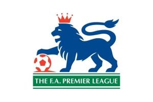 1992 Premier League Logo Vector[/caption]
2007
In this year, the lion is more realistic and is facing front while the rest of the body is slightly to the right. The lion’s paw is on the football and under it is written PREMIER LEAGUE.
[caption id="attachment_70569" align="aligncenter" width="300"] 2007 Premier League Logo Vector[/caption]
2016
In this final year of changes, you can now see a lion’s head facing to the right and to its right, you can see Premier League with capitalized P and L.
[caption id="attachment_70570" align="aligncenter" width="300"] 2016 Premier League Logo[/caption]
Building of Premier League Logo
On a personal level, we love all of the logos of Premier League as the designers must have been hand-picked and the designers have given minute details in the logo. The represents a lot of things. This logo is broken down into two parts.
Colors
In the first year, the lion is blue, the crown and the football is red and the lines and rectangle is green whereas the font is in white color. Next year, the lion is dark navy blue and the football is in red color. In the last year, only dark purple color is used.
Font
In the first year, simple Calibri body font was used. In the second year, simple typeface font was used. Then in last year, a rounded sans-serif typeface was used.
Provided Services
If you are looking to download different editable formats of the Premier League logos for free then you have come to the right place. At VectorSeek, we provide free downloading of the Premier League logos in the best quality. We have the following formats of Premier League logos.
- Premier League PNG
- Premier League SVG
- Premier League AI
- Premier League Vector
Download all of these formats of Premier League logos in a ZIP file.
Conclusion
The first two logos of Premier League logos display royalty, control and boldness. It represents a lot of its origins, meaning and status. The last logo seems very much simple – as the world is going towards shortness and minimalization, companies use fewer colors and uncomplicated designs. But the current logo also says everything about Premier League.


