State Farm Logo Vector
Quick Info
- Posted:
- Website: www.statefarm.com/
- Quality: High Resolution
- Categories:
- Report Copyright Issue
State Farm Logo - History, Symbol, Meaning, PNG, Vector & Evolution
State Farm Insurance is a US Based mutual insurance company. The headquarters of the company is in Bloomington, Illinois. The company was founded back in 1922 and it is the largest casualty, property and auto insurance provider company in the United Sates. In the 2022 Fortune 500, State Farm secured 42nd rank among the top American companies by revenue.
State Farm authorizes only exclusive agents to sell the company products. These agents are called captive agents as well. These agents are not authorized to sell any product of any other insurance company.
Early Branding of State Farm
Initial branding of the State Farm Company was not that much impressive. This is because the initial logo design spoke about Auto Insurance loudly. Luckily, the State Farm Logo was lucky enough to secure the significant presence at the beginning. Furthermore, the company introduced the iconic emblem in 1936 and logo created in 1922 was the base for that iconic emblem that we all know currently.
State Farm Logo Evolution Over Time
1922 – 1936

The initial State Farm Insurance Logo was so simple yet distinct. It was consisting of oval shaped badger with double outline. Inside the double border outline, there was a wordmark in bold sens-serif font. The image of a car was also there in monochrome and there was 4 words encryption around the car image. This inscription consisted of following words.
- Service
- Satisfaction
- Safety
- Economy
These were 4 primary pillars of company’s vision with slogan “Here to Help Life Go Right”.
Color Palette of the logo was Black and White.
1936-1943
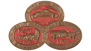
Back in 1936, State Farm Insurance Company Logo was rebranded and one badge was turned into three of similar style. These badges were arranged in a matter that they form a triangle. The complete emblem became brighter and more significant. Furthermore, the color palette was changed to Red and Gold. All three badges included three different images of Car, Fire Truck and Cornucopia image.
The biggest visual change was three badges and color palette. Color of outer frame was set bronze/golden including backgrounds and words. Similarly, the images of car, fire truck and Cornucopia was also in Bronze/Golden color. However, the background was bright red.
Previous original emblem was merged into two new emblems at the bottom. Interestingly, the two bottom badges were joint in an infinity symbol. However, the upper oval was behind it. The inscriptions of the outer frame remained unchanged. Two new ovals incorporate the images of fire truck and cornucopia in bronze color with bright red background. These two new images were supposed to represent the life and fire insurance respectively.
1943 – 1953
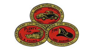
In 1943, State Farm Insurance Logo was revised. Entire text all over the logo became black in all badges. Though they remained in bronze/golden part but their appearance was changed drastically. Furthermore, the car image in upper oval part became more modern and advance. Furthermore, the cornucopia image remained unchanged largely. In addition to this, in the right lower badge, the firetruck image was replaced with firemen’s helmet and a word “and marine” was incorporated. Inclusion of this word depicts that insurance company has started to provide flood protection as well. The location information on the top badge came back but it came as a part of it is cut off.
1953 – 2006

Company introduced new logotype in 1953 which remained intact for decades. This new State Farm Logo still carries the legacy of previous logo in the form of three oval shape badges. In a new manner, these all three logos were arranged in a center of logo. However, total number of ovals remain same and borders of bottom two ovals still connected in a style of infinity sign. The color of these three ovals is red except the white outlines around the borders. Everything in these badges was removed except three letters “Auto”, “Life”, “Fire”in tilted style.
These all three badges were places in the center of a white square with red outline. New State Farm Logo incorporated the company name in two bits. “State Farm” above the badges, “Insurance” below the badges in bold, red and capital form.
2006 – 2012

Again in 2006, company redesigned the State Farm Insurance Logo and made it a Logo Within a Logo Type. The previous entire logo was used as an emblem in new logo next to the company name “State Farm” in this design of State Farm logo. However, the previous logo was made short enough to make it aligned with the letters to the right side. Logo designers used the simple, bold, basic sans-serif font for the company name next to emblem. Company name was written in bold, tilted font style. The color remained unchanged but the letters were not all capital.
2012 – Today

Probably, realizing the awkwardness of using company name twice in Logo design, company updated the logo in 2012. They only kept the ovals and company name, everything else was discarded. This time, company made the white outline bit bolder and prominent. In addition to this, all three ovals stand alone and they are not interconnected. The color tone became darker in this new State Farm Company Logo.
| Color Name | Vivid Red |
| Hex | #F01716 |
| RGB | (240, 23, 22) |
| CMYK | 0, 0.904, 0.908, 0.058 |
font of logo
The font of logo remains unchanged from 2012. The current font was updated in 2012 but the generic features remain unchanged. The letters are bold, slanted, smooth, fluid and quite artistic and used sans-serif style.
Color of logo
For decades, the main color of State Farm Insurance company remains white and red. These colors are being used since alteration in 50s and before this red was the only primary color. So, we can say the red color secured the position of primary color in company’s branding. The other color that remained the part of journey are Black, Bronze.
FAQs About State Farm Logo
Where can I find high-resolution versions of the State Farm logo?
You can download State Farm Logo PNG, State Farm Logo JPEG, State Farm Logo AI, State Farm Logo SVG from VectorSeek.com in High resolution.


