Telenor logo vector
Quick Info
- Posted:
- Website: www.telenor.com.pk/
- Quality: High Resolution
- Categories:
- Report Copyright Issue
Overview
Websites should use high quality logos to give a good representation. There is also a lack of multiple variants of logos of companies and brands – we have provided the facility to visitors to download logos for free in PNG, Vector, AI and SVG formats.
About Telenor
Telenor ASA is a multinational telecommunications Norwegian-based company. It was founded in 1855 and its headquarters is in Fornebu, Norway. Its current CEO and President is Sigve Brekke. The company provides IPTV, IT services, digital TV and mobile telephony services.
Telenor employs more than 16000 people in Norway alone – the company has set business worldwide making more than 110 billion US dollars in revenue. Telenor is the distributor of networks in 8 countries.
Meaning and History of Telenor Logo
Telenor started as a state-operated monopoly provider of telegraph of services and it was first named as Telegrafverket. The first time services were launched for the Royal Norwegian Navy in 1848 and by 1852, the system was launched for Parliament of Norway and followed by the whole country. Telenor changed its logo 5 times in the following years.
- 1933
- 1969
- 1995
- 2001
- 2006
Evolution of Telenor Logo
By 1857, the service reached to Bergen and by 1871, the service expanded it networks to Kirkenes. The company began conducting operations internationally via cable connections that were made available for Denmark in 1867 and travelled to The Great Britain by 1869. Telenor changed its logo in the following ways.
1933
In this year, the logo has a yellow and red crown with a cross on top. Below it, there is a yellow star with lightening with black outline.
[caption id="attachment_80535" align="aligncenter" width="300"]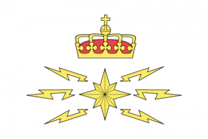 Telenor logo vector 1933[/caption]
1969
In this year, the logo has three blue lines with white space. In the first space, Tele is written in blue and white colors, on its right, there are two red and blue shapes representing lightning bolts. On the second space, Televerket is written in the same way and has the same shapes with same colors.
[caption id="attachment_80536" align="aligncenter" width="300"]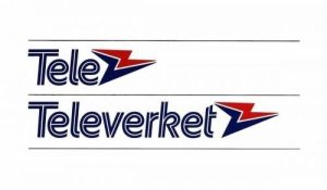 Telenor logo vector 1969[/caption]
1995
In this year, the logo has a blue shape that seems like a person holding a red lightning bolt. On its right, Telenor is written in blue color.
[caption id="attachment_80537" align="aligncenter" width="300"]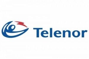 Telenor logo vector 1995[/caption]
2001
In this year, the logo is the same but it is now designed in 3D and the direction of the shapes is vertical. Telenor is written in light blue color but this time, the letter T is small.
[caption id="attachment_80538" align="aligncenter" width="300"] Telenor logo vector 2001[/caption]
2006
In this year, the logo has a flower consisting of three petals in light blue color and Telenor is written on its right in black color.
[caption id="attachment_80539" align="aligncenter" width="300"] Telenor logo vector 2006[/caption]
Building of Telenor Logo
The first telephony service was started in 1878 between Tvedestrand and Arendal. After this innovation went viral, the service started between Stockholm and Christiania in 1893. Telephony automation service was started in 1920 and was completed in 1985. Telenor logo is based on the following two things.
Colors
In the first year, yellow, black and red color was used in the logo. Second year, blue, white and red colors were used in the logo. In the third and fourth year, blue and red colors were used. In the last year, light blue and black colors were used.
Font
There was no text in the logo in the first year. In the second year, the font was completely customized. In the last three years, customized Calibri Body font was used.
Provided Services
VectorSeek provides editable formats of Telenor logo for free and without any sign-up on login. Just click on the desired format and that is it. We have the following formats of Telenor logo:
- Telenor logo PNG
- Telenor logo SVG
- Telenor logo AI
- Telenor logo Vector
The best part is that you can download all of these formats in a zip file.
Variants of Telenor Logo
VectorSeek offers their visitors different variants of Telenor logo for free and, in the best quality. We understand that different variants of logos are used of different reasons and we have the following variants of Telenor logo:
- Telenor old logo
- Telenor original logo
- Telenor logo black and white
- Telenor logo transparent
Conclusion
We are not sure why a telegraph and telephony services company would have a crown as a logo. The second logo is somewhat relevant and the last three logos very much represent the company’s core services and operations. Visitors can download Telenor logo PNG format and experiment with it.

