Texas Roadhouse Logo Vector
Quick Info
- Posted:
- Website: www.texasroadhouse.com/
- Quality: High Resolution
- Categories:
- Report Copyright Issue
About Texas Roadhouse
Texas Roadhouse is an American steakhouse restaurant that cooks steaks in Southwestern and Texan cuisine style. Its headquarters are in Louisville, California. It has branches in 627 locations according to a stat done in August 2021. These branches are allocated in 49 United States cities and, in 29 branches in international countries.
It was first opened on February 17, 1993, and it was first opened in Green Tree Mall in Clarksville. It was founded by W. Kent Taylor, Kent worked in restaurants and nightclubs and he also worked as a manager in KFC (Kentucky Fried Chicken) after saving money, he quit here and started Texas Roadhouse.
Meaning and History of Texas Roadhouse Logo
The logo of Texas Roadhouse only changed twice and both logos were liked by every generation every time they changed because they gave complete meaning to the company. It changed twice in the two following years:
- 1993
- 2012
Evolution of Texas Roadhouse Logo
Texas Roadhouse is a worldwide famous restaurant for its steaks. The logo has a lot to do with its success as it attracted people from the very beginning when it was started.
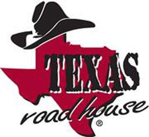
1993
This year, the logo seemed like a semi-professional sketch artist has made the logo but it was very much new to that gen. It consisted of the map of Texas in pink color with a black cowboy hat on the top point of the map and “Texas” was written in capitalized letters on the middle right side of the map and “roadhouse” was written in small letters at the end of the map. Both of these words are in dark blue color.
2012
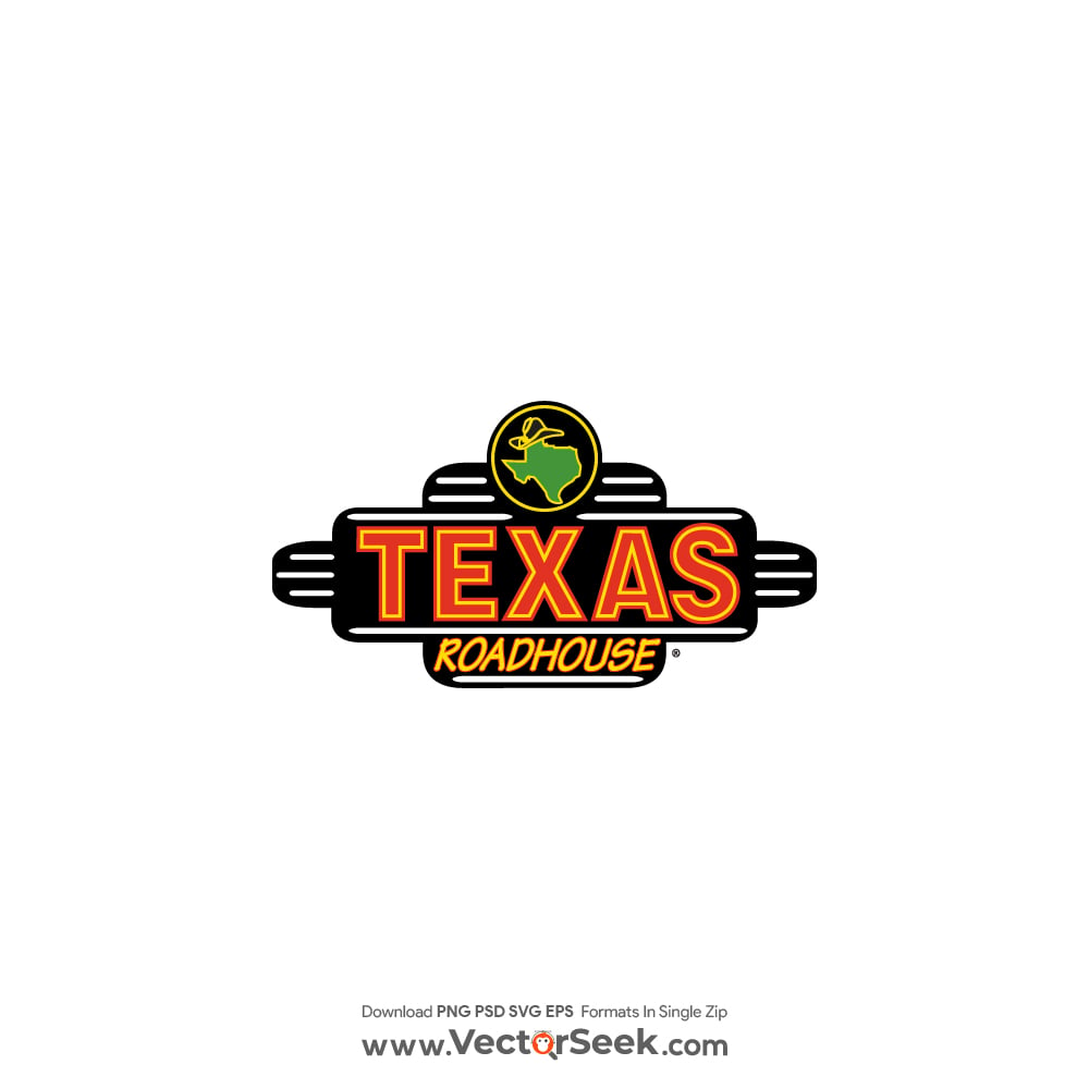
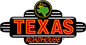
This year, the logo was modernized as it was a need of that marketing era and it is still the same. You can still see the map with the hat on top of the logo. But now, the map and the cowboy hat have a yellow outline with green color in them and both of these are in a yellow outlined circle.
However, Texas is still capitalized and has an orange outline with yellow inline and filled again with orange and a roadhouse is right underneath it and is now capitalized and is in red color.
The whole logo has a black background that shapes with white lines in it – the lines don’t touch the words and shapes in it.
Building of Texas Roadhouse Logo
Every font in the world is divided into two factors:
1) color
2) font
Moreover, Texas Roadhouse had interesting fonts and colors both times it evolved.
Font
In the first year, the font was written in Calisto MT, and the roadhouse was written in simple sans-serif. In the last year of modification, in bolded Calibri and roadhouse was written in MV Boli.
Color
In the first year, the colors used were: yellow, pink, and dark blue, and, in the last modification year, the used were: yellow, green, red, orange, white, and black.
Provided Services
At VectorSeek, you can find (enter number) different types of Texas Roadhouse logos which are free to download and you can use them anywhere. You will find the following formats of Texas Roadhouse logos here:
- Texas Roadhouse logo PNG
- Texas Roadhouse logo SVG
- Texas Roadhouse logo Vector
- Texas Roadhouse logo AI
You can also download all high-quality Texas Roadhouse logo variants in ZIP files with just one click.
Variants of Texas Roadhouse Logo
Here at VectorSeek, you can download two variants of Texas Roadhouse logos that are downloaded by people around the world, the commonly download variants of Texas Roadhouse logos are:
- Texas Roadhouse's original logo
- Texas Roadhouse's old logo
Conclusion
The logo used bright and amazing colors. The black and yellow colors are always attractive but adding orange, white and green made the logo more eye-catching. Adding pink color to any logo is a graphic designer’s nightmare but the early designer of the logo did like it was a game and it played a huge role in its success of it.

