Tigres UANL Logo Vector
Quick Info
- Posted:
- Website: www.tigres.com.mx/en/
- Quality: High Resolution
- Categories:
- Report Copyright Issue
About Tigres UANL
Tigres UNAL is also known as Tigres or Club de Futbol Tigres de la Universidad Autonoma de Nuevo Leon. It is a football club based in San Nicolas de Los Garza, Mexico. It was founded in 1960 and the club is known as the top tier of the Mexico Football League system it spent 60 years in Liga MX.
The club had three nicknames; Los Tigres means The Tigres, La U de Nuevo Leon means The U of Nuevo Leon, and Los Auriazules means The Golden Blue Ones. It is owned by Cemex and UNAL. Its chairman is Diego Cocca.
Meaning and History of Tigres UANL Logo
When the team is playing in Mexico, it wears a yellow and blue uniform and when they are playing in a different country, they wear only blue uniforms. The football team got their first success when they won Copa MX defeating Club America in 1975. The Tigres UNAL changed its logo 11 times in the following years.
- 1960
- 1974
- 1996
- 2000
- 2002
- 2012
- 2015
- 2016
- 2017
- 2018
- 2019
Evolution of Tigres UANL Logo
Tigres UNAL have been champions 7 times and won Copa MX 3 times. As for foreign successes, the team was a runner-up in River Plate in 2015 and won the CONCACAF Champions League in 2020. The Tigres UNAL changed their logos in the following years.
1960
This year, the logo is a 2-layered nested circle. The first part has a thick black outline with a white filling. There is unclear text written in black color on the top and bottom part of the circle. The second layer has a fierce tiger facing to the left and is in white and black color.
[caption id="attachment_75029" align="aligncenter" width="150"] 1960 logo[/caption]
1974
This year, the logo has an enlarged letter U in yellow color with a thin black outline. On the right part of U, there is a 2-layered circle. The first layer of the circle is yellow with a thin blue outline, and on the top ‘CLUB DEPORTIVO’ is written, and on the bottom, ‘TIGRES. UANL .’ is written in blue color. In the second layer, there is a tiger facing to the left. The tiger is colored now and is on a white background.
[caption id="attachment_75030" align="aligncenter" width="200"]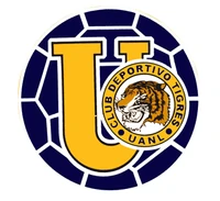 1974 Logo[/caption]
1996
This year, the logo has Tigres written in blue color with a yellow outline and below it, there is a paw of the tiger in yellow and blue color and its’ nails are white and it is grabbing a football. There are yellow, blue and white strips between the football and the tiger’s paw.
[caption id="attachment_75031" align="aligncenter" width="200"] 1996 Logo[/caption]
2000
This year, the Tigres is written in the way. Now the letters are yellow in color and have a blue outline with a slight white gradient. Below it, there is a badge and it has a tiger’s paw. The letter T is outside on the right side of the badge. It is designed in a way to look like a part of a tiger’s paw. There are two blue stars on the top right corner of the badge.
[caption id="attachment_75032" align="aligncenter" width="200"] 2000 Logo[/caption]
2002
This year, the logo has a square. There is a blue T in the logo and the ‘TIGRES’ is written on the first part of the T. The remaining part of the square is yellow and the bottom part of the square has two blue stars and between them, UANL is written in blue color. The square has a thin blue outline.
[caption id="attachment_75033" align="aligncenter" width="200"] 2002 Logo[/caption]
2012
This year, the square is now vertical. There is a blue star on the top of the square. The outline is gone. Inside the square, in the top part, TIGRES is written in dull yellow color. There is a yellow U in and a tiger’s face is designed in it. On the bottom part of the square, there are two yellow stars and between them UANL is written in yellow color.
[caption id="attachment_75034" align="aligncenter" width="166"] 2012 Logo[/caption]
2015
This year, everything is the same but now there is a yellow star in the middle space of the letter U.
[caption id="attachment_75035" align="aligncenter" width="150"]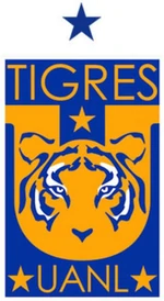 2015 Logo[/caption]
2016
This year, the stars near the UANL and the star in the middle of U have shifted outside on top of the square. Now there are 4 yellow stars and the rest is the same.
[caption id="attachment_75036" align="aligncenter" width="200"] 2016 Logo[/caption]
2017
In this year, the square has a white outline and is on a blue background. Now there are 5 yellow stars and the rest is the same.
[caption id="attachment_75037" align="aligncenter" width="200"] 2017 Logo[/caption]
2018
This year, the blue background is now dark blue and there is another yellow star on top of the 5 yellow stars and the rest is the same.
[caption id="attachment_75038" align="aligncenter" width="150"] 2018 Logo[/caption]
2019
This year, all the stars have gone from the logo and the white outline is also gone. The colors are dull now and the rest is the same.
[caption id="attachment_75039" align="aligncenter" width="207"] 2019 Logo[/caption]
On Our Website: You can see the logo in an orange background, there is the white outline again. The yellow stars and now blue and now there are 7 stars; 3 on the top row and 4 below them. The yellow color is replaced with orange in the logo.
[caption id="attachment_75040" align="aligncenter" width="300"] 7 star logo[/caption]
Building of Tigres UANL Logo
Tigres is basically the football team of the University of the State of Nuevo Leon. The team was first named Jabatos de Nuevo Leon. Tigres UNAL won their first match outside Mexico in Houston, Texas and it was the InterLiga Championship in 2005. Tigres UNAL’s logo is made of the following things.
Font
All the years, Calibri Body font was used in the logos.
Color
In the first year, only black and white colors were used in the logo. For the rest of the years, the common colors used in the logos were yellow, black, blue and white.
Provided Services
At VectorSeek, you can find useful editable formats of the Tigres UANL logo. The editable formats are free to download and with all legal rights. You can edit them in any way you want. We have the following formats of Tigres UANL logo:
- Tigres UANL logo PNG
- Tigres UANL logo SVG
- Tigres UANL logo AI
- Tigres UANL Vector
You can download all of these formats in a zip file.
Variants of Tigres UANL Logo
VectorSeek ensures to provide the latest variants of Tigres UANL logo in HD quality for free. Download the following variants of Tigres UANL logo for free and, with a single click:
- Tigres UANL old logo
- Tigres UANL original logo
- Tigres UANL logo black and white
- Tigres UANL logo transparent
Conclusion
Every football logo starts with some kind of animal, stars and slowly comes in a badge and later it is minimalized. All the logos of football clubs are fancy and they always raise the bar of logo designing. Except for the first one, all the logos of Tigres UANL are brilliant.

