Tmnt Logo Vector
TMNT Logo: Company Overview
TMNT is the abbreviation of Teenage Mutant Ninja Turtles. It is a media franchise of Ninja Turtles and was created by Peter Laird and Kevin Eastman who are renowned comic book artists. The story revolves around 4 turtle brothers trained in ninjutsu and they fight evil in New York City. The story also involves a sensei turtle, a rat who is a splinter, and two human friends named Casey Jones and April O’Neil.
It started in 1984 and from this year to 2009, the series was owned by Mirage Studios. From 2009 to till date, the series has been owned by Nickelodeon. The series became a mega hit and merchandise like Ninja Turtle toys sold up to $1.1 billion from 1988 to 1992. You will also find many Ninja Turtle video games.
Colors of TMNT Logo
TMNT changed its logo 2 times and used the following colors
| Year | Colors |
| 2021 | White, red, yellow, green |
| 2023 | Black, red, yellow, green |
TMNT Logo Details
The series of Ninja Turtles has 8 logos but the TMNT series has only 2 logos. The logos have very little similarity to the original series’ logo. Compared to the original series, these 2 logos have stuck to mainly 3 colors.
History of TMNT: Evolution of the Logo
TMNT changed its logo in the following ways.
2021
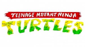
In this logo, you can see a red ribbon that has uneven ends. In this ribbon, you will see text that says “Teenage Mutant Ninja”, all of these letters are capitalized and in white color. Outside below the ribbon, Turtles is written in uppercase letters. The first half of the letters are in yellow color and the second half of the letters are in green color.
2023
This logo was a series of Mutant Mayhem series. On top of the logo, you can see Teenage Mutant Ninja in red color with a black show on each word. The letters E and M have extended ends. The word Ninja is underlined by a red and black color. Below it, Turtles is written in green color with a yellow outline. Below it, Mutant is written on top of Mayhem in green color. All of these letters are capitalized.
TMNT Cover Logo
Remember that it is not a logo of TMNT, it is a cover logo of the series.
Conclusion
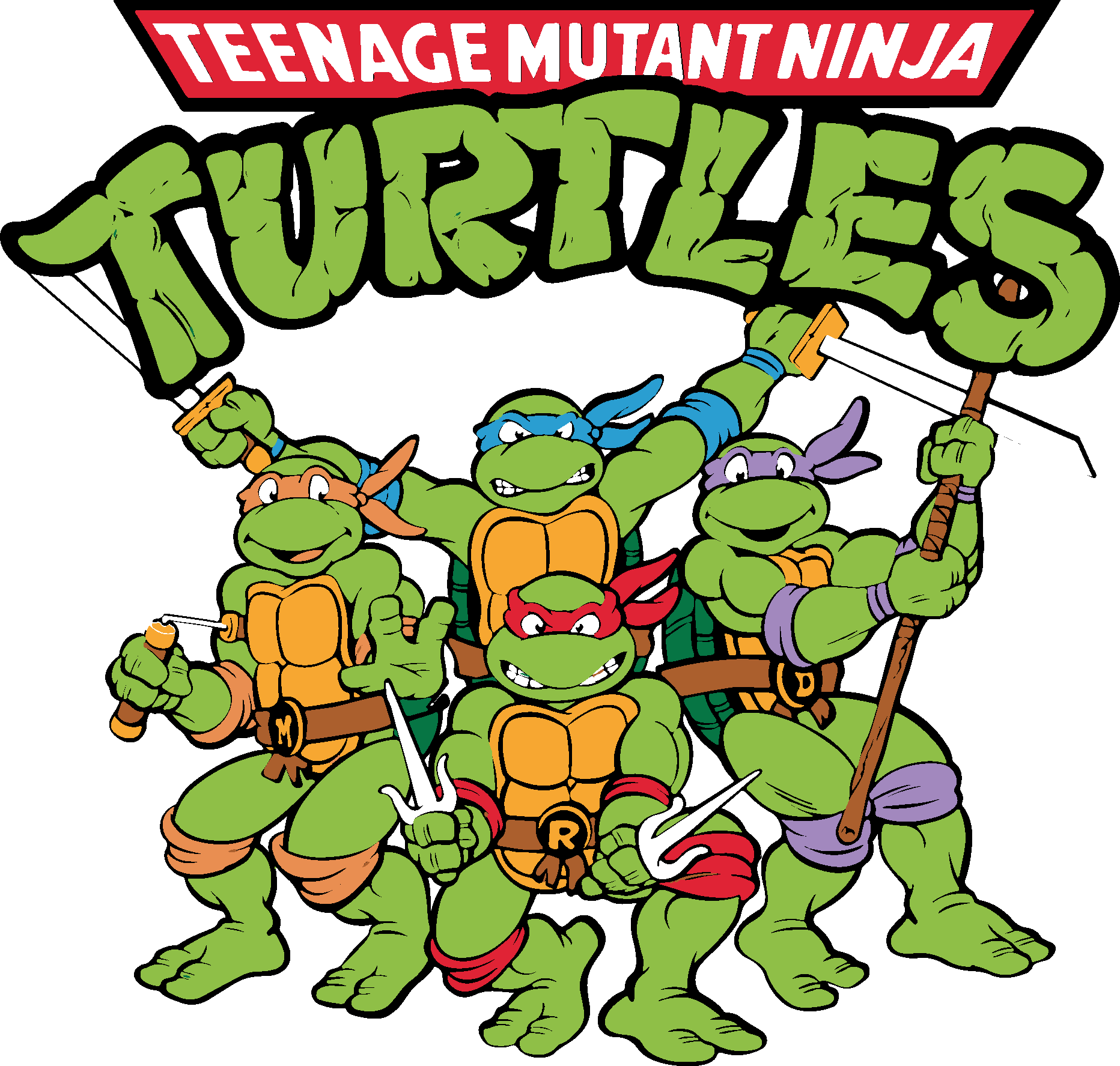
Both of the logos used a customized ninja font. The fonts are highly tailored. We cannot say exactly what the font type is. The cover of the TMNT is very different from the logo. The cover logo has a leaned rectangle in red color with black outline and Teenage Mutant Ninja is written in white color. Below it, Turtles is written in green color with black outline and below it, the 4 ninja brothers are designed.

