Welch’s Logo Vector
Quick Info
- Posted:
- Website: www.welchs.com/
- Quality: High Resolution
- Categories:
- Report Copyright Issue
About Welch's
Welch’s is also known as Welch Foods Inc. It is an American company which was founded in 1869 in New Jersey. It was founded by Thomas Bramwell Welch. Its headquarters is in Massachusetts, United States. Welch’s is owned by National Grape Cooperative Association since 1956. The company is known for producing the best juices, jellies and jams made from dark concord grapes.
It is also known for making the best white Niagara grape juice. The company also manufactures dried fruits, fruit snacks, organic juices, shelf-stable concentrates, frozen and refrigerated juices. Welch’s has been producing grape flavored soft drinks since 1974.
Meaning and History of Welch's Logo
The founder Thomas was a dentist and he founded his company with the assistance of his son Charles Welch. The duo sold the company in 1956 which had 1300 grape growers located in Ontario, Washington, Maryland, Pennsylvania, Ohio, New York and Michigan. In the 1800s, the company’s logo just had ‘Welch’s Grape Juices’ written on the packaging. The logo of the company emerged in 1900s and the company changed its logo 6 times in the following years.
- 1910
- 1947
- 1985
- 1996
- 2006
- 2013
Evolution of Welch's Logo
Welch’s was the biggest sponsor of ABC primetime show ‘The Flintstones’ in 1960s. The cartoons had bottles of Welch’s juice bottles and the characters can be seen on juice bottles. Later, the company also sponsored ‘The Archies’ cartoons. Welch’s oldest building called the Welch Factory Building No. 1 is listed among the historic places since 1983. Welch’s changed its logo in the following ways.
1910
In this year, the logo is a square with curved edges and has a green border with white filling. In the square, Welch’s is written in blackish blue color and below it, there is a green strip slight diagonal and on it, Grape Juice is written in purplish blue color. There is a design of grapes and leaves on the back side of the strip. On the bottom right side of the grapes design, Serve is written on top of Cold.
Below the strip, CONTENTS is written on top of ’16 OZ.NET’. Then below it, ‘From Choicest’ is written on top of ‘Concord Grapes’. Below it, ‘Pure & Unfermented’ is written on top of ‘No 140 Guaranteed under Food and Drugs Act by’ and below it, ‘The WELCH GRAPE JUICE CO.’ is written and then below it, ‘WESTFIELD. N.Y., U.S.A.’ is written. All of the text is written in purplish-black color.
[caption id="attachment_72918" align="aligncenter" width="212"]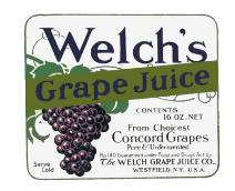 1910 Logo[/caption]
1947
This year, the logo was overhauled. This logo had a light purple square and Welch’s is written in white color.
[caption id="attachment_72919" align="aligncenter" width="251"] 1947 Logo[/caption]
1985
This year, the purple square is gone and Welch’s is written in black color.
[caption id="attachment_72920" align="aligncenter" width="268"] 1985 Logo[/caption]
1996
This year, the logo became very traditionally fancy. Now the logo has a fruit basket with apples, green grapes, black grapes, pear, strawberries and some leaves. There is a banner coming from the back and overlapping the front of the fruit basket. The banner has a purple border with white filling. Welch’s is written on the banner in purple color and below it there are two purple lines and between these lines ‘SINCE 1869’ is written in purple color.
[caption id="attachment_72921" align="aligncenter" width="181"] 1996 Logo[/caption]
2006
This year, the logo again changed a lot. Now the logo had a dark blueish purple square and Welch’s is written in white color.
[caption id="attachment_72916" align="aligncenter" width="225"] 2006 Logo[/caption]
2013
This year, the logo has a banner making an infinity sign. It has a dark blue border with white filling and Welch’s written in dark blue color.
[caption id="attachment_72917" align="aligncenter" width="201"] 2013 Logo[/caption]
Building of Welch's Logo
The idea came to Welch when he opposed the making of wine from grapes and recommended using juices instead. He even said that wine should be replaced with grape juice in the holy communion services in the church. He moved to Vineland, New Jersey to start his very own alcohol-free society. Welch’s logo is based on the following two things.
Font
In the first year, the words ‘Welch’s’, ‘Grape Juice’, ‘CONTENTS’, ’16 OZ. NET’, ‘From Choicest’, ‘Concord Grapes’, ‘Pure & Unfermented’, ‘WELCH GRAPE JUICES CO’ and ‘WESTFIELD NY USA’ were written in customized Times New Roman font. The words ‘NO 140 Guaranteed under Food and Drug Act by’ and ‘Serve Cold’ are written in customized Calibri Body font.
In the second year, bold Calibri Body font was used. In the third and fourth years, bold Times New Roman font was used. And in the last two years, Welch’s was written in Gelica and TT Norms font.
Color
In the first year, green, white, purplish blue, and blackish blue colors were used. In the second year, light purple and white colors were used. Then in the third year, only black color was used. In the fourth year, brown, purple, white, yellow, green, and red colors were used. And in the fifth year, dark purple and white colors were used. In the last year, blue and white colors were used in logo.
Provided Services
To download different formats of logo, all you need to do is click and you are done. VectorSeek offers the following formats of logo:
- Welch’s PNG logo
- Welch’s SVG logo
- Welch’s AI logo
- Welch’s logo Vector
You can download Welch’s logo in a ZIP file without any sign-up.
Variants of Welch's Logo
Welch’s logo on their business cards and signups so, download Welch’s logo with the right to use. Below are the most downloaded types of variants of logo:
- Welch’s old logo
- Welch’s original logo
- Welch’s black and white logo
- Welch’s transparent logo
Conclusion
We think that the first logo was basically a sticker and that is why it had so many things on it. On a personal scale, we liked the logo of 1996 which has a fruit basket and it has fresh and bright colors.

