WWE Logo Vector
Quick Info
- Posted:
- Website: www.wwe.com/
- Quality: High Resolution
- Categories:
- Report Copyright Issue
Overview
Wrestling is the oldest sport of the world. It was done in showoff power, get enrolled in the army and a way for men to spend quality time with each other. Today, you will learn about WWE’s logo history, meaning, timeline, transformation, evolution and making. You can also download it in different formats and variants including PNG, AI, SVG and Vector.
About WWE
WWE is the abbreviation for World Wrestling Entertainment and it is an American professional wrestling promoting platform. It was previously known as Titan Sports Inc. in 1980, its name was then changed to World Wrestling Federation Entertainment in 1999. The name World Wrestling Entertainment was finalized in 2002.
Its predecessor is Capitol Wrestling Corporation LTD and it was founded in 1953. It was founded by Vince J. McMahon and Jess McMahon. Its headquarters is in Connecticut and its current executive chairman is Vince.
Meaning and History of WWE Logo
Its current CEO is Nick Khan and its President and CFO is Frank A. Riddick II. The company made a profit of more than 1 billion US dollars. The company employs more than 800 people. Back in the early 90s, the company was considered one of the biggest wrestling promoting platforms in the world. WWE changed its logo 10 times in the following years.
- 1952
- 1963
- 1971
- 1979
- 1982
- 1985
- 1995
- 1997
- 2002
- 2014
Evolution of WWE Logo
For those who think that WWE’s wrestling is real; it’s time for a reality check because the company itself says that matches are not actual contests. They are based on scripted entertainment but the bleeding of wrestlers are legit whenever it happens or when things get heated. WWE changed its logo in the following ways.
WWE logo in 1952
In 1952, the logo is given the shape of sunglasses which are half finished. There is a line making a W in the center. All of the logo in black color.
[caption id="attachment_82690" align="aligncenter" width="300"] 1952[/caption]
WWE logo in 1963
In 1963, the logo has a lot of text. The World Wide is written on top of WRESTLING ENTERTAINMENT and below it, W.W.W.F is written in white color in a black rectangle. On its right, CHAMPIONSHIP is written in black color and below it, WILLIE GILZENBERG is written on top of PRESIDENT. All of the letters are in black color. On the left side of the text, there is a wrestler throwing another wrestler. These figures are in black color with white filling.
[caption id="attachment_82691" align="aligncenter" width="300"] 1963[/caption]
WWE logo in 1971
In 1971, the logo has a black and white globe and there are two black lines filled gaps having two W letters in white color with thin black outline. On top of the globe, WORLD WIDE WRESTLING FEDERATION is written in black color.
[caption id="attachment_82692" align="aligncenter" width="300"] 1971[/caption]
WWE logo in 1979
In 1979, the logo has a black and white globe and some countries are highlighted. On top of it, THE WORLD WRESTLING FEDERATION is written and on top of it, W.W.F is written in black color.
[caption id="attachment_82693" align="aligncenter" width="300"] 1979[/caption]
WWE logo in 1982
In 1982, the logo has two W letters and a letter F designed into a single shape. The whole logo is mainly in black color with a single black line.
[caption id="attachment_82694" align="aligncenter" width="300"] 1982 WWE Vector Logo[/caption]
WWE logo in 1985
In 1985, the logo is the same but it is now in white color and has a black outline.
[caption id="attachment_82695" align="aligncenter" width="300"] 1985 WWE Vector Logo[/caption]
WWE logo in 1995
In 1995, the logo has a small blue square and WWF is overlapped by it in yellow and blue color.
[caption id="attachment_82696" align="aligncenter" width="300"] 1995 WWE Vector Logo[/caption]
WWE logo in 1997
In 1997, the logo had a white WWF with dull black outline and it is underlined in red color.
[caption id="attachment_82697" align="aligncenter" width="300"]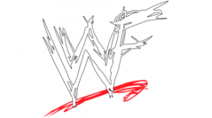 1997 WWE Vector Logo[/caption]
WWE logo in 2002
In 2002, the letter F was removed and the rest of the logo is the same.
[caption id="attachment_82698" align="aligncenter" width="300"] 2002 WWE Vector Logo[/caption]
WWE logo in 2014
In 2014, the logo is still the same but now, it is given a neater look in 2D design.
[caption id="attachment_82699" align="aligncenter" width="300"]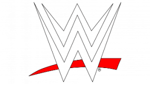 2014 WWE Vector Logo[/caption]
Designing of WWE Logo
The company’s history was long before it was started. It is traced back to 1953 when it operated under the name of Capitol Wrestling Corporation. Instead of WWE, it was called CWC. WWE logo is based on the following two things.
Colors
In the first 6 years, the logo was in black and white color. And seventh year, the logo used blue and yellow colors. In the last three years, the logo used black, white and red colors.
Fonts
In the second and third logo, the logo used customized Calibri Body fonts. And In the fourth year, the logo used customized Times New Roman and Calibri Body fonts. In the rest of the years, there are no texts in the logo.
Provided Services
At VectorSeek, you can find the best and highest quality of WWE logo in different editable files which are completely free. To download different formats of WWE logo, all you need to do is click and you are done. VectorSeek.com offers the following formats of WWE logo:
- WWE logo PNG
- WWE logo SVG
- WWE logo AI
- WWE logo Vector
You can download WWE logo in a ZIP file without any sign-up.
Variants of WWE Logo
VectorSeeks make sure to bring up most wanted variants of WWE. We want you to experiment with different and trendy variants of WWE logo so that you can enhance your editing skills. We also know that people now use WWE logo on their business cards and signups so, download WWE logo with the right to use. Below are the most downloaded types of variants of WWE:
- WWE WrestleMania 32 Logo
- WWE WrestleMania 31 Logo
- WWE WrestleMania 26 Logo
- WWE Money In The Bank Logo
Conclusion
The logo transformation and timeline is epic of WWE. The first logo is impressive and it seems they hired a graphic designer from the future. The logo having a two wrestlers fighting was extra and the logos having globes were way too basic. We still don’t get why the company used bright colors in the 7th logo. The last three logos represent roughness and toughness. You can download WWE logo in PNG, AI, Vector and SVG variants.

