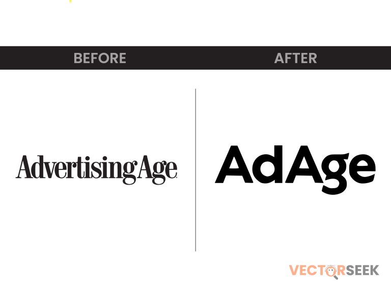
AdAge, one of the most respected names in marketing and advertising journalism, has recently unveiled a new logo inspired by the 1930s. This redesign is not just a visual update—it’s a statement about the brand’s heritage and its vision for the future. But does this nostalgic look align with the modern digital landscape?
In this blog, we’ll explore the history of AdAge’s branding, the reasoning behind the redesign, and what it means for the publication’s identity in the fast-changing world of advertising.
The Evolution of AdAge’s Logo: From Classic to Contemporary
AdAge has undergone several logo updates over the decades, each reflecting shifts in design trends, technology, and industry focus. Here’s a look at how the logo has changed over time:
| Year | Logo Style | Key Features |
| 1930s | Original Classic | Serif typography, newspaper-style layout |
| 1980s | Modernized Update | Sleek, simple lettering, black-and-white color scheme |
| 2000s | Digital-Friendly | Sans-serif font, streamlined appearance |
| 2023 | 1930s Revival | Vintage-inspired lettering, bold and authoritative |
Why AdAge Chose a 1930s-Inspired Logo
1. Honoring Its Legacy
Since its founding in 1930, AdAge has been a trusted voice in advertising. The throwback design pays tribute to the publication’s origins while reinforcing its status as an industry authority.
2. Blending Classic and Modern Elements
The new AdAge logo merges retro typography with modern simplicity, striking a balance between heritage and digital relevance.
3. Standing Out in a Crowded Market
With numerous marketing news outlets emerging, the bold, nostalgic branding helps AdAge maintain its distinct identity while drawing attention to its longstanding credibility.
Breaking Down the New Logo: What’s Changed?
| Feature | Old Logo | New Logo |
| Font Style | Sans-serif, modern | Vintage-inspired serif |
| Color Scheme | Black and red | Classic black with subtle retro hues |
| Design Theme | Clean and digital-first | Heritage-driven, authoritative |
| Readability | Optimized for screens | Bold and striking |
The vintage aesthetic doesn’t just look appealing—it reinforces trust, credibility, and a deep-rooted connection to advertising history.
Industry Reactions: What Experts Are Saying
The response to AdAge’s rebranding has been overwhelmingly positive. Experts in branding and media have praised the move for its strategic blend of history and modernity. Here’s what industry professionals are saying:
- “AdAge’s new logo is a masterclass in brand storytelling—honoring its past while staying future-focused.”
- “It’s refreshing to see a publication embrace its roots instead of chasing fleeting design trends.”
- “The redesign reminds us why AdAge remains a powerhouse in advertising journalism.”
What This Rebrand Teaches Us About Branding
AdAge’s rebranding offers key takeaways for businesses considering a logo update:
- Heritage can be a powerful branding tool when executed correctly.
- A timeless design stands out in an industry filled with fleeting trends.
- Brand consistency is crucial—even in digital transformations.
Final Thoughts
AdAge’s 1930s-inspired logo is a bold move that bridges the gap between past and future. By embracing its rich history while staying visually relevant, the publication strengthens its authority in the marketing world.
Call to Action
Want access to 100,000 brand logos in a single ZIP file? Download now for just $9: https://vectorseek.com/download-10000/


