• Home
  • Logo History
  • Rebranding
  • Logo Symbolism
  • News
  • Home
  • Logo History
  • Rebranding
  • Logo Symbolism
  • News
Home » Evernote’s Darker, Sleeker Look: The Power of a Small Logo Change
Rebranding

Evernote’s Darker, Sleeker Look: The Power of a Small Logo Change

Vector SeekBy Vector SeekFebruary 19, 2025No Comments3 Mins Read11 Views
Facebook Twitter Pinterest LinkedIn Telegram Tumblr Email
Evernote’s Darker, Sleeker Look The Power of a Small Logo Change-01
Share
Facebook Twitter LinkedIn Pinterest Email

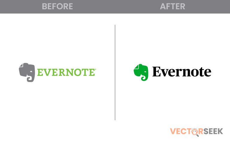
Evernote, one of the most popular note-taking apps, recently introduced a darker, sleeker logo. While at first glance, the change may seem minor, it actually carries big implications for the brand’s identity, usability, and perception. But why did Evernote make this change, and how does a subtle redesign impact user experience and brand recognition?

In this post, we’ll explore the strategy behind Evernote’s rebranding, its impact, and what businesses can learn from this design evolution.

The Evolution of Evernote’s Logo

Evernote has used the elephant head logo since its launch in 2008, symbolizing memory, organization, and intelligence. Over the years, the logo has undergone small but significant changes:

Year Logo Style Notable Features
2008 Classic Green Elephant Traditional, bright green color
2018 Modernized Elephant Refined design with cleaner lines
2023 Darker, Sleeker Look Darker shades, minimalistic approach

The new, darker logo reflects modern design trends that emphasize sleekness, professionalism, and digital adaptability.

Why Did Evernote Choose a Darker Logo?

The decision to darken the Evernote logo was not random. Here are the key reasons behind the change:

🔹 Enhanced Professionalism

  • Darker colors convey sophistication and maturity.
  • Many productivity apps, like Notion and Microsoft OneNote, use darker tones to create a more premium feel.

🔹 Improved Contrast and Visibility

  • The previous bright green was harder to integrate with different UI themes.
  • The new darker green stands out better on both light and dark backgrounds.

🔹 Modern, Minimalist Branding

  • Companies like Spotify, WhatsApp, and Instagram have moved toward sleek, refined logos.
  • Evernote followed the trend to stay relevant in a changing digital landscape.

The Impact of Evernote’s Logo Change

Many businesses worry that even a small logo change can confuse users. However, Evernote’s subtle approach worked in its favor. Here’s why:

Impact Explanation
Stronger Brand Identity The Evernote new logo aligns Evernote with modern design standards.
Better User Experience Improved contrast makes the logo clearer in app interfaces.
Increased Brand Loyalty A sleek update reassures users that Evernote is evolving.

According to a 2023 survey by Brandwatch, 70% of users preferred the new Evernote logo, citing its modern appeal and better usability.

What Can Businesses Learn from Evernote’s Rebrand?

If you’re thinking about rebranding, Evernote’s strategy offers key lessons:

✅ Subtle Changes Can Have Big Impacts – A minor color tweak can improve perception dramatically. ✅ Adapt to Modern Trends – Keep up with industry shifts to stay competitive. ✅ User-Centric Design Matters – Ensure readability, accessibility, and visual appeal.

Conclusion: A Small Change with Big Results

Evernote’s transition to a darker, sleeker logo proves that even small tweaks can enhance brand perception and usability. While it retains its iconic elephant design, the refined color palette brings freshness and modernity to the brand.

📢 Want Thousands of Brand Logos for Just $9?

If you love exploring brand designs, get 100,000+ brand logos in a single zip file for just $9!

👉 Download Now

Share. Facebook Twitter Pinterest LinkedIn Tumblr Email
Vector Seek
  • Website

Related Posts

DuPont’s Minimalist Rebrand: How Simplicity Enhances a Legacy Brand

February 19, 2025

Book by Cadillac’s Logo Makeover: Luxury Rebranding for a New Generation

February 19, 2025

Chicago Sun-Times Revamps Its Logo: The Story Behind the New Look

February 19, 2025

Firefox’s Evolving Logo: The Future of Mozilla’s Iconic Fox

February 19, 2025

Glamour’s Retro Makeover: How the Logo Redesign Reflects Modern Elegance

February 19, 2025

Flipboard’s Transparent ‘F’: A Smart Design Choice or a Risky Rebrand?

February 17, 2025
Leave A Reply Cancel Reply

Top Posts

25 Most Famous Green Color Logos That Define Trust, Growth, and Sustainability

May 8, 2025476 Views

25 Famous Companies with Leaves in their Logos – Symbolism, Style & Brand Identity

April 24, 202590 Views

1000 Most Popular Emojis: Names, Meanings, and Easy PNG Downloads

February 15, 202544 Views
Don't Miss

BMW Logos Over the Years: A Deep Dive into Brand Identity and Symbolism

May 23, 2025

BMW is one of those car brands almost everyone knows—and respects. Its story began with…

25 Most Famous Logos in Red Color – Evoking Passion, Power, and Visibility

May 15, 2025

25 Most Famous Green Color Logos That Define Trust, Growth, and Sustainability

May 8, 2025

25 Most Famous Logos in Blue Color: Iconic Designs That Inspire

May 7, 2025
Stay In Touch
  • Facebook
  • YouTube
  • Instagram
  • Pinterest

About

Vectorseek is your premier destination for high-quality vector logos. As a passionate team of designers ourselves, we understand the importance of brand assets in a designer’s toolkit. That’s why we created Vectorseek – to empower designers worldwide with an extensive library of vector logos, ready to use in a multitude of projects.

© VectorSeek All Rights Reserved

Vectorseek is your premier destination for high-quality vector logos. As a passionate team of designers ourselves, we understand the importance of brand assets in a designer’s toolkit. That’s why we created Vectorseek – to empower designers worldwide with an extensive library of vector logos, ready to use in a multitude of projects.

Quick Links

  • Home
  • Logo History
  • Rebranding
  • Logo Symbolism
  • News
  • Home
  • Logo History
  • Rebranding
  • Logo Symbolism
  • News
Most Popular

25 Most Famous Green Color Logos That Define Trust, Growth, and Sustainability

May 8, 2025476 Views

25 Famous Companies with Leaves in their Logos – Symbolism, Style & Brand Identity

April 24, 202590 Views

1000 Most Popular Emojis: Names, Meanings, and Easy PNG Downloads

February 15, 202544 Views
Our Picks

BMW Logos Over the Years: A Deep Dive into Brand Identity and Symbolism

May 23, 2025

25 Most Famous Logos in Red Color – Evoking Passion, Power, and Visibility

May 15, 2025

25 Most Famous Green Color Logos That Define Trust, Growth, and Sustainability

May 8, 2025

Subscribe to Updates

Get the latest creative news from Vectorseek about latest Brand Logos.

Vectorseek News
Facebook Instagram Pinterest YouTube Dribbble
© 2025 VectorSeek Designed by techNgraphic.

Type above and press Enter to search. Press Esc to cancel.