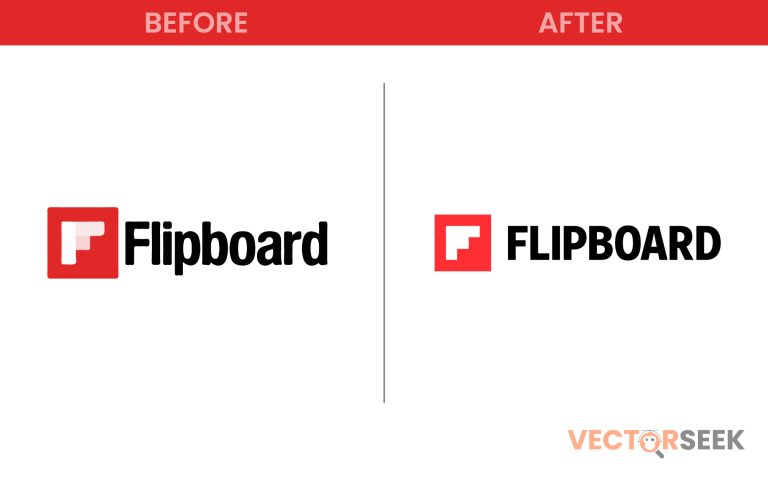
Flipboard, the popular content curation platform, is known for its sleek, user-friendly interface that allows people to discover and engage with news, stories, and insights from across the web. But in recent years, its branding has gone through a major transformation, most notably with the introduction of the transparent ‘F’ logo. This move has sparked a lot of discussion—was it a brilliant design choice or a risky rebrand?
In this blog post, we will analyze Flipboard’s new branding strategy, its impact, potential risks, and whether this transparent ‘F’ was a smart move or a design misstep.
The Evolution of Flipboard’s Logo
Flipboard’s branding journey has evolved significantly since its launch in 2010. Below is a timeline of major logo changes:
| Year | Logo Style | Notable Features |
| 2010 | Classic Red ‘F’ | Bold, blocky, and instantly recognizable |
| 2015 | Sleeker Red ‘F’ | More refined but still bold |
| 2018 | Transparent ‘F’ | A complete departure, focusing on a minimalist approach |
The new transparent ‘F’ logo was designed to represent openness, modernity, and adaptability. Flipboard wanted to showcase its evolution from a simple news aggregator to an interactive platform for thought leaders, brands, and everyday readers.
Why Did Flipboard Choose a Transparent Logo?
The design team behind the rebrand had clear objectives in mind:
- Minimalism and Modern Appeal: Many brands are shifting towards simpler, more adaptable logos. The transparent ‘F’ aligns with this trend.
- Versatility Across Platforms: The see-through effect allows the logo to seamlessly integrate with different backgrounds, making it visually appealing across devices and media formats.
- Symbolizing Open Information: Flipboard curates news and insights from across the internet, and transparency represents accessibility and openness.
But was this a smart move or a potential brand dilution? Let’s break it down.
The Pros: A Smart, Future-Proof Design?
Many design experts believe that Flipboard’s transparent ‘F’ was a strategic move. Here’s why:
✅ 1. Aligns with Modern Branding Trends
Big brands like Instagram, Airbnb, and Google have adopted simplified, flatter, and more adaptive logos. Flipboard’s transparent ‘F’ follows this pattern, making it look more sleek and contemporary.
✅ 2. Enhanced Flexibility Across Media
In an era of diverse digital platforms, logos need to be versatile. A transparent logo can adapt better across websites, apps, and even merchandise.
✅ 3. Creates a Unique Brand Identity
While many brands use solid colors, Flipboard’s choice of transparency sets it apart from competitors like Apple News or Google News.
The Cons: A Risky Rebrand?
Despite its advantages, the transparent ‘F’ has also raised concerns among branding professionals:
❌ 1. Loss of Strong Brand Recognition
The old red Flipboard ‘F’ was bold and easily recognizable. The new transparent design, while modern, can be harder to identify at a glance.
❌ 2. Visibility Issues
The transparent design works well on some backgrounds but can become invisible or unnoticeable on lighter ones, leading to inconsistency in branding.
❌ 3. Risk of Brand Dilution
A strong brand relies on a consistent and memorable identity. Drastic changes—especially one that reduces visual presence—can confuse users and weaken brand recall.
Audience Reaction: What Do Users Think?
Public response to Flipboard’s transparent ‘F’ has been mixed. Some appreciate the sleek modernity, while others feel the brand lost its bold iconic identity.
According to a 2023 online survey, here’s what people think about the new Flipboard logo:
| Opinion | Percentage |
| Love it – it’s modern and sleek | 45% |
| Neutral – no strong feelings | 30% |
| Dislike it – lost its identity | 25% |
While nearly half of users appreciate the change, a significant portion still feels nostalgic for the old red ‘F’ logo.
Lessons for Businesses Considering a Rebrand
If you’re a business owner or designer thinking about a logo refresh, here are some key takeaways from Flipboard’s rebrand:
✅ Consider Your Brand Recognition: If your logo is highly recognizable, drastic changes can confuse users. ✅ Test Visibility Across Backgrounds: A transparent logo may look great in concept but might struggle in real-world applications. ✅ Get User Feedback Before Launching: Audience sentiment matters—gauging responses before committing to a full rebrand can save time and money.
Conclusion: A Bold Step or a Branding Misstep?
So, was Flipboard’s transparent ‘F’ a smart choice or a risky move?
The answer depends on perspective. From a design standpoint, it’s modern, sleek, and adaptive. But from a branding standpoint, it sacrifices some visibility and recognition.
Whether you love it or hate it, Flipboard’s transparent ‘F’ represents a shift towards minimalist branding—a trend that’s shaping the future of digital branding.
📢 Want Thousands of Brand Logos for Just $9?
If you love exploring brand designs, get 100,000+ brand logos in a single zip file for just $9!


