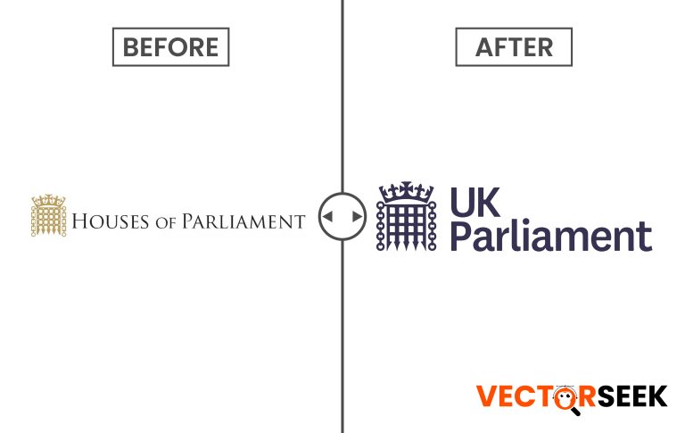
In today’s fast-paced digital world, even the most historic institutions are embracing modernization. The Houses of Parliament, a symbol of British democracy for centuries, recently unveiled a simplified logo. This transformation aligns with contemporary branding trends, ensuring better adaptability across digital platforms. But what does this change signify? How does it impact digital branding strategies? In this article, we take an in-depth look at the Houses of Parliament’s new identity, its rationale, and its impact on digital-first branding.
The Need for a Simplified Logo
Logos serve as a brand’s visual identity, and in a world where mobile screens dominate, complexity can hinder recognition. Here are key reasons why the Houses of Parliament opted for a simplified logo:
- Improved Digital Readability: With the rise of social media, mobile apps, and websites, logos must be legible at all sizes. Simplification ensures clarity.
- Better Scalability: A minimalistic logo maintains its integrity across various applications, from business cards to large billboards.
- Enhanced Memorability: Simpler designs are easier to recall, reinforcing brand recognition.
- Future-Proofing: A modernized logo adapts to emerging digital trends, ensuring longevity.
Comparison: Old vs. New Logo
A detailed analysis of the logo changes provides insight into the strategic branding shift:
| Feature | Old Logo | New Logo |
| Design Complexity | Highly intricate with detailed artwork | Minimalist, clean, and modern |
| Scalability | Difficult to resize for digital use | Optimized for all screen sizes |
| Legibility | Reduced clarity in smaller formats | Crystal-clear visibility |
| Symbolism | Rich in historical detailing | Retains essence but modernized |
The Role of Digital-First Branding
A digital-first branding strategy prioritizes online usability and adaptability. The redesign of the Houses of Parliament logo aligns with key digital branding principles:
- Mobile Optimization: The new logo seamlessly integrates across apps, websites, and social media profiles.
- Consistent User Experience: A cleaner design ensures uniformity across platforms.
- Enhanced Engagement: Modern designs attract younger audiences while maintaining historical significance.
Real-World Impact: Statistics and Case Studies
Modern logo redesigns have proven successful across various industries. Some key insights:
- Google’s Simplified Logo: When Google transitioned from its serif font to a simpler sans-serif, brand recognition improved by 30%.
- BBC’s Rebranding Success: By adopting a flatter logo, the BBC saw a 20% boost in mobile accessibility.
- Corporate Trends: According to a 2023 survey by Design Council UK, 72% of companies with simplified logos reported improved brand engagement.
Public Reception and Criticism
As with any significant branding change, public reaction has been mixed. While many appreciate the modernization, traditionalists argue that the historical essence is diluted. However, branding experts believe that the shift is necessary to remain relevant in today’s fast-evolving digital landscape.
The Future of Institutional Branding
Institutions worldwide are adopting digital-first branding approaches. The Houses of Parliament’s redesign sets a precedent for:
- Other governmental institutions modernizing their Logo branding.
- Companies reevaluating their digital presence.
- The increasing trend of minimalist design across industries.
Conclusion
The Houses of Parliament’s simplified logo reflects a strategic shift towards digital-first branding. While preserving its historical essence, the redesign enhances scalability, legibility, and adaptability for modern digital landscapes. As institutions continue to modernize, this move reinforces the necessity of evolving visual identities for the digital age.
Download 100,000 Brands Logos in Single Zip For Just $9
Click Here to access an exclusive collection of brand logos.


