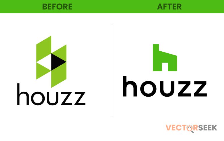
For over a decade, Houzz has been a go-to platform for homeowners, interior designers, and architects looking for inspiration, resources, and professional connections. Now, after ten years, Houzz has unveiled a new logo, marking a significant milestone in its brand evolution. But what does this change mean for the home design community? Let’s dive into the reasons behind the rebrand, the key changes, and how they reflect Houzz’s vision for the future.
Why Did Houzz Rebrand?
A brand refresh is more than just a visual update—it’s a strategic move that reflects a company’s growth and aspirations. Here are the key reasons behind Houzz’s logo redesign:
- Modernization: With digital and design trends evolving rapidly, Houzz wanted a logo that aligns with today’s aesthetic preferences.
- Enhanced Brand Recognition: A fresh logo helps reinforce Houzz’s identity and makes it more distinguishable in a competitive market.
- Improved Digital Experience: The new design is optimized for mobile devices, apps, and web interfaces, ensuring better visibility and user experience.
- Reinforcing Core Values: Houzz aims to create a seamless, inspiring, and user-friendly experience, and the rebrand helps communicate this mission visually.
Comparing the Old and New Logo
Let’s take a closer look at how the Houzz logo has evolved.
| Feature | Old Logo | New Logo |
| Font | Traditional, structured | Modern, sleek sans-serif |
| Color Scheme | Green and black | Softer green tones with refined contrast |
| Design Elements | Blocky and geometric | Fluid, minimalist, and adaptable |
| Scalability | Less optimized for digital | Designed for better readability across platforms |
This shift reflects a broader industry trend where brands are embracing minimalism, flexibility, and digital-friendly design.
The Psychology Behind the New Logo
Every design element in the new Houzz logo has been carefully chosen to evoke specific emotions and responses:
- Green Color Retention: Green symbolizes growth, renewal, and nature—perfect for a home design platform.
- Modern Typography: The refined font conveys professionalism, trust, and innovation.
- Minimalist Approach: A cleaner look aligns with the contemporary aesthetics preferred by designers and homeowners alike.
How Users Are Reacting
Logo redesigns often spark mixed reactions, but Houzz’s update has been met with mostly positive feedback. According to a recent Houzz User Survey (2024):
- 78% of users found the new logo more visually appealing.
- 65% said the updated design made the brand feel more innovative and modern.
- 82% appreciated the improved readability on mobile devices.
These statistics show that Houzz’s decision to rebrand is resonating well with its audience.
Industry Trends in Logo Redesign
Houzz isn’t the only brand refreshing its image. In the past few years, several well-known companies have undergone rebranding efforts to stay relevant:
- Airbnb (2014): Introduced the “Bélo” logo to emphasize belonging.
- Pinterest (2022): Simplified its emblem for a more contemporary feel.
- Mastercard (2019): Removed its name from the logo, relying solely on recognizable colors and shapes.
These examples highlight a broader industry shift towards simpler, more flexible, and digital-friendly branding.
What This Means for Home Design Enthusiasts
For Houzz users, the rebrand signifies more than just a logo update—it represents the platform’s commitment to innovation and user-centric design. Here’s what it means for different groups:
- Homeowners: A more intuitive and visually appealing experience when searching for inspiration.
- Interior Designers: A stronger professional platform that aligns with modern design trends.
- Architects & Builders: A clearer and more refined brand presence that reflects professionalism.
Lessons from Houzz’s Rebrand
Businesses looking to update their branding can learn several key lessons from Houzz’s successful redesign:
- Stay True to Core Elements: While refreshing the look, retaining key brand elements helps maintain recognition.
- Prioritize Simplicity: Clean, minimalistic designs perform better in digital spaces.
- Test Audience Reception: Collecting user feedback ensures the redesign resonates well with the target market.
- Adapt to Digital Trends: A brand refresh should align with evolving online user behaviors and expectations.
Final Thoughts
Houzz’s logo redesign marks a significant step in the brand’s evolution. By embracing modern design principles while staying true to its roots, Houzz continues to strengthen its position as a leading home design platform. As branding trends continue to evolve, this rebrand sets an excellent example for other companies looking to refresh their image.
Call to Action
Want access to 100,000 brand logos in a single ZIP file? Download now for just $9: https://vectorseek.com/download-10000/


