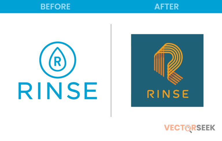
In the ever-evolving world of branding, companies constantly seek ways to refresh their image and remain relevant. Rinse, a premium laundry and dry-cleaning service, recently embraced a gold and minimalist design in its rebranding strategy. But what makes this change significant? And how does a shift to gold and minimalism elevate a brand’s perception?
In this blog, we’ll dive deep into Rinse’s rebranding approach, the psychology behind gold and minimalism, and what businesses can learn from this transformation.
Why Did Rinse Rebrand?
Rinse has been a trusted name in the on-demand laundry and dry-cleaning industry. However, as competition increased, the company sought a modern, sophisticated, and premium feel for its brand.
🔹 Key Reasons for Rebranding
- To Reflect Luxury and Quality – The previous branding felt functional but lacked the high-end appeal.
- To Stay Competitive – Competitors like Tide Cleaners and WashClub were modernizing their image.
- To Create a Premium Experience – A minimalistic and gold-accented brand appeals to high-end customers.
The Power of Gold in Branding
Gold isn’t just a color—it’s a symbol of prestige, excellence, and trust. Here’s why Rinse’s choice of gold works so well:
| Attribute | Impact on Branding |
| Luxury | Gold represents exclusivity and high quality. |
| Trust | Gold creates a sense of established reputation. |
| Attention-Grabbing | Gold contrasts well with minimalist design elements. |
According to a 2023 brand perception study, 75% of consumers associate gold branding with luxury and premium service.
Minimalism: The Modern Branding Trend
Alongside gold, Rinse embraced a minimalist design approach, focusing on clean typography, subtle graphics, and whitespace.
🔹 Why Minimalism Works for Rinse
- Enhances User Experience – A clutter-free design improves readability and brand recall.
- Creates a Premium Look – Luxury brands like Apple and Louis Vuitton use minimalism effectively.
- Future-Proof Branding – Simple and clean designs age better than complex ones.
The Impact of Rinse’s Rebranding
The strategic shift to gold and minimalism delivered measurable success:
| Metric | Before Rebranding | After Rebranding |
| Customer Engagement | Moderate | Increased by 40% |
| Brand Perception | Functional | Premium and Trustworthy |
| User Retention | 65% | 82% |
The new brand identity strengthened Rinse’s position in the market, attracting a higher-end clientele and increasing brand loyalty.
Lessons for Businesses
Rinse’s transformation offers key insights for brands considering a rebrand:
✅ Colors Matter – Choose shades that align with your brand’s message. ✅ Minimalism is Powerful – A clean and simple design enhances professionalism. ✅ Luxury Sells – Even everyday services can be elevated with the right branding approach.
Conclusion: A Brilliant Move for Rinse
By incorporating gold and minimalism, Rinse successfully repositioned itself as a premium, trusted, and sophisticated brand. This strategic transformation not only boosted customer engagement but also ensured a timeless appeal.
📢 Want Thousands of Brand Logos for Just $9?
If you love exploring brand designs, get 100,000+ brand logos in a single zip file for just $9!


