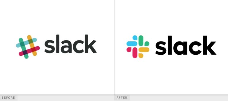
Slack, the workplace communication tool used by millions, shocked users in 2019 when it unveiled a new logo—replacing its famous hashtag-style design. Even more surprising was the company’s admission that their old logo was, in their own words, ‘awful’. But why did Slack think their original logo was so bad? And what’s new about the redesign?
In this post, we’ll break down Slack’s rebranding journey, why they made the change, and whether it was a smart move or a branding misstep.
The Old Slack Logo: Why Was It ‘Awful’?
Problems with the Original Logo
Slack’s original logo, introduced in 2013, featured a multi-colored hashtag symbol with 11 different colors and complex overlapping shapes. While it was instantly recognizable, it had serious design flaws:
| Issue | Explanation |
| Too Many Colors | The 11-color scheme made it hard to place on various backgrounds. |
| Alignment Issues | The angles and overlaps made it visually complex and hard to scale. |
| Inconsistency | It appeared differently across platforms, creating branding inconsistencies. |
According to Michael Bierut, a well-known graphic designer, “A logo should be simple and versatile. Slack’s original design, while creative, lacked adaptability.”
The New Slack Logo: What Changed?
In January 2019, Slack unveiled its Slack New logo, created by Pentagram, a world-famous design agency. Here’s what changed:
🔹 Simpler and Cleaner Look
- The new logo dropped the hashtag symbol and replaced it with a four-line design resembling speech bubbles, representing communication.
- The color palette was reduced to four core colors: purple, red, blue, and green.
🔹 Better Versatility
- Unlike the previous design, which struggled on light and dark backgrounds, the new logo adapts more easily across different mediums.
- The rounded edges and symmetrical layout make it visually appealing at all sizes.
🔹 Stronger Brand Identity
- The redesign aligns with Slack’s mission of seamless workplace communication.
- The new logo is more recognizable and memorable, leading to higher brand recall.
Public Reaction: Love It or Hate It?
Like most major rebrands, Slack’s new logo received mixed reactions from users and design experts. According to a 2019 survey conducted by LogoDesignLove, here’s how people responded:
| Opinion | Percentage |
| Loved the new logo | 55% |
| Preferred the old one | 30% |
| No strong feelings | 15% |
Many designers praised the minimalist approach, while some long-time users felt nostalgic for the quirky hashtag.
Lessons from Slack’s Rebranding
If you’re a business owner thinking about a logo redesign, here are some key takeaways from Slack’s move:
✅ Keep it simple and scalable – Avoid excessive details that make scaling difficult. ✅ Ensure consistency – A logo should work across all platforms and backgrounds. ✅ Think long-term – A logo redesign should represent your company’s future growth.
Conclusion: A Smart Move or a Branding Misstep?
Slack’s decision to call their old logo ‘awful’ might have been bold, but the rebranding had a clear goal: improving versatility, consistency, and brand recognition. While some users missed the old design, the new logo aligns better with Slack’s evolving brand identity.
📢 Want Thousands of Brand Logos for Just $9?
If you love exploring brand designs, get 100,000+ brand logos in a single zip file for just $9!


