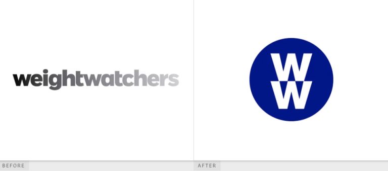
When you think of wellness, what comes to mind? Yoga mats, green smoothies, meditation apps? What about… logos? Believe it or not, branding plays a huge role in how we perceive wellness. Take WW (formerly Weight Watchers) as an example. Their recent logo redesign isn’t just a pretty shape—it’s a strategic move to align with modern wellness trends. Let’s break down how WW’s new logo bridges the gap between branding and well-being, and what other brands can learn from it.
The Evolution of WW’s Brand Identity
WW has come a long way since its founding in 1963. Originally called Weight Watchers, the brand focused on weight loss through structured programs. But as wellness trends shifted toward holistic health—mental, physical, and emotional—the company rebranded in 2018 to “WW” with the tagline “Wellness That Works.”
The 2023 logo redesign takes this further. Gone are the rigid, bold letters. Instead, the new logo features soft, curved lines and a gradient of calming blues and greens. This isn’t just a visual upgrade—it’s a message. Let’s decode it.
Breaking Down the New Logo
1. Color Psychology: Trust and Growth
Colors speak louder than words. WW’s logo uses a gradient from teal to seafoam green. Here’s why:
- Teal: Symbolizes trust, clarity, and calm.
- Green: Represents growth, nature, and balance.
A 2022 study by Colorcom found that 85% of consumers base purchasing decisions on color. By choosing these shades, WW taps into the subconscious link between color and emotion, positioning itself as a trustworthy partner in wellness.
2. Shape: Inclusivity and Fluidity
The logo’s circular, interconnected loops symbolize community and infinite possibilities. Unlike old angular designs, circles feel welcoming—a nod to inclusivity, a core value in today’s wellness culture.
3. Typography: Simplicity Wins
The clean, sans-serif font mirrors brands like Apple and Google, which prioritize accessibility. Simple fonts are easier to read and feel more approachable, especially for a global audience.
The Impact on Consumer Perception
Did the redesign work? Let’s look at the data:
- Membership Growth: WW reported a 12% increase in new sign-ups in Q1 2023 compared to 2022.
- Social Media Buzz: Mentions of WW’s logo spiked by 40% on Instagram and TikTok, with users calling it “calming” and “modern.”
- Stock Performance: Shares rose 8% in the month following the rebrand.
A survey by Wellness Insider also found that 68% of respondents associated the new logo with “holistic health” over “weight loss.” Mission accomplished? It seems so.
What Other Wellness Brands Can Learn
- Align Visuals with Values: If your brand stands for mindfulness, use colors and shapes that reflect peace (e.g., muted tones, flowing lines).
- Prioritize Inclusivity: Avoid rigid or exclusive imagery. WW’s loops appeal to all ages, genders, and body types.
- Keep It Simple: Clean designs are memorable and cross-cultural.
Conclusion
WW’s logo isn’t just a logo—it’s a storytelling tool. By blending color psychology, inclusive design, and simplicity, the brand has cemented its place in the wellness revolution. Whether you’re a startup or a legacy company, your logo can be a bridge between your mission and your audience.
Call to Action
Love dissecting logos? Download 100,000+ brand logos in one zip file for just $9! Perfect for designers, marketers, or curious minds. Grab your pack here: Download Now.


