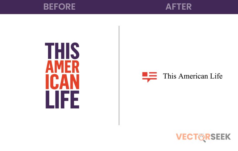
For over two decades, This American Life has been a staple in the world of storytelling and journalism. Known for its compelling narratives and deep dives into real-life experiences, the podcast has built a loyal audience. Recently, the show underwent a visual rebranding, unveiling a flag-inspired logo that symbolizes its deep connection to American culture. But does this new design successfully capture the essence of the show?
In this blog, we’ll explore the history of This American Life’s branding, analyze the new logo, and discuss how this design update aligns with the podcast’s identity.
The Evolution of This American Life’s Logo
Since its inception, This American Life has had a handful of logo iterations, each representing different phases of its growth. Here’s a look at its evolution:
| Year | Logo Design | Key Features |
| 1995 | Original Logo | Simple serif typography |
| 2008 | Modernized Update | Bold colors, refined typeface |
| 2023 | Flag-Inspired Logo | Strong patriotic elements, contemporary design |
The 2023 redesign embraces a new visual identity while staying true to the podcast’s core themes.
Why This American Life Opted for a New Logo
The decision to update the logo wasn’t random—it was a strategic rebranding meant to reflect the show’s evolving identity. Here’s why:
1. Emphasizing American Storytelling
The new flag-inspired design reinforces the show’s mission of telling uniquely American stories, resonating with listeners from all walks of life.
2. Modern Aesthetic for Digital Platforms
With over 3 million weekly downloads, This American Life has expanded its presence across digital platforms. A bold, clean design ensures the logo is visually effective across apps, social media, and marketing materials.
3. Stronger Brand Recognition
In a crowded podcast space, a distinctive and memorable logo helps maintain a strong brand identity, making the show instantly recognizable.
Breaking Down the New Logo: What’s Changed?
| Feature | Old Logo | New Logo |
| Color Scheme | Muted blue and red | Vibrant red, white, and blue |
| Font | Traditional serif | Modern sans-serif |
| Design Elements | Simple text-based | Flag-inspired graphics |
| Theme | Classic & minimal | Patriotic & bold |
The updated design takes a modern, patriotic approach, reinforcing the podcast’s American storytelling roots.
Audience Reaction: Love It or Hate It?
Reactions to the logo update have been largely positive, with many praising its bold, clean aesthetic. However, some longtime fans miss the older, more understated branding. Here’s what listeners are saying:
- “The new logo perfectly captures the essence of the show—simple yet meaningful.”
- “I liked the old logo’s minimalism, but I get why they wanted to refresh it.”
- “It’s great to see a podcast embrace strong visual branding!”
What This Rebrand Teaches Us About Podcast Branding
The redesign of This American Life’s logo offers valuable insights into brand evolution:
- Visual identity matters, even in audio-based media.
- Modern, versatile design works better on digital platforms.
- Logos should evolve with brand storytelling and audience growth.
Final Thoughts
The flag-inspired redesign of This American Life’s logo is more than just a visual change—it’s a statement of its commitment to storytelling that represents America in all its diversity. While some fans miss the old design, the new logo ensures the podcast remains relevant in an ever-evolving media landscape.
Call to Action
Want access to 100,000 brand logos in a single ZIP file? Download now for just $9: https://vectorseek.com/download-10000/


