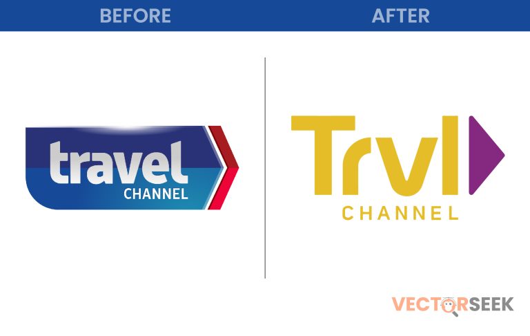
For years, the Travel Channel has been synonymous with adventure, exploration, and cultural discovery. However, in a bold move to modernize its image, the channel underwent a major rebranding—including a fresh new logo. But does this redesign truly capture the essence of adventure and travel?
In this blog post, we’ll take a deep dive into Travel Channel’s new logo, its impact on brand identity, and what this change means for its loyal audience.
The Evolution of Travel Channel’s Logo
Over the years, Travel Channel has gone through several logo transformations to reflect shifts in branding and content focus. Here’s a quick look at its evolution:
| Year | Logo Design | Key Features |
| 1987 | Original Logo | Classic serif font, globe icon |
| 1999 | Sleek Update | Modernized typeface, subtle wave |
| 2008 | Blue Logo | Stronger emphasis on adventure |
| 2018 | Bold Redesign | Simple typography, minimalist look |
The latest rebrand is the most significant change yet, embracing a bolder and more contemporary style.
Why Did Travel Channel Change Its Logo?
The decision to update the logo wasn’t just about aesthetics—it was a strategic move aimed at redefining the brand. Here’s why:
1. Aligning with a New Content Direction
In recent years, Travel Channel has shifted its programming to focus more on mystery, paranormal, and adventure-driven content. The new logo reflects this shift by moving away from traditional travel imagery.
2. Simplicity and Digital Optimization
A minimalist design ensures the logo looks clean and professional across different platforms, from TV screens to mobile apps. More than 70% of media consumption now happens on digital platforms, making logo clarity crucial.
3. Appealing to a Broader Audience
With a sleeker look, the new branding attracts not just travel enthusiasts but also fans of adventure, mystery, and exploration.
Analyzing the Old vs. New Logo: What Changed?
| Feature | Old Logo | New Logo |
| Color Scheme | Blue and white | Darker, bolder shades |
| Font | Playful, rounded | Modern, sleek typography |
| Icon | Globe-inspired | Minimalist, abstract design |
| Theme | Traditional travel | Adventure and mystery |
The Impact of the Rebrand
The response to the Travel Channel new logo has been mixed, with some praising its fresh look while others miss the traditional travel aesthetics. However, key benefits include:
- Stronger Digital Presence: Works well on streaming and mobile platforms.
- Increased Brand Recognition: Simpler, more modern design is easier to remember.
- Better Audience Alignment: Matches the channel’s evolving content themes.
What Travel Channel’s Logo Redesign Teaches Us About Branding
The Travel Channel’s bold rebrand offers valuable branding lessons:
- Brand Evolution is Necessary: Companies must adapt to stay relevant.
- Simplicity Wins in the Digital Age: Clean, minimalist logos are more versatile.
- Logos Should Reflect Content Direction: A strong visual identity should align with the brand’s message.
Final Thoughts
Travel Channel’s new logo is more than just a design update—it’s a reflection of the channel’s evolving identity. While the departure from traditional travel imagery may surprise some, it marks a step toward a modern and adventurous future.
Call to Action
Want access to 100,000 brand logos in a single ZIP file? Download now for just $9: https://vectorseek.com/download-10000/


