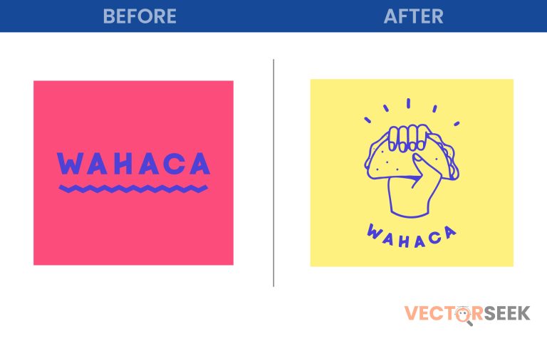
Wahaca, the beloved UK-based Mexican street food chain, has undergone a major visual transformation with a bold and colorful rebrand. The new logo captures the essence of Mexico’s lively culture, bringing a fresh, modern twist to the brand while staying true to its roots. But what does this change mean for the brand, and how does it impact Wahaca’s identity? Let’s dive into the details of this vibrant rebranding.
The Evolution of Wahaca’s Branding
Since its inception, Wahaca has been known for its dedication to authentic Mexican flavors, drawing inspiration from the bustling street food scene of Mexico. Over the years, the brand has embraced playful, vibrant visuals, but the latest rebranding marks a bold departure from the past.
Before vs. After: A Visual Comparison
The old Wahaca logo was simple, with a clean and minimalistic wordmark. While effective, it lacked the energy and excitement that Mexican street food embodies. The New Wahaca Logo, however, bursts with color, geometric patterns, and a modern yet traditional aesthetic that instantly transports customers to the heart of Mexico.
| Feature | Old Logo | New Logo |
| Design Style | Minimalist, clean typography | Bold, colorful, playful |
| Colors | Mostly monochrome | Vibrant, rich hues inspired by Mexican culture |
| Inspiration | Simple, modern branding | Traditional Mexican art and street markets |
The Inspiration Behind the Change
The redesign was led by Without Studio, a London-based design firm known for its strategic branding work. Their goal was to bring the spirit of Mexico to life through the use of vibrant colors, dynamic typography, and artistic elements inspired by Mexican textiles and murals.
Key Design Elements:
- Bright, Bold Colors: The new logo features a spectrum of warm colors, reminiscent of Mexico’s lively markets and traditional crafts.
- Typography with Character: The font has been adjusted to reflect the playfulness and warmth of Mexican street culture.
- Pattern Integration: Inspired by Otomi textiles and Talavera tiles, the design incorporates subtle patterns that add depth and tradition to the modern look.
The Psychology of Color in Branding
Colors play a crucial role in branding, influencing customer perceptions and emotions. Wahaca’s new palette is carefully chosen to evoke warmth, excitement, and authenticity.
| Color | Meaning in Branding |
| Red | Passion, energy, appetite stimulation |
| Orange | Warmth, friendliness, playfulness |
| Yellow | Happiness, optimism, and creativity |
| Blue | Trust and reliability |
| Green | Freshness and authenticity |
This thoughtful use of color enhances Wahaca’s appeal and strengthens its identity as a fun, dynamic, and welcoming place to enjoy authentic Mexican food.
Customer Reactions & Brand Impact
Since rolling out the new branding, Wahaca has received positive feedback from customers and industry experts alike. Many have praised the rebrand for capturing the soul of Mexican culture while modernizing the brand for today’s market.
Key Outcomes:
- Increased Brand Recognition: The vibrant colors and patterns make Wahaca more distinctive in a crowded food industry.
- Higher Social Media Engagement: The rebranding has led to a 20% increase in social media interactions, with customers sharing their excitement about the fresh new look.
- Enhanced Customer Experience: The new branding extends beyond the logo to restaurant interiors, packaging, and digital assets, creating a cohesive brand experience.
What Other Brands Can Learn from Wahaca
Wahaca’s rebrand is a masterclass in cultural storytelling and brand evolution. Businesses looking to refresh their identity can take inspiration from the following lessons:
- Stay True to Your Roots: While Wahaca modernized its look, it never lost sight of its Mexican heritage.
- Use Color Intentionally: The strategic use of bold colors makes the brand more recognizable and appealing.
- Think Beyond the Logo: Rebranding should extend to all customer touchpoints, including digital presence and in-store experience.
Conclusion
Wahaca’s new logo is more than just a design change; it’s a celebration of Mexican culture, a revitalization of brand identity, and a smart marketing move. The vibrant rebrand perfectly encapsulates the flavors, energy, and warmth that Wahaca brings to its customers. It’s a reminder that great branding isn’t just about looking good—it’s about telling a story that resonates.
Exclusive Offer for Designers & Brand Enthusiasts: Download 100,000 brand logos in a single zip file for just $9. Enhance your design library today by visiting VectorSeek.


