Dollar General Logo Vector
Quick Info
- Posted:
- Website: www.dollargeneral.com/
- Quality: High Resolution
- Categories:
- Report Copyright Issue
Dollar General Logo - History, Symbol, Meaning, PNG, Vector & Evolution
Dollar General Corporation is a family-owned business that was established in Kentucky, USA back in 1939 by Cal Turner and James Luther Turner. This company operates a large chain of variety stores offering a selection of variety products. They sell consumable and non-consumable products like cleaning products, food, medicines, pet supplies, and seasonal merchandise. Today, the corporation runs over 16 thousand outlets across the United States and provides low-cost merchandise.
Dollar General Logo History
The company has changed the logo several times but the legacy of the very first General Dollar Logo remains intact. The basic text with a bright juicy and refreshing color palette remains unchanged for decades. Owing to this consistent visual identity, Dollar General's Logo design is easily recognizable not only in the USA but all around the world.
1955 – 1972
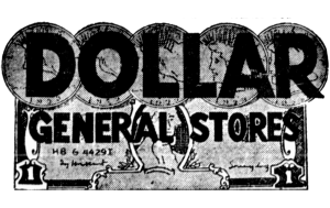
Though the company was established back in 1939 the very first logo Dollar General rolled out in 1950. The black color text was featured on a yellow background. The overall shape of the logo was rectangular. The text font was unique and this style remains traceable in the Current Dollar General Logo.
The text includes two levels of inscription upper and lower. The logo featured the company name “Dollar General Stores” in two levels. The upper level of writing includes the word “Dollar” in bold Sans-Serif font and all letters are not capitalized. The lower inscription includes two words in capital letters “General Stores”. The upper portion of the logo includes 5 coins with merged/overlapped portions.
1966
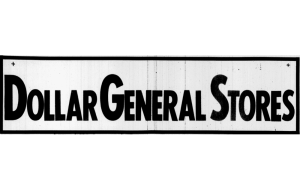
In 1966, the company introduced a badge design for “Dollar General Stores”. In this version, all letters are placed in the upper inscription level in horizontal orientation. The first letters of all words are capitalized and bold. Primarily, this logo was used by retailers on a large scale. This design was simple yet solid and memorable.
The logotype was placed against the light background to enhance the visual impact of the logo. All letters were encapsulated in a horizontally positioned rectangular frame. The rectangular frame is also in black color same as the logotype.
1966 – 1967
A few months later, in the same year, the company's logo was updated for the first time. In this revision, the color of the text was turned to white and placed against a black background. Contrarily to the badge design, the size of all letters is the same and all of them are bold. However, the lines of letters were made thicker and contours as compared to the previous design. This was a simple, easily recognizable, and memorable logo but it stayed only for less than one year.
1967 – 1972
1966 logo design version was revised again in 1967 and only the color palette was changed and everything else remained the same. The color palette was changed to light grey from white. However, the background color remains the same. So, we can say nothing was changed except the color of the Text. This is how the company managed to keep its visual identity consistent and this is the biggest reason the company’s logo is largely recognized.
1972 – 1984
Once again, the company considered redesigning the logo and this logo version remained in use for more than a decade. In this revision, inscriptions were again used in two levels upper one and lower one. This time, the concept of the logo was entirely changed. Though still it was a text-based logo many other things were changed.
The upper inscription featured the word “Dollar” in bold, stylish, and capitalized letters. The font for the word “Dollar” was custom-built. A tiny memorable element was introduced to the left side of the letter “D” of the word “Dollar”. The lower inscription includes the words “General Stores” in horizontal orientation.
Lower inscription utilizes the geometric sans-serif font and unique contours of some letters that give a different look to the company’s visual identity. The color palette for this logo version is Black placed against a white background. This logo was only text-based, simple yet memorable and recognizable.
1984 – 1995
In the Dollar General Logo 1984 version, the font styles for the logotype remained unchanged. However, inscription orientation was changed remarkably. In addition to this, the color palette was also revised. This logo design features the words “General Stores” set on the left side of the word “Dollar”. The logotype “General Stores” was arranged in two vertical levels.
These all letters are enclosed into an elongated rectangle. The corners of the rectangular frame are rounded and the background color turns bright yellow. This logo also stayed for more than one decade.
1995 – 2009
The company redesigned the logo again in 1995. Previously, logo designs featured three words for all designs. But this 1995 version of the logo featured only two words “Dollar General” and the word “Dollar” was eradicated. However, the color palette of the logo remains unchanged. Black text on a bright yellow background was used.
This time the border lines of the frame are made thinner. An optimum blend of colors, fonts, sizes, and frames gave a very fresh, solid, and confident feel to the logo. This logo also stayed with the company for more than one decade.
2009 – Today
To keep the company’s visual identity aligned with modern design trends, the company redesigned the logo in 2009 which is still in place. This new logo design brought a fresh, modern, sleek, and minimal appearance to Dollar General’s logo. The color palette was slightly changed as the bright yellow color turned to neon yellow. The contemporary design of the logo still carries the legacy of brand colors Black and Yellow.
Fonts and color codes of Dollar General Logo
The Dollar General font style is known as FS Lola Bold. The following two colors are used for the logo.
NEON Yellow:
| HEX Color | #fef200 |
| RGB | 254 242 0 |
| CMYK | 0 5 100 0 |
| Pantone | PMS 3955 C |
Raisin Black
| HEX Color | #252120 |
| RGB | 37 33 32 |
| CMYK | 0 11 14 85 |
| Pantone | PMS Neutral Black C |
Comparison to Competitor’s Logo
When we compare the logo of Dollar General with competitors like Costco, Target, Walmart, etc, we can easily conclude that Dollar General’s logo stands out. However, when the logo is compared with competitors’ logos, both differences and similarities exist. But the blend of unique colors, fonts, and sleek rectangle design set it apart.
Future Logo Consideration
Dollar General Corporation used to update the logo from time to time showing the company’s intentions to meet contemporary trends and fashion. So, we can easily conclude that we may witness new logo designs in the future as well. It will be interesting to witness the new logo design possibilities in the future.
Conclusion
Overall, Dollar General's logo design gives a fresh, strong, and confident feel. The logo represents the optimum blend of modernity and simplicity that the company has finally achieved after decades. The bright, eye-catching, and refreshing color palette reflects the company’s vision of providing value products to its customers.

