KFC Logo Vector
Quick Info
- Posted:
- Website: www.kfc.com/
- Quality: High Resolution
- Categories:
- Report Copyright Issue
About KFC
KFC or Kentucky Fried Chicken is an American fast food multinational chain restaurant. Its headquarters is in Louisville, Kentucky and the restaurant’s specialty is fried chicken. After McDonald’s, it is the second-largest restaurant chain in the world. According to stats of 2019, it has more than 22000 branches in 150 countries. It has more than 100,000 employees working around the world.
The company also owns Taco Bell, Pizza Hut, and Yum! It was founded by Colonel Harland Sanders on 20th March 1930. The first franchise was opened in Utah on 24th September 1952. According to stats done in 2020, KFC generated a revenue of more than 28 billion dollars. Before KFC, it was called Sanders Court and Café.
Meaning and History of the KFC Logo
KFC’s chicken is famous around the world. Even though there are so many restaurants and fast-food chains that sell top-class fried chicken but for some reason, KFC still is preferred on a weekend nights. KFC changed its logo 7 times in the following years.
- 1952
- 1978
- 1991
- 1997
- 2006
- 2014
- 2018
Evolution
KFC is the kid’s favorite fast-food restaurant because the spices in the fried chicken are very moderate but still give a rich and flavorful taste. They also serve burgers and other delicacies.The logo has always been elite from the very first logo and they changed their logo in the following ways.
1952
In this year, you can see Kentucky Fried Chicken and the portrait of Sanders on the left side.
[caption id="attachment_67936" align="aligncenter" width="300"]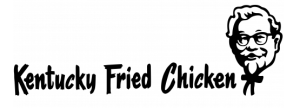 1952 KFC logo vector[/caption]
1978
In this year, Sander’s portrait is on the left and Kentucky is on its right on the top, below it is Fried, and below it is Chicken. The tails of K and Y are extended.
[caption id="attachment_67937" align="aligncenter" width="300"] 1978 KFC logo vector[/caption]
1991
In this year, the iconic red color was added in the logo. Now, there are bold red stripes tilted to the right and the stripes are getting bigger from left to right. The last stripe is almost a red box having the portrait of Sanders. The bow of Sanders is outside the box. Below it KFC is written in italics and bold.
[caption id="attachment_67938" align="aligncenter" width="300"] 1991 KFC logo vector[/caption]
1997
In this year, the portrait of Sanders is in a half-red box and KFC is written on the right side of Sander’s shirt (near the heart).
[caption id="attachment_67939" align="aligncenter" width="287"] 1997 KFC logo[/caption]
2006
In this year, colors are now bright and Sander’s portrait is now in a circle and Sanders is wearing an apron. Their hair of Sanders is slightly out of the circle.
[caption id="attachment_67940" align="aligncenter" width="300"] 2006 KFC logo[/caption]
2014
In this year, the logo was minimalized. Now, you can see a black and white portrait of Sanders and below it, KFC is written.
[caption id="attachment_67941" align="aligncenter" width="202"] 2014 KFC logo[/caption]
2018
In this year, the logo is in a shape of a chicken bucket. There are two lines inside the bucket left and right making a center. In the center, there is a portrait of Sanders and below it, KFC is written.
[caption id="attachment_67942" align="aligncenter" width="300"] 2018 KFC logo[/caption]
Building of KFC Logo
We love each and every logo of KFC. It has the creativity and even looks fun. The logo is now a brand itself. Each logo of KFC shows that thoughts and imagination are added. The logo of KFC is divided into two parts.
Font
In the first year, the font is similar to Comic Sans MS. In the second year, the logo is similar to the bold Baskerville Old Face font. For the rest of the years, bold Friz Quadrata font was used.
Color
In the first and second years, only black and white colors were used. Upcoming year, red, black, and white colors were used. in the third year, red, white, and blue colors were used. In the fourth year, red, white, and black colors were used.Upcoming year again black and white colors were used. In the last year, red, white, and black colors were used.
Provided Services
At VectorSeek, you can download different types of editable formats of the KFC logo with complete rights. No need to worry about copyright issues as we make sure our visitors face no such challenges. You can download the following formats of the logo:
- KFC logo PNG
- KFC logo SVG
- KFC logo AI
- KFC logo Vector
You can download formats of the logo in a zip file.
Variants of the KFC Logo
VectorSeek keeps looking for different variants of the KFC logo. Anyone can download different variants and formats of the KFC logo for free. All you have to do is click download and it's done. We have the following variants of the KFC logo in HD quality:
Conclusion
KFC is the world’s favorite fried chicken. Once you eat at KFC, there is no going back. All logos of KFC are awe-inspiring and a great effort has been put to work. The current logo is a good example of minimalization and creativity.

