
Windows 2.0 Logo Vector
About Windows
Windows is a cluster of proprietary graphical OS system which is developed by Microsoft. A lot of versions of Windows were introduced and the active ones are Windows Phone, Windows Mobile, Windows 9x, Windows Embedded Compact/Windows CE, Windows Server, Windows IoT, and Windows NT. Windows was introduced on 20th November 1985 and it was the first ever graphical user interface of an intelligent operating system.
Windows is the most common software installed in every computer system around the world. Even though MacBook is considered a luxury and very more securer than Windows, but still, people prefer Windows OS as it is much easier to use.
Meaning and History of Windows Logo
Windows logo is similar to a window. The company says that they put a windows symbol suggesting that it opens a window to different and endless possibilities. Windows has made people’s lives easier. Since 1985, the Windows logo has changed for almost 17 times in the following years.
- 1985 – 1990
- 1992 – 1993
- 1994 – 1995
- 1996 – 2000
- 2001 – 2003
- 2006 – 2009
- 2012 – 2013
- 2015 – 2017
- 2020
Evolution of Windows Logo
Windows operating system is so easy that kids can use it for making assignments and presentations. The best part about Windows OS is that it can be customized and that is why the world’s best gamers consider this operating system to build powerful computer systems. The Windows logo evolved with different changes.
1985
In this year, you can see the traditional window with four squares of different sizes and to its right, Windows Microsoft, and all the letters are capitalized. The W is larger than the rest of the letters and MICROSOFT is written on top of WINDOWS.
[caption id="attachment_67988" align="aligncenter" width="300"]![]() 1985 Windows Logo[/caption]
1985 Windows Logo[/caption]
1990
In this year, the logo completely changed. It feels like Microsoft hired a goth person to design the logo. You can see a black, grey and white window. The colors are gradient and MICROSOFT WINDOWS are written below it.
[caption id="attachment_67989" align="aligncenter" width="157"]![]() 1990 Windows Logo Vector[/caption]
1990 Windows Logo Vector[/caption]
1992
In this year, bright colors were added to the logo. The window seems like a flag waving and the left side of the window is falling into pixels – below it, you can see MICROSOFT WINDOWS.
[caption id="attachment_67990" align="aligncenter" width="170"]![]() 1992 Windows Logo Vector[/caption]
1992 Windows Logo Vector[/caption]
1993
In this year, the logo became slightly bold and everything else was the same except Windows is now WindowsNT. In the same year, Windows 98 was also introduced and the logo of it was all the same except 98 was not bold.
![]()
1994
In this year, the waving flag pixeled windows are now tilted downwards to the right and you can see WINDOWS below it and Microsoft is written vertically beside W.
[caption id="attachment_67992" align="aligncenter" width="300"]![]() 1994 Windows Logo Vector[/caption]
1994 Windows Logo Vector[/caption]
1995
In this year, the Windows is still the same but the Microsoft is on top of Windows, and 95 is written on the right side of it.
[caption id="attachment_67993" align="aligncenter" width="300"]![]() 1995 Windows Logo Vector[/caption]
1995 Windows Logo Vector[/caption]
1996
In this year, the Windows is the same, and Microsoft is written below it, and Windows is written below it which is slightly right and to its right NT is written.
[caption id="attachment_67994" align="aligncenter" width="300"]![]() 1996 Windows Logo Vector[/caption]
1996 Windows Logo Vector[/caption]
2000
In this year, you can see one complete square having Windows and to its left and right, you can see half and connected squares. On the right, in the second square, Microsoft Windows 2000 is written.
[caption id="attachment_67995" align="aligncenter" width="300"]![]() 2000 Windows Logo Vector[/caption]
2000 Windows Logo Vector[/caption]
2001
In this year, there is a 3D-shaped square with the Windows logo in it, and to the left of the square, there are two more half and connected squares. Microsoft Windows is written to the right and you can also see enlarged ‘me’ and ‘Millennium Edition’ under me.
![]()
2003
This year, the logo is now minimalized. Microsoft is still on top of enlarged Windows and to its right, ‘XP’ is superscripted. Above all it, the frame was removed from the window, and only waving squares are there.
[caption id="attachment_67996" align="aligncenter" width="300"]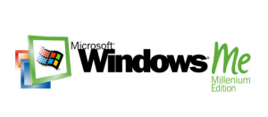 2000 Windows ME[/caption]
2006
In this year, the waving squares are in a blue circle with white gradients at the top and bottom of the circle. Windows is bolded and you can also see Vista to its right with TM superscripted.
[caption id="attachment_67998" align="aligncenter" width="300"]![]() 2006 Windows Logo Vector[/caption]
2006 Windows Logo Vector[/caption]
2009
In this year, you can then wave squares and below it, Windows 7 is written.
[caption id="attachment_67999" align="aligncenter" width="300"]![]() 2009 Windows Logo Vector[/caption]
2009 Windows Logo Vector[/caption]
2012
In this year, the squares seems like they are coming from left to right and now all squares are in light blue color and TM is subscripted. To its right, Windows 8 is written.
[caption id="attachment_68000" align="aligncenter" width="300"]![]() 2012 Windows Logo Vector[/caption]
2012 Windows Logo Vector[/caption]
2013
In this year, everything is the same as in 2012 but the letters are not bold anymore and 8 is now 8.1.
[caption id="attachment_68001" align="aligncenter" width="300"]![]() 2013 Windows Logo Vector[/caption]
2013 Windows Logo Vector[/caption]
2015
In this year, the window squares are now slightly dark blue and Windows 10 is written to its right.
[caption id="attachment_68002" align="aligncenter" width="300"]![]() 2015 Windows Logo Vector[/caption]
2015 Windows Logo Vector[/caption]
2020 till Now
In this year, the window squares are kind of 3D and the left bottom square is dark blue and the rest of the squares are something between light and dark blue. You can see Windows 10X is written to its right.
[caption id="attachment_68003" align="aligncenter" width="300"]![]() 2020 Windows Logo Vector[/caption]
2020 Windows Logo Vector[/caption]
Building of Windows Logo
Windows made big changes in the beginning, in the middle of all these years, modifications slowed down and were almost the same. But at the last few years of modifications in the logo, the changes made were very small and even unnoticeable. These changes had two main changes.
Font and Color
- In 1985, the colors used were sky blue and black and the font was a thin elegant serif typeface.
- In 1992, the colors used were black, white, and grey and two font styles were used; Microsoft was in logotype font and Windows was in a serif typeface.
- In 1993, red, blue, yellow, green, and black colors were used and the font was the same.
- In 1994, 1995, and 1996 same colors and fonts were used.
- In 2000, the colors used were red, yellow, green, blue, black, dull orange, and blue and the font was a sans-serif typeface.
- In 2001, the colors used were red, blue green yellow, black, dull green, and gradient green, blue and red.
- In 2003, the colors red, green, yellow, and blue are dull with black letters, and XP was written in orange and the font was the same.
- In 2006, the colors are now bright again and the circle was blue color and the letters were black and the font was the same.
- In 2009, the colors are again dull and letters are black and the font stays the same.
- From 2012, 2013, 2015, and 2020 till now, only dark and light blue colors were used and the font remained the same.
Provided Services
At VectorSeek, you can find different formats of editable files of the Windows logo for free and the best part is that you don’t need to sign-up or sign in – download any format with a single click. We have the following formats of Windows logo:
- Windows logo PNG
- Windows logo SVG
- Windows logo AI
- Windows logo Vector
You can download all of these formats in a ZIP file.
Variants of Microsoft Logo
VectorSeek strives to provide latest and old variants of the Microsoft logos in high quality. People look for different variants of the Microsoft logo for different purposes and here, you can download them with all legal rights. Below are the most downloaded variants of the Microsoft logo:
- Windows 10 Logo Vector
- Windows Vista Logo Vector
- Windows Server 2012 Logo Vector
- Windows Azure Logo Vector
- Windows 8 Logo Vector
- Windows Live Hotmail Logo Vector
- Windows Phone Logo Vector
- Windows 3.1x Logo Vector
- Designed for Microsoft Windows 98 Logo Vector
Conclusion
We cannot imagine our lives without Windows operating system. Programmers and developers opt for Windows only as it is easy to use, it is fast, and you can download all sorts of software. With every change in the logo, Windows introduced a new feature in the OS and it was worth it.