
Introduction
BMW is an abbreviation of Bayerische Motoren Werke. It is a multinational German corporation which designs, manufactures, and sells luxury vehicles, motorcycles, and engines. The company was founded in 1916 and has been famous for its high-performance and powerful cars. Its famous vehicles include 3 Series, 5 Series, and 7 Series.
Logo Details
Logo designed by: BMW in-house designers
Meaning
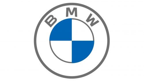
BMW logo is called the roundel. The logo consists of 4 equal parts with blue and white colors. There are three meanings of the logo: Rapp Motorenwerke interpretation, Bavarian flag colors, and aircraft propeller interpretation.
Colors
Grey, white, blue
History of BMW: Evolution of the Logo
BMW changed its logo 8 times in the following ways.
1913

The logo is a 2 nested circle. The first layer has a black color fill with 2 white stars on each side. On top of this layer, “RAPP” is designed in white color and at the bottom of this layer “MOTOR” is designed in white color. The letters and the stars have white circular lines. The second layer of circle has a white color fill with a horse’s head facing left in black color.
The horse represents the coat of arms of Stuttgart – this is the birthplace of the company. The logo was designed in this way to pay tribute to the city. The horse also represents agility, strength, and power of the cars.
1916
This logo is a 4 nested circle. The first layer is yellow and the second layer has a black color fill and on its top, “BMW” is designed in yellow using Times New Roman font. All letters are capitalized. The third layer is yellow and the fourth layer is divided into four equal parts of blue and white color.
1923
The logo is the same like the 1916 BMW logo. The only difference is that the yellow color is bolder than before and the blue color is thicker.
1936
The logo remains the same, the yellow color has been replaced with greyish white color. The blue color is very much light.
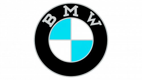
1963
The logo is again a 4 nested circle. The first two layers are black and white. The third layer has a black color fill with BMW designed in white color using Calibri Body Bold font. The last layer stays unchanged. The light blue color is darkened again.
1970
This logo is a 7 nested circle. The first layer is white and light blue, the second layer is white and dark blue, and the third layer is white and light pink. The fourth and fifth layers are black and white. The sixth layer has a black color fill with BMW designed in the same way and the layer stays the same.
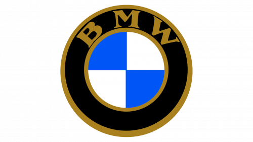
1997
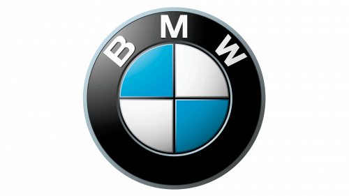
This logo has reduced to 3 nested circles. The first layer is grey and the second one has black color fill with BMW designed in the same way. The last layer has the same design. The logo is given a slight 3D look.
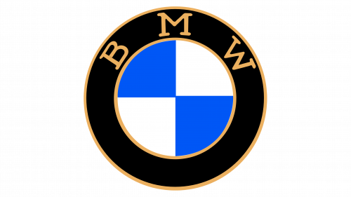
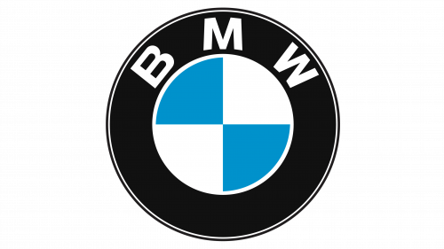
2020
The logo is the same as the 1997 BMW logo – the only difference is that the black color has been replaced with grey and the colors are lighter than before. BMW has introduced this logo as a minimalized version.
Over time, the BMW logo has become one of the most recognizable automotive symbols worldwide, representing engineering precision and performance across markets. From Europe to Asia, the emblem carries the same core identity, whether seen at a motorsport event, on the road, or through an official BMW dealer Singapore, where the brand’s heritage is presented to a new generation of drivers.
BMW: Company Overview
BMW was founded in 1916 by Karl Rapp and it is now headquartered in Munich, Germany. Its current chairman of board of the management is Oliver Zipse and its chairman of board of the supervisory is Norbert Reithofer. As of 2022, the company sold 2300000 vehicles around the world and made revenue of 142 billion euros. BMW was previously known as Otto Flugmaschinenfabrik and was founded by Gustav Otto in 1910 in the Kingdom of Bavaria. The firm was reorganized into BMW. BMW didn’t start by manufacturing cars; it first made fighter aircrafts. During the World War 1, the company did a lot of business by manufacturing railway brakes, household items, agricultural equipment, and motorcycle engines. BMW started making vehicles in 1928.
Fact
BMW designed and built the first electric car in the world in 1993 – it was called BMW E1.
Conclusion
Except the first BMW’s logo, the rest of the logo kept the logo almost the same. The color gradient changed throughout the years. The 1970 BMW logo has a pink color in the logo – we have no idea why the company opted for it but it must be for a good reason. The yellow color in the 1916 and the 1923 BMW logos represent royalty and high-end features of the vehicles. The current BMW logo is amazingly minimalized.
FAQs
Who designed the first BMW logo?
The first BMW logo was designed by Giorgio Giugiaro but some say that the first logo of BMW was designed by Karl Rapp himself.
Who designed the latest BMW logo?
The latest BMW logo is designed by the company’s in-house graphic design team.
What is the slogan of BMW?
The slogan of BMW is “Sheer Driving Pleasure”.
How to download BMW logo in PNG?
You can download BMW logo PNG from VectorSeek.
Download All bmw logos